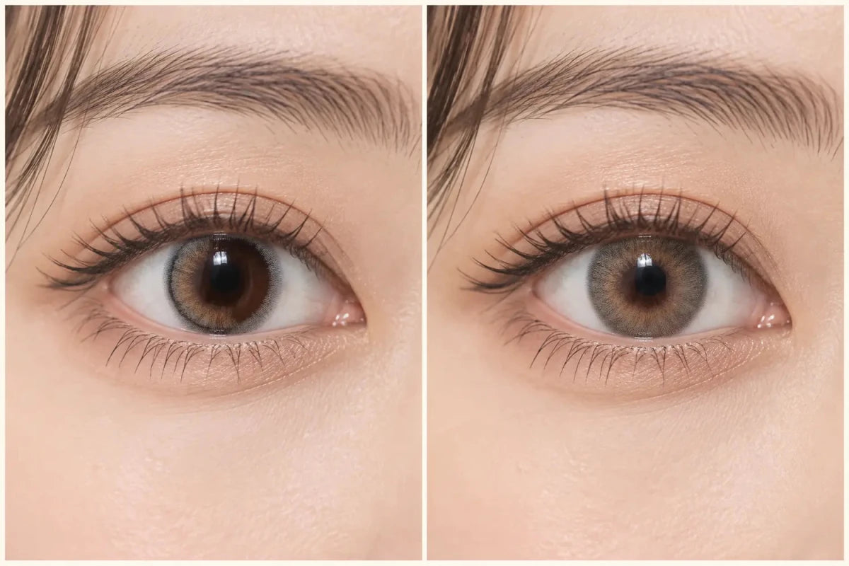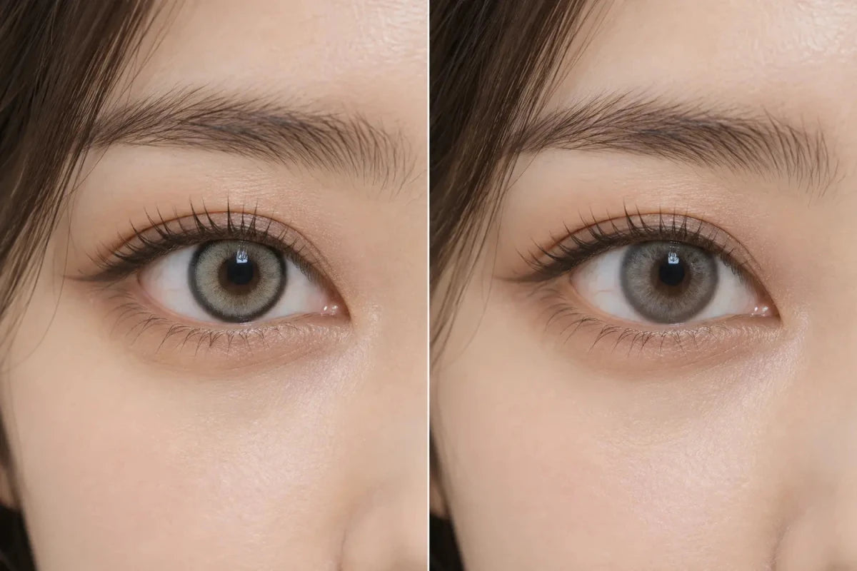


To brighten dark eyes without making them look larger, start with softly edged gray-brown, taupe, muted olive or medium warm brown patterns whose printed area stays close to your natural iris size. Prioritize visible mid-tone pigment and a blended center over a thick black rim or wide graphic diameter. Color visibility and enlargement are separate design choices.

Separate Brightness From Apparent Size
A lens looks brighter when its printed color creates enough contrast with the natural iris. It looks larger when the outer printed boundary extends beyond the visible iris or uses a strong ring that makes the edge more prominent. A product can do one, both or neither.
That is why choosing only by a light shade name can fail. A pale gray with a thick charcoal ring may brighten the center but still create an enlarged outline. A medium taupe with a fine, soft edge may produce a clearer color change while keeping the overall scale restrained.
Color Families to Compare First
Gray-brown and taupe
These bridge cool gray and natural brown, reducing the chance of a stark silver-on-dark contrast. Look for mid-tone print through the center and a diffused perimeter.
Muted olive
An olive-brown blend can lift a dark iris with earthy green rather than a neon effect. On very dark eyes, some olive prints read more brown, so use wearer photos with similar starting color.
Medium warm brown
Caramel or amber-brown can add light without changing the color family dramatically. Avoid assuming the warmest or lightest shade will be most natural; a yellow center can look more contrasted than expected.
Cool light gray may be more noticeable, but it is not automatically subtler. Compare it when the goal is a clearer color shift, and inspect the pupil transition carefully.
Use a Four-Part Pattern Checklist
| Feature | Look for |
|---|---|
| Graphic diameter | A printed span close to the natural look you prefer |
| Outer edge | Fine, broken or softly faded rather than a heavy black rim |
| Mid-tone opacity | Enough pigment to remain visible on a dark iris |
| Center gradient | A gradual transition around the pupil, not an abrupt pale ring |
Do not use lens diameter as a substitute for graphic diameter; the overall lens size describes fit-related geometry, while the printed area affects the visible design.
Test the Result at Normal Viewing Distance
Macro photos reveal dots, rings and gradients, but they can exaggerate a delicate pattern. Use a straight-on eye photo to inspect the edge, then a full-face image to decide whether the eyes appear brighter without dominating the face. Compare indoor light and daylight when possible.
Results vary with natural iris undertone, pupil size, lighting, camera exposure and editing. Give more weight to consistent photographs from eyes similar to yours than to a single dramatic image.
A Practical Three-Lens Shortlist
- Choose three patterns without a strong enlargement cue.
- Compare one gray-brown, one olive-brown and one warm brown direction.
- Remove any option whose center or edge appears too harsh on similar dark eyes.
- Confirm the exact prescribed power and required specifications before ordering.
Frequently Asked Questions
Does a lighter color always make dark eyes look bigger?
No. Apparent size depends more on graphic span and outer-edge definition than on lightness alone.
Which edge looks least enlarging?
A fine, broken or faded edge generally creates less outline emphasis than a thick, dark limbal ring.
Can olive contacts brighten nearly black eyes?
Some can, depending on print density and lighting, but muted olive may read brown on very dark irises. Similar-eye photos are essential.
Are gray-brown contacts subtler than silver gray?
Often, because brown can soften the cool contrast, but pattern opacity and ring design can outweigh the shade label.
Should I choose the smallest graphic diameter?
Not automatically. Choose a size near your preferred scale, then evaluate color visibility and center blend separately.
Can product photos guarantee the same brightness?
No. Starting iris color, lighting, pupil size and image processing affect the result.
Related categories: Colored Contacts for Dark Eyes · No Black Rim · Brown Contacts · Gray Contacts · Green Contacts