

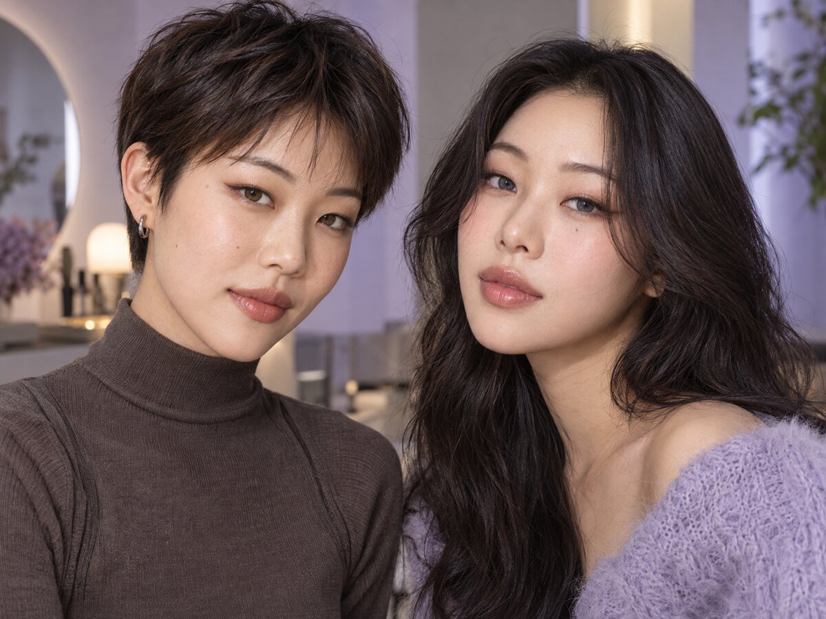
There is no single colored contact that is automatically best for monolid or hooded eyes. Eye shape changes how much lid space and eye makeup is visible, but the final lens effect also depends on natural iris color, contrast, graphic diameter, limbal ring, lighting and personal style.
Use eye shape as one part of the styling plan—not as a rule that limits you to one color or size.
Start with the effect you want
| Style goal | Features to compare | Possible direction |
|---|---|---|
| Natural everyday definition | Low contrast, soft edge, smaller graphic | Warm brown, choco or muted hazel |
| Clear eye definition | Visible but controlled limbal ring | Dark brown, gray-brown or olive |
| Brighter color statement | Higher opacity and color contrast | Gray, green, blue or violet |
| Photo-focused look | Pattern visibility under lighting | Gradient or highlight-style graphics |
Graphic diameter and visible balance
Graphic diameter describes the printed color area, not the overall lens size. A smaller graphic can keep the result closer to the natural iris, while a larger graphic may create more visible enlargement. Neither is universally better for monolids or hooded eyes.
If the eye opening is visually compact, a very large dark graphic can become the dominant feature. That may be exactly right for a doll-like or stage look, but shoppers seeking subtle definition often prefer a smaller or softer-edged design. Compare our small graphic diameter guide and what to adjust when contacts look too dramatic.
With or without a limbal ring?
A limbal ring can outline the iris and remain visible even when eye makeup is minimal. A soft or absent ring creates a blended effect, while a darker ring adds definition. Hooded eye makeup may hide part of the liner when the eyes are open, so some wearers use the lens ring itself as part of the visual structure.
See Colored Contacts With vs Without a Limbal Ring for a direct comparison.
Color ideas for naturally dark brown eyes
Brown and choco shades usually stay within a related color family. Hazel and olive introduce warmth or muted green. Gray can cool the overall palette, while brighter green or blue creates stronger contrast. Coverage and pattern matter as much as the color name.
- Brown contacts: soft tonal definition
- Hazel contacts: warm mixed-color effect
- Gray contacts: neutral to cool contrast
- Green contacts: olive to brighter color change
For dark irises, use our dark brown eyes color guide and compare opaque versus enhancement patterns.
Makeup placement for monolids
When the full lid is visible differently with eyes open, place the most important color or shimmer where it can be seen in your normal gaze—not only when the eye is closed. A thin lash-line definition can keep the contact color visible, while a softly lifted outer shade can balance a larger graphic.
Makeup placement for hooded eyes
Test the look with eyes open and relaxed. If liner or shadow disappears under the fold, move the visible transition slightly above the crease and keep heavy darkness away from the entire eye unless a smoky effect is intentional. Contact color can then act as a controlled focal point.
Build complementary shades with our makeup color palette guide.
Frequently asked questions
Do monolids need large circle lenses?
No. Large graphics are a style choice, not an eye-shape requirement. Smaller graphics can look equally intentional.
Are gray contacts better for hooded eyes?
Gray can create attractive contrast, but brown, hazel, green and other colors can also work. Choose by the whole palette and desired visibility.
Should the limbal ring match eyeliner?
It does not need to match exactly. A softer ring with brown liner creates gentle definition; a darker ring with stronger liner creates a sharper frame.
Does eye shape change contact-lens fit?
Cosmetic eye-shape labels do not determine fit. Contact suitability requires a prescription and professional fitting based on the eye and lens design.
Bottom line
Choose colored contacts for monolids and hooded eyes by testing the visible balance with eyes open: color contrast, graphic diameter, ring definition and makeup placement. Start with proper fit, then use eye shape to refine the style rather than restrict it.