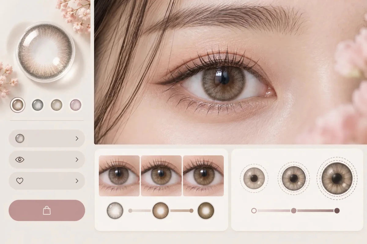

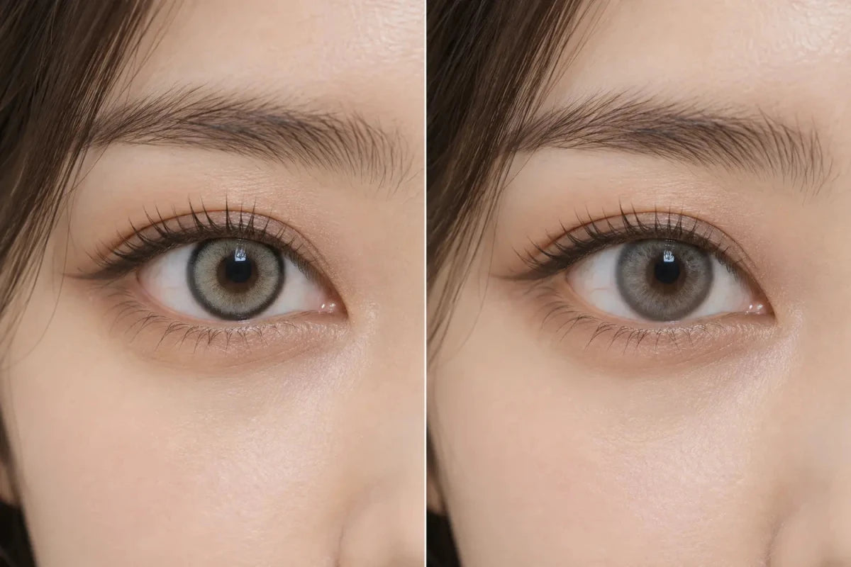
A light colored-contact center can look harsh on a dark iris when pale pigment ends abruptly around the pupil instead of blending into the natural color. The effect becomes stronger when the print is opaque, the pupil-zone transition is narrow, the natural iris is very deep brown, or bright lighting makes the pupil appear smaller. Compare the inner gradient—not only the shade name or graphic diameter.

Why the Center Can Look Separate From the Rest of the Iris
Colored lenses need a clear central opening so the wearer can see. Around that opening, the printed design may fade gradually, use fine dots, or stop with a more visible boundary. On a dark iris, a pale gray, beige, hazel or icy-blue print can create a light ring next to the naturally dark area around the pupil. When the tonal jump is large, the viewer reads the center as a separate circle rather than one continuous iris.
This does not automatically mean the lens is defective. It is usually a design-and-appearance interaction: print density, inner gradient, natural iris tone, pupil size and lighting combine to produce the result. One wearer may like the high-contrast effect, while another seeking a seamless look may find it too sharp.
Compare Four Features Before Choosing a Lighter Shade
| Feature | What to inspect | Possible visual effect on dark eyes |
|---|---|---|
| Inner gradient | How far the dots or strokes fade toward the pupil | A wider, gradual fade can soften the transition |
| Center opacity | How pale and dense the print appears near the opening | Dense light pigment can increase contrast |
| Color undertone | Warm beige/brown versus cool gray/blue | Cool pale tones may separate more clearly from warm dark brown |
| Outer ring | Whether the perimeter is soft, broken or strongly defined | A strong edge can make the overall design feel more graphic |
Graphic diameter tells you the overall span of the printed area, but it cannot reveal the width or opacity of the pupil-zone blend. A larger graphic diameter can still have an abrupt inner ring, while a smaller print can use a smoother center gradient.
Bright Light Can Reveal More of the Inner Transition
Pupils naturally change size with light. In brighter settings, a smaller-looking pupil can reveal more of the iris and more of the lens design around the center. That may make a pale inner print appear clearer than it did in dim indoor light. Camera exposure, sharpening, white balance and screen settings can amplify or soften the same contrast.
For this reason, an indoor model image and a bright-window close-up answer different questions. Neither alone proves how the lens will always look. The most useful product gallery keeps exposure believable and shows a close eye view plus a normal face-level view.
Use a Three-View Photo Checklist
1. Inspect the lens pattern by itself
Look for fine dots or feathered strokes extending toward the clear center. A solid pale band with little transition is more likely to create a visible boundary on a very dark iris.
2. Compare a straight-on eye close-up
Check the area immediately around the pupil. Do not judge only the outer ring. If possible, compare a wearer whose starting iris depth and undertone resemble yours.
3. Step back to the whole face
A transition that looks dramatic in a macro photo may feel balanced at conversational distance. The face-level image reveals whether the center contrast supports the intended look or draws more attention than desired.
How to Shortlist a Softer Light-Lens Result
- Start with the target color family, then compare at least two different inner-gradient designs.
- Prefer similar-eye photos over a single studio image on a much lighter iris.
- Remove options with a pale center boundary that already appears abrupt in neutral light.
- Compare the face-level result before deciding that a macro pattern is too strong.
- After the appearance shortlist, confirm the exact prescribed power and all required product specifications.
If the goal is subtle brightening, a medium gray-brown, taupe, muted olive or warm brown with a gradual center often creates a smaller tonal jump than icy silver or very pale beige. This is a comparison direction, not a guaranteed outcome: natural iris color and the exact print still matter.
Frequently Asked Questions
Is a harsh center caused by the clear pupil opening?
The opening itself is necessary; the visible effect usually comes from how the printed color transitions around it and contrasts with the natural iris.
Does reduced-pupil design always create a smoother result?
No. A smaller clear center may place more color near the pupil, but opacity, pattern and the wearer’s iris still determine whether the transition looks soft or sharp.
Why does the center look stronger in daylight?
Brighter light can change pupil size and reveal more of the inner design. Camera exposure and sharpening may also increase visible contrast.
Are warm colors always softer on dark brown eyes?
Not always, but warm brown or taupe can create a smaller tonal jump than a very pale cool shade. The print structure remains just as important.
Can graphic diameter predict pupil-zone coverage?
No. It describes the total printed span, not how the inner pigment is distributed around the clear center.
Can product photos guarantee the same center blend on my eyes?
No. Starting iris color, pupil size, lighting, camera processing and screen display can all change the apparent result.
Editorial note: Appearance guidance compares visible pattern features and common lighting effects. It does not predict an identical result for every iris or replace the exact lens specifications provided for each product.