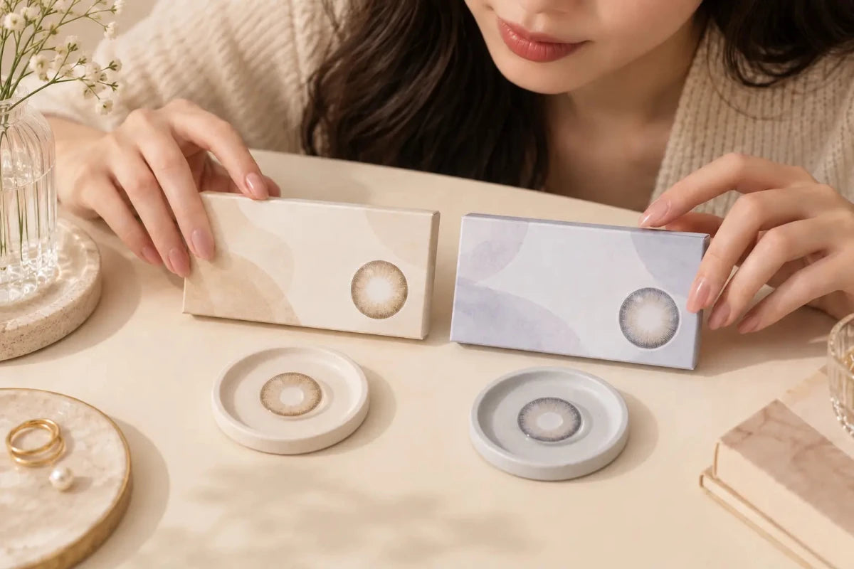


Beige colored contacts can disappear on very dark brown eyes when the print is too translucent or too close in brightness to the natural iris. “Beige” describes a color direction, not coverage. To predict visibility, inspect pigment density, undertone, pupil transition, edge definition and on-eye photos taken on a comparable starting eye.

Why Beige Can Blend Into a Dark Iris
Many natural beige lenses use fine dots and open spaces so the wearer’s iris remains part of the result. On a very dark brown eye, those spaces contribute deep brown. If the printed beige is also muted and translucent, the overall effect may read as slightly softer brown rather than an obvious beige color.
The effect is not automatically a failure. A nearly invisible beige can add texture, reduce harsh contrast or create a subtle pupil transition. It is unsuitable only when the shopper expects visible lightening. The product name cannot distinguish those goals.
Brightness matters as much as hue. A pale print may look strong on a white product card or transparent blister but weak when layered over a dark iris. Conversely, a medium taupe-beige with greater density can stay visible because it creates reliable contrast. “Lighter” on its own does not mean “more visible.”
Five Details That Control Beige Visibility
Print density
Density describes how much visual information the colored pattern carries. Closely spaced dots or more opaque zones can compete with a dark base; sparse translucent dots blend into it. Graphic diameter does not measure this property.
Undertone
Warm beige can merge with the natural warmth of brown eyes and appear caramel or simply brown. Cool taupe-beige introduces gray contrast and may remain easier to identify. A yellow-beige center can look brighter but may also read gold rather than beige.
Pupil transition
A wide clear center exposes a strong dark ring around the pupil. A soft gradient can integrate that ring, while a sharply printed pale center can create an obvious boundary. The best choice depends on whether your goal is seamless blending or visible transformation.
Outer edge
A defined limbal edge can make the eye look clearer and larger even if the beige itself is subtle. A no-rim design may feel more natural but can disappear at face distance. Edge definition and color visibility should be evaluated separately.
Lighting and image processing
Bright indirect daylight reveals pale dots and differences in undertone. Dim or warm indoor light can return the lens to brown. Ring lights, exposure and editing may make the effect look brighter online than in ordinary use.
Subtle Beige vs Visible Beige
| Design cue | Subtle beige | More visible beige |
|---|---|---|
| Pattern | Fine, sparse or highly translucent | Denser dots or layered tonal zones |
| Undertone | Close to the natural warm brown iris | Neutral taupe, gray-beige or controlled light center |
| Outer edge | Soft or nearly absent | Moderate definition without an overly dark rim |
| Likely face-level effect | Softer brown texture | Recognizable beige-taupe change |
| Main risk | Too little visible change | Too much contrast around the pupil or edge |
These cues help compare candidates; they do not guarantee an outcome. The exact product, starting iris, pupil size, prescription and lighting can change the result.
How to Judge Beige Contacts From Product Photos
Find the starting eye color. A beige lens shown on light brown eyes answers a different question from one shown on black-brown eyes. A bare-eye comparison is more valuable than a larger gallery with no baseline.
Use both close-up and face views. Close-ups reveal dot spacing, pupil opening and ring structure. Face views show whether the beige remains visible at conversational distance. Do not mistake macro visibility for everyday visibility.
Check the whites and background. If neutral objects look strongly warm, cool or overexposed, the photograph is not a neutral color reference. Compare another lighting condition before deciding.
Inspect the exact version. Daily, monthly, spherical and toric versions sharing a shade name may use different patterns, specifications or available powers. Use photos and details for the exact product you plan to order.
Separate color from enlargement. A dark outer ring may make the result noticeable even when the middle stays brown. Decide whether you want beige color, a larger-looking iris, stronger definition, or a combination.
A Better Way to Choose Beige for Very Dark Eyes
- State the desired distance: choose barely noticeable up close, visible at conversation distance or clearly lightened in photos.
- Confirm the prescribed lens first: check brand, measurements, product version and required powers before comparing style.
- Prefer comparable evidence: prioritize dark-eye models and both indoor and daylight images.
- Choose the contrast source: decide whether visibility should come from a cooler undertone, denser middle print or more defined edge.
- Reject misleading shortcuts: do not treat a larger graphic diameter, paler swatch or brighter studio photo as proof of coverage.
For a visible but natural result, a neutral taupe-beige with a graduated center and moderate pattern density is a practical direction. For a nearly undetectable enhancement, a warm translucent beige may be exactly right. The answer depends on the goal, not on which effect is universally better.
Do Not Change Fit or Power to Get a Color
Color is never a reason to approximate contact-lens measurements or prescription values. Use the exact fitted product and parameters provided for you. Decorative lenses require a prescription in the United States even without vision correction. Follow the product’s care and replacement instructions, never share lenses, and promptly remove them and seek professional advice for persistent pain, redness, discharge or reduced vision.
Frequently Asked Questions
Does pale beige always cover dark eyes better?
No. A pale but translucent print can disappear. Density, pattern placement and contrast matter more than the swatch’s lightness.
Why does beige look brown indoors?
Warm or dim light reduces visible contrast and strengthens the natural brown contribution beneath the pattern.
Will a black rim make beige easier to see?
It makes the outer boundary more defined, but it does not necessarily make the beige middle lighter or denser.
Is taupe better than warm beige for dark eyes?
Taupe often creates more cool contrast, while warm beige blends more naturally. Choose according to whether visibility or seamless warmth is the priority.
Does graphic diameter measure coverage?
No. It describes the approximate printed area, not opacity or pigment density. Compare exact pattern images and dark-eye results.
Can the toric and regular version look different?
Yes. Versions with the same shade name may differ in pattern, stabilization design, specifications and availability. Review the exact version.