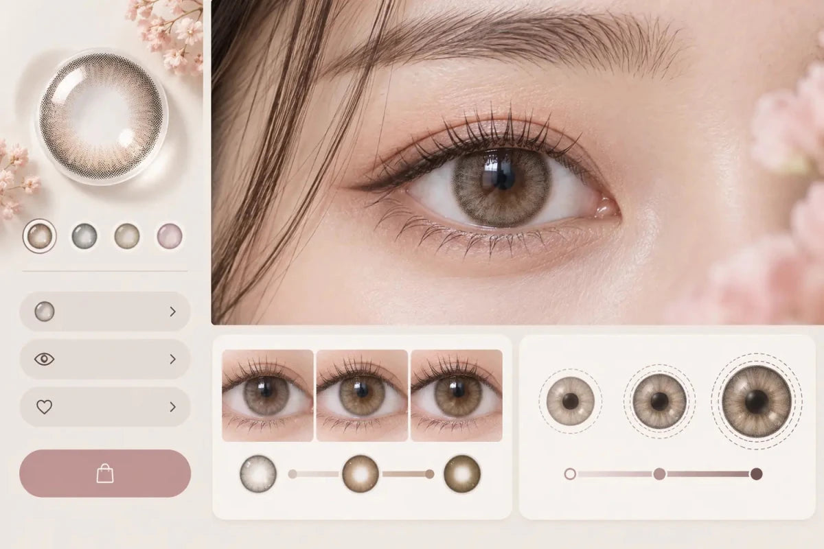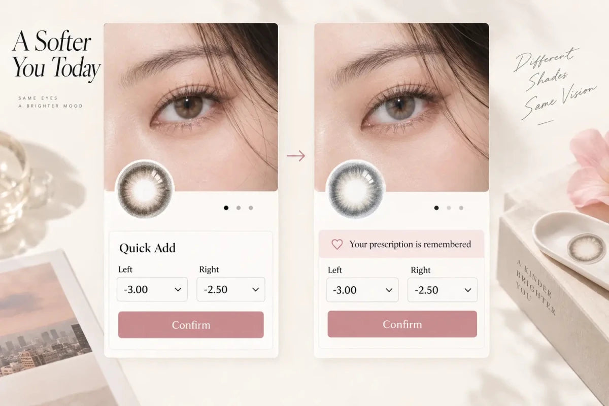

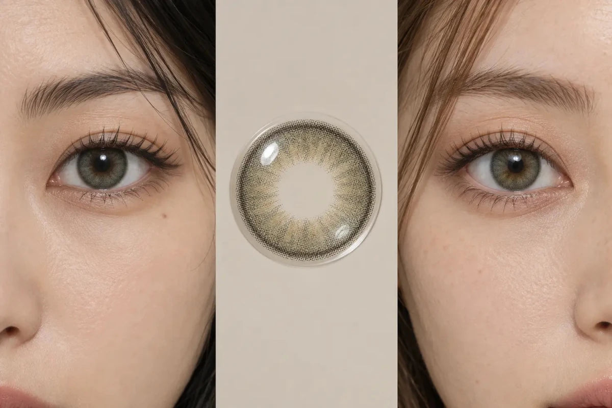
Label dark-eye and light-eye colored-contact results by the model’s starting iris group, lighting and image type—not as guaranteed before-and-after outcomes. A useful caption says what is known, such as “Shown on deep brown eyes in indirect daylight,” while a short qualifier explains that natural iris pattern, pupil size, camera processing and screens can change the appearance.

Use a Minimum Three-Part Photo Label
Every on-eye image should answer three questions where the information is available: What was the starting iris group? What lighting was used? What kind of image is this? A concise format is:
Starting eyes: deep brown · Light: indirect daylight · View: eye close-up
For a lighter-eye image, use the same order: Starting eyes: light brown · Light: indirect daylight · View: face-level. Keeping the labels parallel makes comparison faster and prevents one image from appearing more authoritative simply because it has a longer caption.
Use broad, understandable starting-eye groups when exact color data is unavailable: very dark brown, deep brown, medium brown, light brown, or light iris. Do not infer the model’s natural color from a processed final image. If the source information is not known, say “Starting eye color not provided” rather than guessing.
Separate Known Image Facts From Expected Results
| Information | Good label | Why it helps |
|---|---|---|
| Starting iris | Shown on deep brown eyes | Gives shoppers a relevant comparison point |
| Lighting | Indirect daylight / indoor light | Explains why brightness may change between images |
| View type | Pattern macro / eye close-up / face-level | Clarifies whether the image shows detail or normal-distance balance |
| Variation | Results vary by iris, pupil, lighting and display | Prevents the reference image from becoming a promise |
A product page can accurately describe the lens pattern—such as a soft ring, warm center or high-contrast gray—without stating that every dark eye will reach one final shade. Product facts and expected appearance should remain visually distinct.
Give Each Photo Type One Clear Job
Lens-pattern macro
Shows the print itself: pigment placement, transparent zones, inner gradient and outer ring. It is not evidence of how opaque the lens will look on every iris.
Eye close-up
Shows the blend around the pupil and the visible edge on one wearer. It is most useful when the starting-eye group and lighting are labeled.
Face-level image
Shows apparent size and overall styling balance at a more normal viewing distance. It should not be replaced by a heavily cropped macro when the buying question is whether the lens looks natural.
When comparing dark and light starting eyes, use matched framing and similar exposure whenever possible. A bright, tightly cropped light-eye image next to a dim face-level dark-eye image creates a misleading comparison even if both photographs are genuine.
Avoid Outcome Language That Turns a Reference Into a Promise
- Avoid “will look exactly like this on dark eyes.”
- Avoid “guaranteed opaque” or “guaranteed natural.”
- Avoid labeling a result “true color” without defining the lighting and source.
- Avoid “before/after” when the images are different people, lighting or exposure.
- Avoid naming an unverified natural iris color from the final wearing photo.
Better language describes the observed image: “The gray remains visible on the pictured deep-brown iris in indirect daylight.” The sentence reports the reference without claiming that every shopper will see the same intensity.
Keep the Product-Page UI Compact
Place the starting-eye and lighting label directly under each relevant image, not in a distant disclaimer. On mobile, use one short caption line with an optional information trigger. On desktop, use consistent chips or a two-line caption aligned to the image edge. Do not spread a few links across the full screen or create tall empty columns.
Near the gallery, include one concise shared qualifier. Keep the fuller explanation in the image-guide or Product Details accordion so the buying controls remain visible. The result is transparent without turning the page into a long warning.
Recommended Caption Formula
[Starting iris group] · [Lighting] · [View type]. Reference image; appearance varies with natural iris pattern, pupil size, camera processing and display.
Use only the fields that are actually known. Consistency is more valuable than adding decorative adjectives, and uncertainty should be stated rather than filled with assumptions.
Frequently Asked Questions
Should dark-eye photos be labeled “before and after”?
Only when the images genuinely show the same person under comparable conditions. Otherwise, label the starting-eye group and the wearing result as references.
Can a store call one photo the lens’s true color?
That wording is usually too absolute because lighting, camera settings and screens alter the displayed color. State the lighting and view instead.
What if the model’s starting iris color is unknown?
Use “Starting eye color not provided.” Do not infer it from an edited final image.
Are dark-eye and light-eye labels enough to predict my result?
No. They improve comparison, but individual iris pattern, pupil size and viewing conditions still matter.
Which lighting label is most useful?
Plain descriptions such as indirect daylight, bright daylight or indoor ambient light are easier to interpret than promotional phrases.
Where should the variation qualifier appear?
Place a short version next to the gallery captions and a fuller explanation in a compact image-guide or details section.
Editorial note: Image labels should report known conditions and preserve uncertainty. They should not convert one model image into a guaranteed outcome for another wearer.