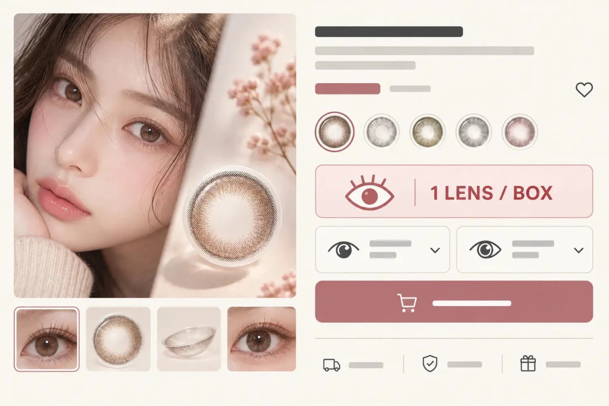


A colored-contact product page should show “Daily” or “Monthly” beside the product name and price, then repeat the replacement schedule next to the box quantity before Add to Cart. Shoppers should not need to open Specifications or read a long description to discover whether a lens is single-use or reusable. The fastest layout answers replacement, lenses per box and estimated supply as one compact decision.
In this guide

The product page should answer the format in five seconds
The replacement schedule is not a secondary technical detail. It changes handling, package math, reorder timing and the meaning of the displayed price. Place a short, high-contrast badge—such as Daily or Monthly—in the first information group with the product name, current price and rating.
Use words rather than color alone. A pink badge for monthly and a beige badge for daily may look attractive, but color does not tell every shopper what the label means. Keep the wording consistent across collection cards, Quick Add, the product page and cart so the customer never has to reinterpret the product.
Replacement schedule and pack count belong together
“Daily” describes how an individual lens is used. “10p” or “30p” describes how many individual lenses are in the box. “Monthly” describes a replacement schedule, while “1 piece / box” or “2 pieces / box” describes the selling unit. Showing only one of these facts creates avoidable quantity errors.
| Visible field | Question it answers | Best position |
|---|---|---|
| Daily or Monthly badge | What replacement format is this? | Beside name and price |
| Lenses per box | What am I buying? | Same summary row |
| Estimated two-eye supply | How long might this quantity cover? | Near quantity selector |
| Right/left configuration | Which eye does each box serve? | Above Add to Cart |
Supply estimates must be labeled as examples and calculated from the exact pack. Different prescriptions in the two eyes can require separate boxes. A promotion also does not automatically assign the free box to the other eye, so the selected configuration must remain visible.
Keep Daily and Monthly version differences visible
Products that share a series or shade name can still be separate versions. Do not use a small dropdown labeled only with pack counts when the underlying replacement schedule changes. A shopper comparing Daily and Monthly should see the version name, pack count, price and any differing specifications without leaving the main purchase area.
A compact two-option selector works well when both versions genuinely belong together. Each option can show:
- replacement schedule in plain language;
- individual lenses per box;
- current price and promotion;
- the exact version selected;
- a link to the full specifications when they differ.
Do not imply that Daily and Monthly versions have identical material, diameter, graphic diameter, power range or print. If a page uses shared images, disclose which version is shown instead of letting the shopper assume every visual and specification is interchangeable.
Mobile needs the same information priority
On mobile, place the schedule and pack count above prescription selectors and the Add to Cart button. Do not hide them behind an accordion that starts below a long image gallery. A sticky purchase bar should repeat the exact version or provide enough context that “Add” cannot be mistaken for a different format.
Use a single column for narrow screens, but keep closely related facts on one compact line when they remain readable: Daily · 10 lenses / box or Monthly · 2 lenses / box. Avoid large vertical gaps between the label and its value. Touch targets can be generous without turning every fact into a full-width card.
When Quick Add opens, preserve the same terminology and show the selected schedule before the customer confirms. If the same shade has several versions, the Quick Add title should include the version rather than relying on a thumbnail.
A practical product-page checklist
- Can a shopper identify Daily or Monthly without scrolling?
- Is the individual lens count visible beside the schedule?
- Does the price clearly apply to the displayed box quantity?
- Are Daily and Monthly treated as distinct versions when specifications differ?
- Does Quick Add repeat the same version label?
- Does the cart line preserve schedule, pack count and selected eye configuration?
- Are expandable specifications available without carrying the only schedule label?
- On mobile, is all decision-critical information visible before Add to Cart?
For customers, the same checklist becomes a fast buying order: identify the format, count the lenses, calculate each eye’s quantity, confirm the exact prescribed product and selections, and only then add the item to the cart.
Related categories
Compare formats through Daily Contacts, Monthly Contacts and Colored Contacts. Keep these choices grouped so the next click is nearby and the page does not create a long, scattered link list.
Questions and answers
Should Daily or Monthly appear in the product title?
Yes when it distinguishes the exact version. It should also appear as a consistent visible badge so shoppers can scan the purchase area quickly.
Is “10p” enough to explain a daily box?
No. Show “Daily” and explain that 10p means ten individual lenses, not ten pairs.
Can replacement schedule stay only in Specifications?
No. Specifications can repeat it, but the schedule belongs in the main purchase summary because it changes the buying decision.
Should a mobile sticky bar repeat the version?
Yes. The shopper should know which exact format will be added without scrolling back to the title.
Can Daily and Monthly share one selector?
They can when each option is unmistakably labeled and all relevant specification, image and price differences remain clear.
What should the cart preserve?
The exact product version, replacement schedule, pack count, selected prescription configuration and quantity should remain readable before checkout.
Reviewed September 14, 2026 by the KPOP2 Editorial Team. This article is an ecommerce information-design guide. Product-specific schedules, specifications and box contents must be confirmed on the current product page. Generated artwork is labeled as an AI editorial illustration.