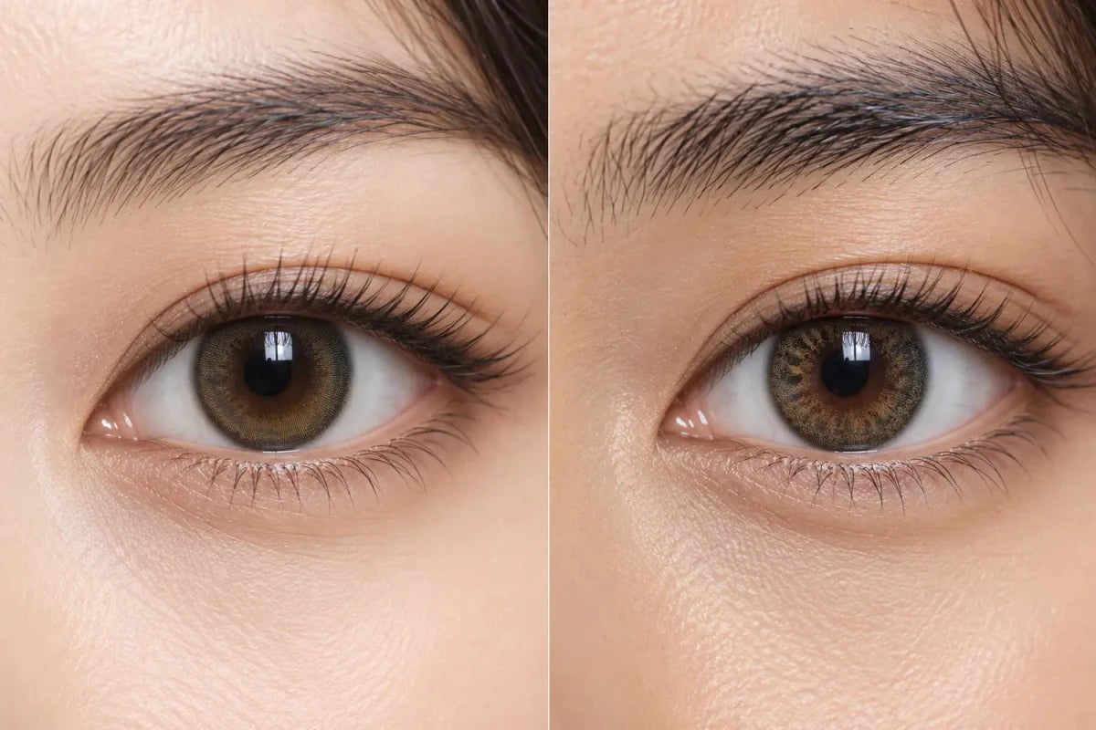

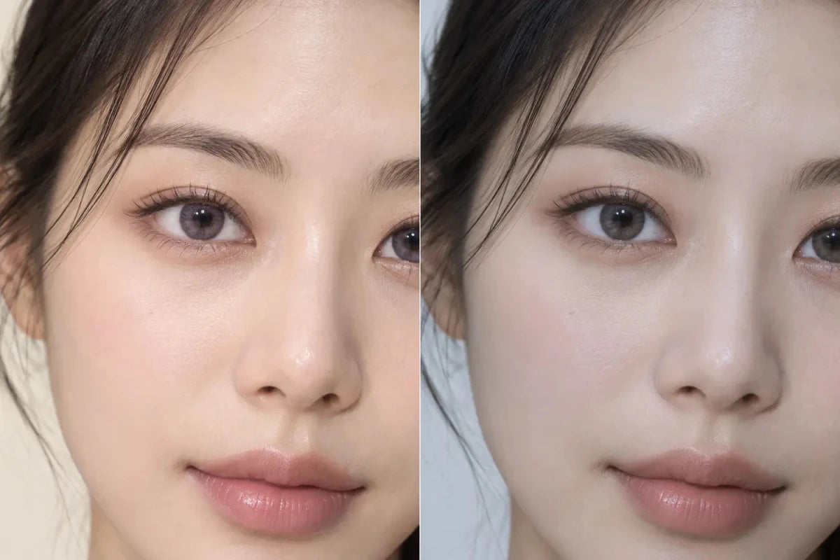
Violet colored contacts can look gray on deep brown eyes when the violet pigment is muted, blue-leaning or translucent and blends with the dark natural iris. Cooler lighting, a gray outer ring and low color saturation can strengthen the smoky-gray impression. To find a visibly violet result, compare the bare-lens print, the model’s starting eye color and photos in neutral daylight as well as indoor light.
In this guide

Why violet and dark brown can blend toward gray
Many wearable violet contacts are not printed as a fully saturated purple layer. They combine small violet, blue, gray or brown dots with transparent spaces so the natural iris remains part of the design. On a deep brown eye, that dark base lowers the brightness of the added color. The final impression can become charcoal violet, smoky taupe or gray instead of obvious purple.
This is not necessarily a product failure. A gray-violet result may be exactly what a shopper wants for a quiet cool-toned change. The problem occurs when the product name creates an expectation of a clear lavender or plum effect that the photographs do not support on dark eyes.
Undertone and saturation matter more than the word “violet”
Violet is a broad color family. A blue-violet print often shifts toward slate or cool gray when mixed visually with a dark brown iris. A red-violet or plum print may preserve more purple warmth. A dusty mauve design can move toward gray-brown, especially if the lens also uses a soft brown center.
- Blue-violet: often reads cool, smoky or gray on a dark base.
- Red-violet or plum: more likely to retain a berry-purple impression.
- Lavender: can look brighter when pigment is sufficiently visible, but a sheer print may become silvery.
- Mauve-brown: usually produces a subtle cool brown or gray-taupe effect rather than a vivid purple.
Use these as comparison directions, not guarantees. The print’s opacity, dot size, clear spaces and placement can matter as much as its apparent hue in the product swatch.
Lighting changes whether the eye reads violet or gray
Neutral daylight usually makes small differences between violet, blue and gray easier to see. Warm indoor light can suppress the cool pigment and let the natural brown dominate. Cooler light may reduce brown warmth but also make a desaturated violet look more neutral gray.
| Viewing condition | Likely visual shift | Best use |
|---|---|---|
| Neutral window light | Reveals whether the print contains a real violet undertone | Primary color comparison |
| Warm indoor light | Can push violet toward brown, mauve or taupe | Everyday indoor expectation |
| Cool indoor light | Can make a muted blue-violet appear smoky gray | Understanding the gray shift |
| Bright flash or studio light | May exaggerate brightness and pigment visibility | Print detail, not the only purchase reference |
Camera white balance and editing add another variable. Give more weight to a set of consistent images than to one highly processed close-up. A full-face photo is also useful because subtle violet may disappear at normal conversation distance even when it is visible in a macro crop.
Check the outer ring and center color
A charcoal or gray outer ring can dominate the first impression, especially when it is wide or sharply defined. From farther away, the eye may be categorized as gray before the inner violet dots are noticed. A soft violet edge or no-black-rim design can let the interior hue carry more of the result, but ring style alone does not determine visibility.
The center is equally important. A warm brown or gold center can help the lens blend naturally with a dark iris, yet it may reduce the amount of violet the eye appears to contain. A cooler gray center can make the result more uniform but more gray. Look at the relative area of each color zone rather than focusing on the shade name.
Choose by the result you want
Start by deciding which of these outcomes would count as success:
- Smoky and subtle: muted violet, generous blending and a soft gray or brown edge can suit this goal.
- Clearly violet but wearable: look for visible plum or red-violet pigment, a relevant dark-eye model and a full-face photo where the color still reads purple.
- Bright lavender statement: require stronger evidence in both the bare-lens print and dark-eye photos; a light-eye campaign image is not enough.
Then check the product in this order: exact photographed version, starting eye color, neutral-light close-up, indoor view, full-face image, print density, center blend and outer ring. Only after narrowing the appearance should you confirm the exact prescribed model, available prescription options, replacement schedule and box contents.
If a product page lacks a dark-eye image, compare another violet lens only to understand color direction. Do not treat a different series or a lighter starting iris as proof of the result. A gray outcome may be more likely when the print is sheer and blue-leaning, but the actual appearance remains individual.
Related categories
Compare the neighboring color families through Violet Contacts, Gray Contacts and Colored Contacts for Dark Eyes. Keeping these links together makes it easier to compare undertones without creating a long, scattered navigation block.
Questions and answers
Why do my violet contacts look gray only indoors?
Indoor color temperature and lower brightness can reduce the visible purple undertone. A desaturated blue-violet print may then read as smoky gray over a dark iris.
Is plum more visible than blue-violet on dark eyes?
A red-violet or plum print may retain more purple warmth, but pigment density, clear spaces and the natural iris still affect the result.
Does a gray limbal ring make violet contacts look gray?
It can strengthen the gray first impression, especially from normal distance. The inner pigment and center color must be considered too.
Will a larger graphic diameter make violet more obvious?
Not automatically. It changes printed area, while saturation, opacity, pattern and contrast determine how strongly the hue reads.
Can makeup make violet contacts look more purple?
Plum or mauve makeup can emphasize the color relationship, but it can also make the lens appear more violet in a photo than it does by itself. Check a neutral-makeup image when available.
Can a light-eye model predict the result on deep brown eyes?
No. It can show print placement, but translucent violet usually appears brighter on a lighter natural iris. Look for a starting-eye color closer to yours.
Reviewed September 14, 2026 by the KPOP2 Editorial Team. This guide offers visual comparison criteria, not a guaranteed color result or a prescription recommendation. Generated artwork is labeled as an AI editorial illustration.