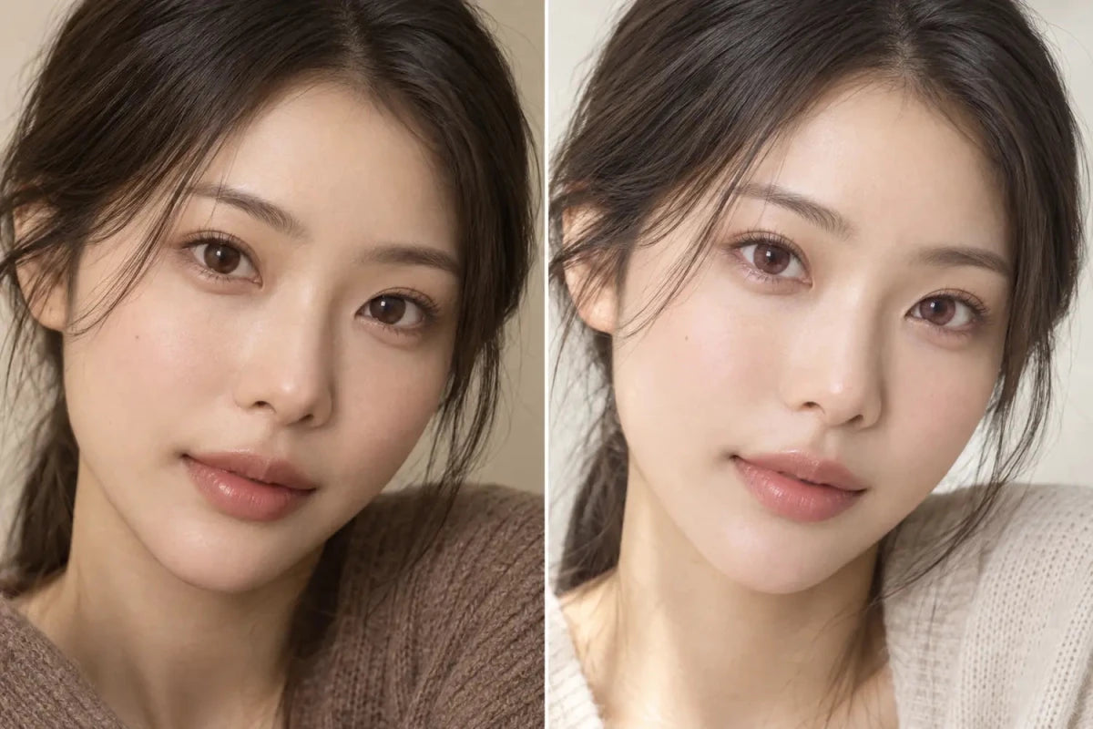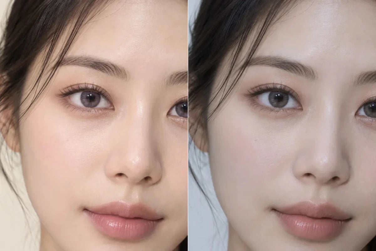

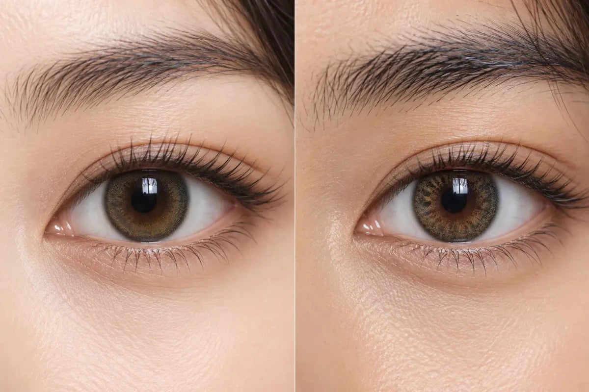
Your natural iris pattern can change how the same colored contact looks on dark eyes because translucent spaces in the print allow the underlying color and texture to remain visible. A fine radial iris may make a blended lens look smoother, while a stronger mottled pattern may remain visible through the center and add texture. Product photos are therefore references, not exact previews of another person’s result.
In this guide

Three visual layers create the final result
A colored-contact photo is not simply the printed lens color placed on a blank background. The visible effect comes from the natural iris, the lens print and the lighting. Camera exposure and editing then influence the photograph you see online.
- Natural iris: the base color, radial lines, darker spots and contrast around the pupil.
- Lens print: the opacity, dot pattern, color zones, clear spaces and outer-ring design.
- Light: the brightness, direction and color temperature that reveal or suppress both layers.
On deep brown eyes, a translucent lens often blends rather than replaces. If the printed dots leave generous clear space, the natural brown and its pattern can remain part of the result. A denser print may create a more even color field, although no single design detail guarantees coverage or a particular appearance.
Radial and mottled iris patterns can blend differently
Some irises show fine spokes that radiate from the pupil. Others have stronger crypt-like shapes, darker patches or a more mottled transition between the center and outer iris. These are ordinary visual differences, but they matter when a cosmetic lens is intentionally semi-transparent.
A lens with fine radial printing may visually align with a naturally radial iris and appear smoothly integrated. The same lens over a more varied iris may show extra depth or irregularity through its open spaces. That does not mean one result is better. It means “natural” can describe different outcomes: a soft uniform blend for one shopper and visible layered texture for another.
Do not try to diagnose an iris pattern from a product photo. The useful shopping question is simpler: does your eye look mostly uniform or visibly textured in clear, neutral light? Then look for model images with a reasonably similar starting pattern and depth of brown.
The clear pupil zone affects visible contrast
Colored contacts keep the central visual zone clear, but printed color may begin close to or farther from that opening depending on the design. The boundary between the clear center and printed area can reveal the natural iris in different ways.
On a dark iris, a lighter printed center can create a brighter halo around the pupil. A softer gradient may allow the natural brown to transition gradually into the added shade. If the natural iris has a distinct dark central pattern, that pattern may stay visible and make the center appear more contrasted than it does on the model.
Pupil size also changes with lighting, so a close-up taken under bright light is not a universal preview. Compare neutral daylight and typical indoor images when the product page provides both. Look for a balanced transition in the whole eye rather than judging a single magnified frame.
How to read product images more accurately
| Image clue | Useful conclusion | Conclusion to avoid |
|---|---|---|
| Bare-lens image | Shows print zones, open spaces and ring structure | Exact color on your eye |
| Close-up on a similar dark iris | Shows a plausible blend and pupil transition | Guaranteed opacity or coverage |
| Full-face photo | Shows how strong the design reads at normal distance | Precise iris detail |
| Multiple lighting views | Shows a useful range of color behavior | Every environment you will encounter |
If the listing uses the same model image for multiple product versions, confirm which exact lens was photographed. A daily and monthly version with a related name may have different specifications or print details. Use the exact product page for the final decision.
A practical comparison order for dark eyes
- Define the goal. Decide whether you want a softly blended change, more visible texture or a cleaner, more uniform color field.
- Inspect your starting eye. In neutral light, note the depth of brown, visible radial lines, darker central area and outer-edge definition.
- Read the lens print. Compare open spaces, center gradient, pigment density and outer ring.
- Find the closest model reference. Give more weight to an image with a similar starting-eye depth and pattern.
- Check normal distance. A full-face image prevents a close-up texture from seeming stronger than it will in everyday viewing.
- Confirm the exact product. After narrowing the look, verify the prescribed model, available options, replacement schedule and box contents.
Change one visual variable at a time when comparing candidates. For example, compare two hazel lenses with different pigment density before switching both color and ring style. A controlled comparison makes it easier to identify whether the natural iris pattern, the lens print or the color family is driving the difference you notice.
Related categories
Continue the comparison with Colored Contacts for Dark Eyes, Hazel Contacts and No Black Rim Contacts. These links are a compact visual-shopping path; confirm each exact product’s current options and specifications before ordering.
Questions and answers
Can two people with the same dark-brown eye color get different results?
Yes. Natural iris texture, pupil appearance, lighting and the way a translucent print overlaps the eye can change the visible blend.
Does a dense print always hide the natural iris pattern?
No. Density is only one factor. Clear spaces, center design, pigment placement and contrast also affect how much natural texture remains visible.
Why does the center look more contrasted on my eyes?
Your natural central iris pattern may remain visible through the clear pupil zone or a soft inner gradient, creating more contrast than the model image shows.
Is a smooth-looking lens more natural than a textured one?
Not universally. Some shoppers prefer a quiet, uniform blend; others prefer visible radial detail. Judge the result against your intended look and normal viewing distance.
Can a bare-lens photo predict the final pattern?
It can reveal print structure and open spaces, but it cannot show how those areas will overlap your natural iris.
Should I choose from iris pattern before prescription options?
No. Appearance comparison is useful only among appropriate candidates. Confirm the exact prescribed model and required options before ordering.
Reviewed September 14, 2026 by the KPOP2 Editorial Team. This visual guide does not guarantee an individual result or provide a prescription recommendation. Generated artwork is labeled as an AI editorial illustration.