
On mobile, contact lens specifications should be grouped into compact labeled rows: product identity, wear schedule, package count, physical specifications and prescription range. Avoid a single wrapped paragraph and nested scrolling panels. This guide keeps the visual decision separate from the product, prescription and quantity checks that determine whether an order is appropriate.
In this guide

Direct answer
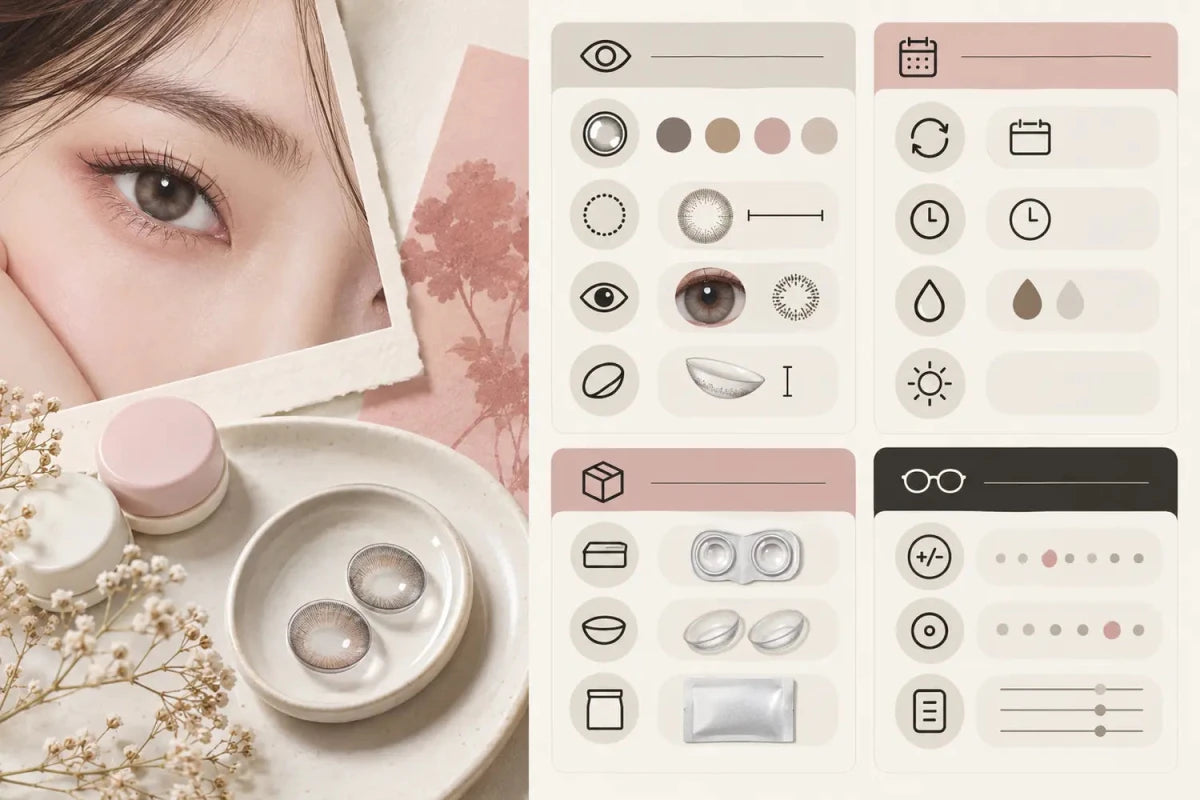
On mobile, contact lens specifications should be grouped into compact labeled rows: product identity, wear schedule, package count, physical specifications and prescription range. Avoid a single wrapped paragraph and nested scrolling panels.
The useful sequence is eligibility first, evidence second and checkout confirmation last. That prevents an attractive image, sale label or broad range summary from carrying more weight than the exact item and selections.
Evidence to compare
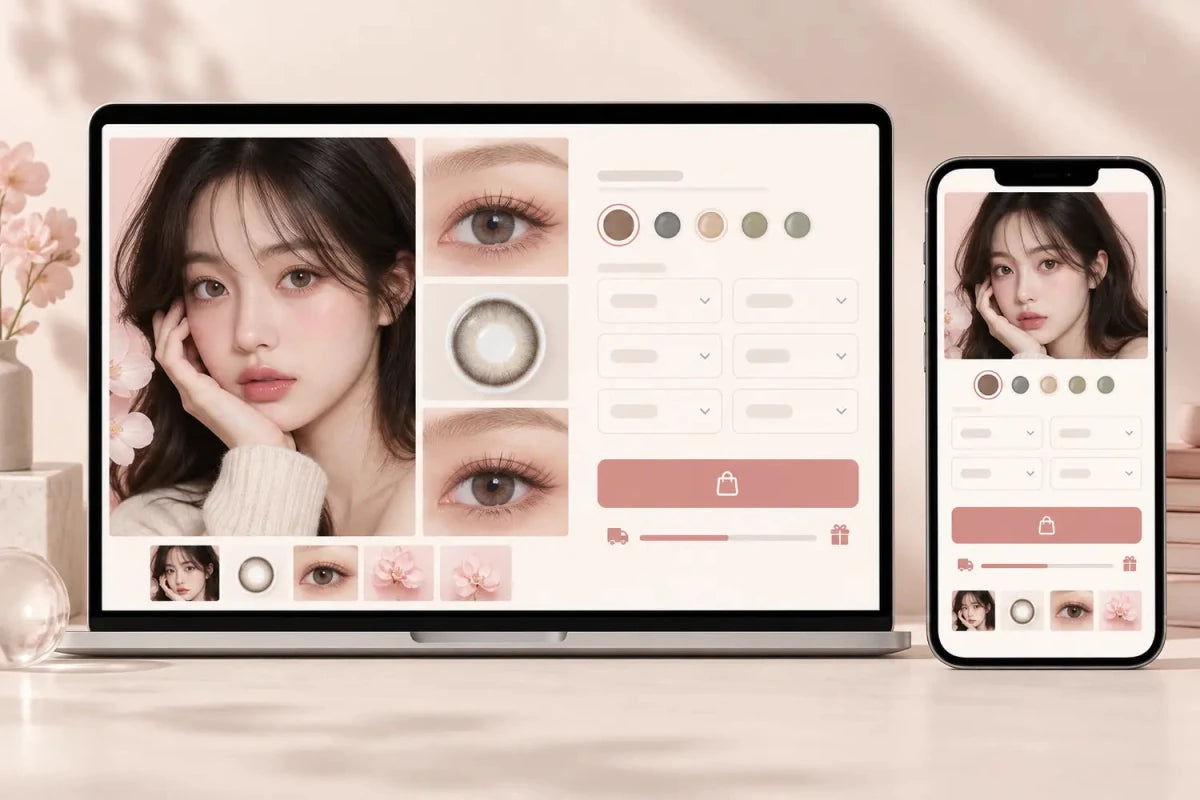
Put the facts needed before purchase near the selector: replacement schedule, pieces per box, power coverage, graphic diameter and preparation status. Secondary technical details can follow in an accessible accordion.
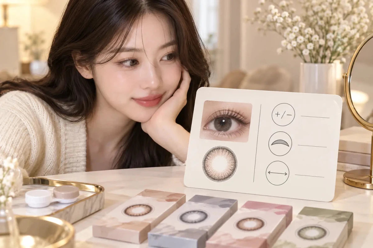
Keep every comparison tied to the exact brand, model, color and replacement schedule. When appearance is involved, compare a close-up with a full-face view and note the starting eye color and lighting. When prescription or stock is involved, verify the live option combination for each eye.
| Checkpoint | Useful evidence | Do not assume |
|---|---|---|
| Exact product | Brand, model, color and schedule | A related name is identical |
| Order eligibility | Complete live options for each eye | A headline range proves availability |
| Appearance | Comparable on-eye images | One edited photo predicts every result |
| Final order | Cart lines, quantities and timing | Remembered values are automatically correct |
A practical workflow
Use a two-column label/value grid when space allows and one column on narrow screens. Preserve tap targets, visible focus, readable minus signs and short lines; long ranges can wrap within a full-width row.
- Open the exact product page rather than relying on a collection card.
- Confirm product identity, schedule and pieces per box.
- Check every required option separately for the left and right eye.
- Compare only the candidates that remain valid.
- Read the completed cart before payment.
If the interface remembers previous selections, treat them as a starting point and confirm them. A helpful shortcut should reduce repeated typing without concealing a changed model, unavailable field or different box configuration.
Mistakes to avoid
Do not underline every value unless it is actually a link. Duplicate borders, clipped values and independent inner scrollbars make comparison harder and should be removed.
Store content can explain what a product page, selector or package says. It should not diagnose symptoms, choose a lens for an eye or invent equivalence between products. If anything about the prescription or fitted model is unclear, pause and ask the eye-care professional.
Related categories
Continue with Colored Contacts, Toric Contacts, Lens Journal. These links are grouped compactly so the next comparison is close at hand on desktop and wraps naturally on mobile.
Questions and answers
What is the direct answer to “How Contact Lens Specifications Should Be Grouped on Mobile”?
On mobile, contact lens specifications should be grouped into compact labeled rows: product identity, wear schedule, package count, physical specifications and prescription range. Avoid a single wrapped paragraph and nested scrolling panels.
What should I check first?
Put the facts needed before purchase near the selector: replacement schedule, pieces per box, power coverage, graphic diameter and preparation status. Secondary technical details can follow in an accessible accordion.
What is the simplest comparison method?
Use a two-column label/value grid when space allows and one column on narrow screens. Preserve tap targets, visible focus, readable minus signs and short lines; long ranges can wrap within a full-width row.
What mistake should I avoid?
Do not underline every value unless it is actually a link. Duplicate borders, clipped values and independent inner scrollbars make comparison harder and should be removed.
Can a product photo or menu replace professional fitting advice?
No. Product information helps you compare and place an order, but it does not prescribe, fit, round, convert or substitute contact lens specifications.
Where should I continue the comparison?
Use Colored Contacts, Toric Contacts, Lens Journal for a focused shortlist, then verify the exact product page before purchase.
Reviewed September 14, 2026 by the KPOP2 Editorial Team. This guide explains product comparison and ordering information; it does not provide a prescription or substitute one contact lens for another. The image is an AI editorial illustration, not a wear test.