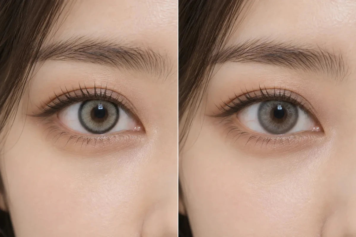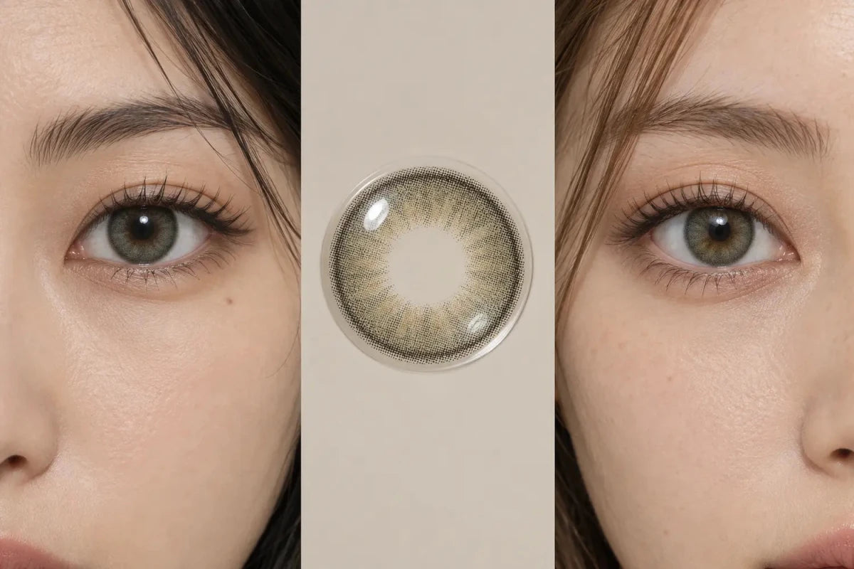

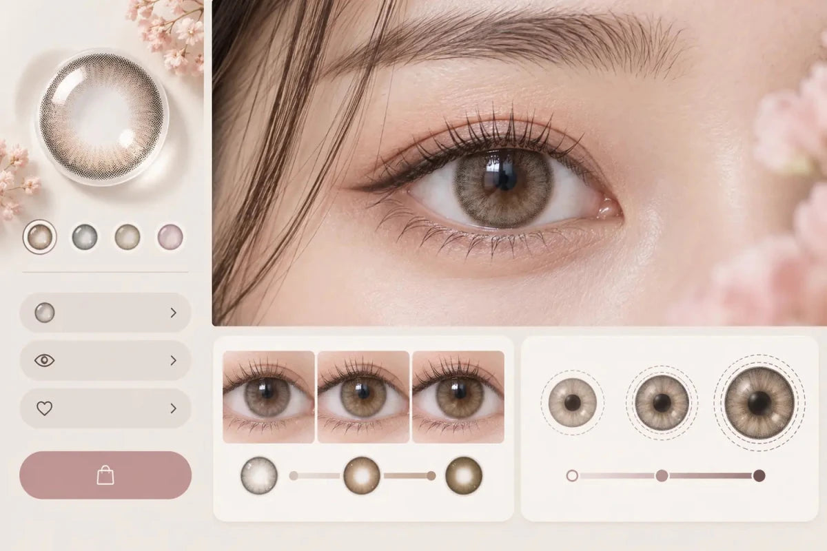
A colored-contact product page should explain visible color change and apparent enlargement as two separate attributes. Show a compact “Color visibility” guide based on the pattern and comparable eye photos, then show graphic diameter and edge definition under a separate “Apparent size” guide. One combined “boldness” score hides the difference and can send shoppers toward the wrong lens.

Color Visibility and Enlargement Answer Different Questions
Color visibility asks how clearly the printed shade may be seen over the wearer’s natural iris. It depends on opacity, pigment placement, undertone, pupil-zone blend, natural iris color and lighting. Apparent enlargement asks how much the printed design emphasizes or extends the visible iris boundary. It depends more on graphic diameter, outer-ring density and edge design.
A lens can be visible without looking large: a medium-opacity gray-brown pattern with a soft edge may change a dark iris while staying near its natural scale. A lens can also look larger without changing the center color strongly: a wide, dark limbal ring can define the boundary while leaving much of the natural iris visible.
Place Both Answers Near the Main Decision Area
Shoppers should not have to open the specifications accordion or scroll through long SEO copy to learn these differences. On desktop, place two compact labels or cards near the shade, rating and price area—before power selection and Add to Cart. On mobile, stack them as two concise rows directly below the main visual facts.
| Product-page element | Recommended information | Avoid |
|---|---|---|
| Color visibility | Low / soft / clear comparison with starting-eye qualifier | “Guaranteed on dark eyes” |
| Apparent size | Natural / defined / enlarging direction plus graphic diameter | Using overall lens diameter as the visual-size score |
| Pattern evidence | Lens macro, straight-on eye and face-level view | One heavily edited model photo |
| Specifications | Exact graphic diameter and overall diameter with distinct labels | Duplicated or unexplained diameter values |
Use Descriptive Labels, Not False Precision
A product page rarely has controlled evidence for a numerical “visibility score.” A three-step descriptive guide is easier to understand and more honest:
- Color visibility: subtle blend, visible shift, or high contrast.
- Apparent size: close to natural, softly defined, or enlarging.
Each label should be supported by the actual print and gallery, and should state that results vary by starting iris color and lighting. “High contrast” describes a styling direction; it should not imply opacity will produce an identical result on every eye.
Graphic diameter remains a factual specification and should appear alongside the apparent-size description. Overall diameter should stay in Specifications because it is not the same as printed graphic size.
Match Each Claim to a Useful Image
Lens-pattern macro
This reveals print density, transparent areas, inner gradient and ring structure. It helps explain why two lenses with the same shade name can behave differently.
Straight-on eye close-up
This shows the center transition and whether the outer edge is softly blended or strongly defined. Label the model’s starting eye color when that information is known.
Face-level image
This is the strongest check for apparent scale. A macro can make every ring look dramatic; the whole face shows whether the lens remains balanced at a normal viewing distance.
Indoor and daylight images are useful only when their context is clear. Exposure, white balance, sharpening and screens can change the perceived color, so galleries should guide comparison rather than promise a fixed outcome.
Keep the Mobile Layout Compact and Tappable
On a narrow screen, avoid two long horizontal meters or a large diagram that pushes power options and Add to Cart far down the page. Use two short, full-width rows with a clear label, a one-line result and a small explanation trigger. Keep touch targets large enough to open, but place related items close together so the customer does not need to scan empty space.
A useful sequence is: product name → price and rating → replacement/offer badges → color visibility → apparent size and graphic diameter → prescription options → Add to Cart. The fuller explanation can sit in a compact accordion below the buying controls.
Editorial Recommendation
Do not reduce color and size to one “natural-to-bold” scale. Instead, let shoppers answer two questions: “Will the color show on eyes like mine?” and “Will the printed edge make my iris appear larger?” This structure improves comprehension and makes product comparisons more meaningful without adding a long block of page content.
Frequently Asked Questions
Can a small graphic diameter still show strong color?
Yes. A compact print with higher opacity or stronger contrast can remain very visible without creating a wide outline.
Can a large graphic diameter look natural?
It can look softer when the edge is diffused, but the face-level photo is needed to judge apparent scale on the model.
Should product pages use one boldness score?
No. One score mixes color visibility, edge definition and apparent size, which can mislead shoppers with different goals.
Is overall diameter the same as graphic diameter?
No. Overall diameter describes the full lens, while graphic diameter describes the printed design area.
Can a product page guarantee visibility on dark eyes?
No. It can show comparable photos and explain the pattern, but natural iris color, lighting and image processing affect the result.
Where should the detailed explanation appear?
Keep concise labels near the buying controls, then place definitions and comparison guidance in a compact accordion below them.
Editorial note: These labels describe comparative visual design. Product pages should retain exact specifications and avoid guaranteeing a uniform result across different eyes or lighting.