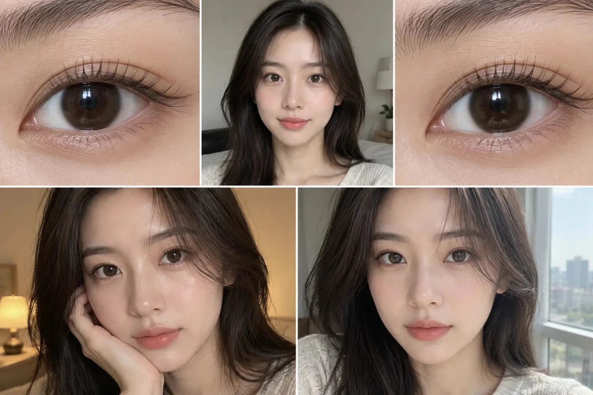


Blue-gray contacts emphasize a cool blue cast, while slate-gray designs usually appear deeper and more neutral. The clearer choice depends on starting iris color, print density, edge design and lighting rather than the label alone. The most reliable decision keeps appearance, product identity, order eligibility and timing as separate checks until the final cart review.
In this guide
Direct answer
Blue-gray contacts emphasize a cool blue cast, while slate-gray designs usually appear deeper and more neutral. The clearer choice depends on starting iris color, print density, edge design and lighting rather than the label alone.
Evidence worth comparing
Look for an uncovered-eye reference and matched indoor and daylight photos. Blue-gray can become brighter near a window, while slate-gray often keeps a smoky outline but may read almost charcoal on very dark eyes.
| Checkpoint | Useful evidence | Avoid assuming |
|---|---|---|
| Identity | Full model, shade and schedule | A related name is identical |
| Appearance | Comparable light and starting iris | One edited image predicts every result |
| Eligibility | Complete live options for each eye | A headline range proves availability |
| Order | Cart lines, quantities and dated status | A label alone proves the final outcome |
A practical comparison method
Hold graphic diameter and ring strength as constant as possible, then compare color temperature and center blending before comparing apparent enlargement.
- Open the exact product or support page instead of relying on a search snippet.
- Record product identity, version, package unit and the condition being compared.
- Change one important variable at a time and remove unlike evidence.
- Confirm the complete left- and right-eye requirements without rounding or substitution.
- Read the final cart, preparation note and delivery information before payment.
Turn the evidence into a decision
Do not compare a ringless blue-gray lens with a dense-ring slate design and conclude that color alone caused the contrast difference.
Store content can explain product fields and ordering steps, but it does not prescribe, fit, round, convert or substitute a contact lens. Remove lenses and seek appropriate professional advice if pain, marked redness, discharge, light sensitivity or persistent blur occurs.
Related KPOP2 guides
Related categories
For the next cool-tone comparison, browse Gray Contacts, Blue Contacts, Daily Contacts. Treat a collection as a discovery route, then verify the exact model, replacement schedule, package count, measurements and available prescription selections on the product page.
Questions and answers
What is the direct answer?
Blue-gray contacts emphasize a cool blue cast, while slate-gray designs usually appear deeper and more neutral. The clearer choice depends on starting iris color, print density, edge design and lighting rather than the label alone.
What evidence should I compare?
Look for an uncovered-eye reference and matched indoor and daylight photos. Blue-gray can become brighter near a window, while slate-gray often keeps a smoky outline but may read almost charcoal on very dark eyes.
What is the simplest method?
Hold graphic diameter and ring strength as constant as possible, then compare color temperature and center blending before comparing apparent enlargement.
What mistake should I avoid?
Do not compare a ringless blue-gray lens with a dense-ring slate design and conclude that color alone caused the contrast difference.
Can a photo, review or menu confirm contact lens fit?
No. These sources can explain appearance and ordering context, but only professional guidance and the exact fitted product address individual suitability.
What should I verify before checkout?
Confirm the full brand, model, shade, replacement schedule, pieces per package, complete options for each eye, preparation status and every final cart line.
Reviewed September 14, 2026 by the KPOP2 Editorial Team. This guide explains comparison and ordering information; it does not provide a prescription or substitute one contact lens for another. The image is an editorial illustration, not a wear test.