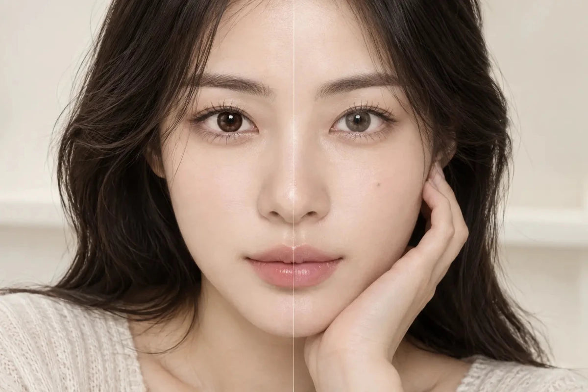


Charcoal gray usually stays more visible and natural on black-brown eyes, while silver gray tends to create a brighter, cooler change—but neither result is guaranteed by the color name alone. The deciding details are the printed pattern, opacity, pupil opening, limbal ring and the light in which you view the lens. Compare those features before treating “charcoal” or “silver” as a promise.

Charcoal Gray or Silver Gray: Which Shows More Clearly?
If “shows clearly” means the iris still looks gray indoors without appearing icy, charcoal is often the safer direction. A charcoal print can add a smoky, cool cast while keeping enough depth to work with a black-brown base. It is especially useful when the desired result is defined rather than pale.
If “shows clearly” means a visibly lighter transformation, silver may have more potential. Silver-gray designs commonly rely on a lighter print, greater contrast or a brighter center. On a very dark iris, however, a translucent silver pattern can disappear more than a denser charcoal pattern. The shade label cannot tell you which construction the designer used.
The best prediction therefore comes from the on-eye images and specifications for the exact lens—not from comparing two color words in isolation. A charcoal lens with a wide transparent center can look subtler than a compact silver design; a finely dotted silver lens can look softer than a high-contrast charcoal ring.
Why the Same Gray Changes on Black-Brown Eyes
A colored contact does not behave like opaque paint placed over the eye. Most cosmetic patterns leave some areas open or semi-transparent so the wearer’s iris participates in the final color. On black-brown eyes, warm brown and near-black tones can deepen a translucent gray, soften blue undertones and reduce the brightness visible in a light-background product photo.
Ambient light adds a second variable. Bright indirect daylight reveals printed dots, lighter zones and the natural iris below them. Warm indoor lighting can make a cool gray appear taupe or smoky brown. Dim light enlarges the pupil, which can expose more of the natural dark center and make the overall effect look deeper. Camera exposure, white balance, makeup and screen settings create additional differences.
This is why one close-up is not enough. The useful evidence is a set: a dark-eye model, a face-level photo, an eye close-up, and ideally more than one lighting condition. A result that looks dramatic under a ring light may be much quieter across a room.
Charcoal Gray vs Silver Gray on Dark Eyes
| Feature | Charcoal gray | Silver gray |
|---|---|---|
| Typical visual direction | Smoky, deep, cool-neutral | Bright, cool, reflective-looking |
| Dark-eye visibility | Often steadier in ordinary indoor light | Can be brighter, but depends strongly on print density |
| Natural-eye integration | Dark base can blend into the design | Contrast may reveal the pattern more clearly |
| Common surprise | Looks almost dark brown in warm light | Looks blue-gray or disappears if too translucent |
| Best evidence | Exact-lens on-eye photos on a similar starting iris, in indoor and daylight views | |
These are useful tendencies, not product guarantees. Manufacturers and retailers do not use a universal definition for charcoal, ash, smoke, silver or pearl gray. Two lenses filed under “silver” may be less alike than one silver and one charcoal design.
How to Read Product Photos Without Overestimating Brightness
Start with the model’s natural eye color
Look for a clearly stated starting color or a bare-eye comparison. If the model begins with medium brown eyes, the image does not directly answer how the lens will behave on a black-brown iris. Use it to study pattern placement, not to predict the exact brightness.
Separate the center, middle and outer edge
The center controls how naturally the lens transitions around the pupil. The middle printed zone carries much of the visible gray. The outer edge determines whether the eye looks softly enlarged, crisply defined or almost unchanged in size. A pale center with a dark ring can appear more dramatic than a uniformly light print.
Compare eye-level and face-level images
A macro image answers whether the print is smooth and where it blends. A face image answers whether another person will notice the gray at conversation distance. If your goal is everyday wear, the face-level image deserves at least equal weight.
Do not use graphic diameter as a brightness score
Graphic diameter describes the approximate printed area, not the opacity, pigment density or lightness. A wider translucent pattern may look softer than a smaller, denser one. Use graphic diameter to think about apparent iris size only after the tone and pattern suit your goal.
A Five-Step Method for Choosing the Better Gray
- Name the result: choose “smoky and believable,” “noticeably cool,” or “clearly lighter.” This is more useful than choosing gray in general.
- Filter by your required prescription: confirm the exact product and power options before spending time on appearance. Never substitute a nearby power or a spherical version for a toric prescription.
- Prioritize similar starting eyes: use black-brown or very dark brown on-eye examples whenever available.
- Check two distances and two lights: look for close-up and face views, then indoor and daylight views.
- Compare one variable at a time: when deciding between two products, keep either ring style, graphic size or brightness similar so you can tell what created the difference.
For a first gray pair on very dark eyes, a mid-depth charcoal or neutral gray with a graduated dot pattern is generally easier to evaluate than an extremely pale design. If you already know you want an editorial, high-contrast result, a denser silver pattern may better match the goal. The exact prescription and professional fit still come first.
Fit and Safety Still Decide Whether the Lens Is Right
Color does not make a contact lens suitable for your eyes. In the United States, decorative contacts require a prescription, including lenses with no vision correction. Buy the exact prescribed parameters from a legitimate source, follow the replacement schedule and care instructions, and do not share lenses. Stop wearing the lens and contact an eye-care professional if you develop pain, marked redness, light sensitivity, discharge or a sudden change in vision.
Frequently Asked Questions
Will charcoal gray always look natural on dark brown eyes?
No. A dense black ring or sharply separated pupil opening can look defined even when the color itself is deep. Check the complete pattern and face-level photos.
Why does silver gray sometimes look blue?
Cool pigments, the warm contrast of a brown iris, daylight and camera white balance can all push a neutral gray toward blue-gray. Verify with several images rather than one studio photo.
Can silver gray disappear on black-brown eyes?
Yes. A light but very translucent pattern may blend into a dark base. Print density and coverage matter more than the word “silver.”
Does a black limbal ring make gray more visible?
It makes the outer boundary more defined, which can increase the impression of contrast. It does not necessarily make the gray pigment itself lighter.
Should I choose the largest graphic diameter?
No. A larger printed area changes apparent size, but it does not guarantee better gray coverage or a more natural fit. Choose by the exact design and prescribed fit.
Can I choose color before checking my prescription options?
It is more efficient to confirm the exact lens type and required power range first. For astigmatism, verify the complete SPH, CYL and AXIS combination for each eye.