

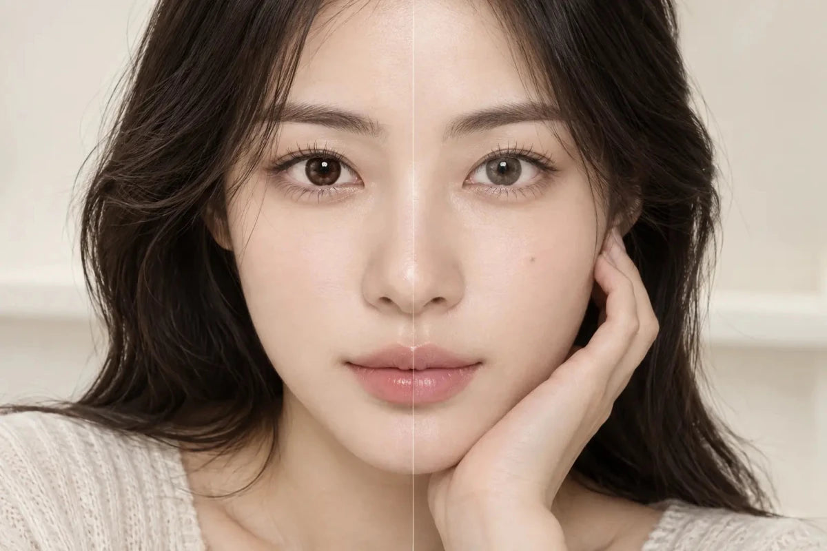
Neutral chocolate, ash brown and muted taupe-brown colored contacts are the most practical starting points when you want brown to stay visible on dark eyes without turning orange. Avoid choosing by “brown” alone. The lens’s undertone, brightness, printed density, center transition and limbal edge determine whether the final result reads as neutral brown, warm amber or orange.

Which Brown Tones Are Least Likely to Look Orange?
Neutral chocolate brown is the clearest first choice when you want an unmistakably brown result. It normally keeps enough depth to remain compatible with a black-brown iris while adding visible definition. Look for a balanced rather than red-toned product image and a gradual dot pattern near the pupil.
Ash brown introduces gray or taupe into the brown. This can reduce the copper effect that some warm lenses produce, especially under indoor lighting. Ash brown may appear quieter than chocolate, so confirm that the printed zone is dense enough to show on eyes similar to yours.
Muted taupe-brown sits between brown and gray. It can be useful when the goal is a cool, softly desaturated change rather than a golden glow. A taupe shade with a hard dark ring may still look dramatic, while a softly feathered edge can look subtle even at a similar graphic diameter.
Deep cocoa and espresso designs are also unlikely to appear orange, but their visibility can be limited on a very dark iris. They are better for added texture or outline than for a clearly lighter color change. The strongest candidate is therefore not simply the coolest name; it is the exact pattern that balances neutral undertone with enough contrast.
Why a Brown Lens Can Turn Amber or Orange
The final color is a blend of the printed lens and the wearer’s natural iris. When a translucent honey, caramel or reddish-brown pattern sits over a warm dark-brown base, the combined result can emphasize gold or copper. That does not mean the lens is defective. It means the visible effect differs from a catalog swatch shown on a pale or digitally simplified background.
Lighting can strengthen the shift. Warm household bulbs add yellow and red to the scene. Golden-hour sunlight can make skin, hair and lenses all appear warmer. A phone’s automatic white balance may then increase saturation or brightness. If every part of a model photo looks golden, do not treat the apparent lens color as a neutral reference.
The pupil transition matters too. A bright yellow-brown inner ring can become the most noticeable part of the design on black-brown eyes. A wide transparent center exposes more natural iris, which may make the boundary between the warm print and dark center appear stronger. Conversely, a fine gradient can integrate the same warm pigment more smoothly.
Finally, shade names are not standardized. “Choco,” “mocha,” “hazel,” “marron,” “beige” and “brown” can describe very different formulas and patterns across brands. Use the name to begin a search, then judge the individual lens.
Brown Tone Comparison for Dark Eyes
| Tone direction | Likely impression on dark eyes | What to inspect |
|---|---|---|
| Neutral chocolate | Clearly brown, balanced and defined | Whether the center transition stays soft |
| Ash brown | Cooler, muted and sometimes gray-brown | Enough print density for dark-eye visibility |
| Taupe brown | Desaturated, softly cool | Whether studio lighting makes it look lighter than daily wear |
| Deep cocoa or espresso | Natural depth with limited lightening | Face-level visibility and edge definition |
| Honey, caramel or amber brown | Brighter and warmer; may read orange | Yellow inner ring, warm lighting and saturation |
| Rose brown or reddish brown | Soft red or pink warmth | Whether the warmth is intentional for your look |
These are decision cues, not guaranteed outcomes. Pattern opacity, your iris, pupil size, makeup and light can move any individual product away from the general tendency in the table.
How to Tell Whether a Product Photo Is Too Warm
Use neutral objects as a reference
White clothing, a gray background or the white of the eye can reveal a strong color cast. If all neutral areas look cream, peach or yellow, the image was taken under warm light or processed warmly. The lens may be less orange in person.
Prioritize a comparable natural iris
A brown lens shown on light brown eyes may look clearer and brighter than on black-brown eyes. Look for a bare-eye image or a stated starting color. If neither exists, use the photo to assess pattern and edge treatment, not the exact final shade.
Check the pupil opening
A concentrated golden ring around the pupil creates a different result from an evenly distributed brown pattern. Zoom into the exact product image and note where the warmest pigment sits. On-eye close-ups are most helpful when accompanied by a normal face-level view.
Compare daylight and indoor images
Neutral indirect daylight is useful for revealing undertone. Indoor light shows whether the lens remains visibly brown in ordinary use. A product that looks neutral only under a bright ring light may not meet an everyday goal.
A Practical Five-Step Selection Method
- Define the unwanted result: decide whether you want to avoid yellow, copper, red or all obvious warmth.
- Begin with neutral families: filter toward chocolate, ash, taupe, cocoa or gray-brown rather than honey and amber.
- Confirm the exact prescription first: do not shortlist a shade before checking the required product model and power options for each eye.
- Inspect the center and edge separately: identify any golden pupil ring and decide whether you want a defined or feathered outer border.
- Validate at real viewing distance: use face-level images to decide whether the brown is visible enough, then use close-ups to judge blend quality.
If two choices remain, compare the one variable most likely to change the result. For example, compare two neutral browns with different edge treatments, or two softly edged patterns with different undertones. Changing color, ring and graphic size simultaneously makes it difficult to learn what you actually prefer.
Fit, Prescription and Care Come Before Color
Choose only the exact contact-lens brand, measurements and prescription provided for you. Decorative lenses still require professional fitting in the United States, even when they contain no vision correction. Follow the supplied wear, cleaning, disinfection and replacement instructions. Never share lenses. Remove them and seek prompt professional advice if you experience persistent pain, redness, discharge or reduced vision.
Frequently Asked Questions
Is chocolate brown always neutral?
No. “Chocolate” is a marketing shade name, not a standardized color value. One chocolate lens may be cool and deep while another contains red or gold.
Will ash brown look gray on black-brown eyes?
It can. A cool, dense ash print may read gray-brown, while a translucent pattern may simply mute the natural iris. Check exact-lens photos on similar eyes.
Why does a neutral brown product look orange in my phone photo?
Warm lighting, automatic white balance, exposure and saturation can shift the image. Compare the lens in neutral daylight and look at neutral objects in the frame.
Does a darker limbal ring prevent an orange result?
No. It can add contrast around the outer iris, but the inner and middle pigments still determine the dominant undertone.
Should I avoid every honey or caramel lens?
Only if warmth conflicts with your goal. Honey and caramel are useful for a bright golden effect; they are simply less suitable when you specifically want neutral brown.
Does graphic diameter tell me how warm the color will look?
No. Graphic diameter describes the approximate printed area. It does not measure undertone, pigment density or opacity.