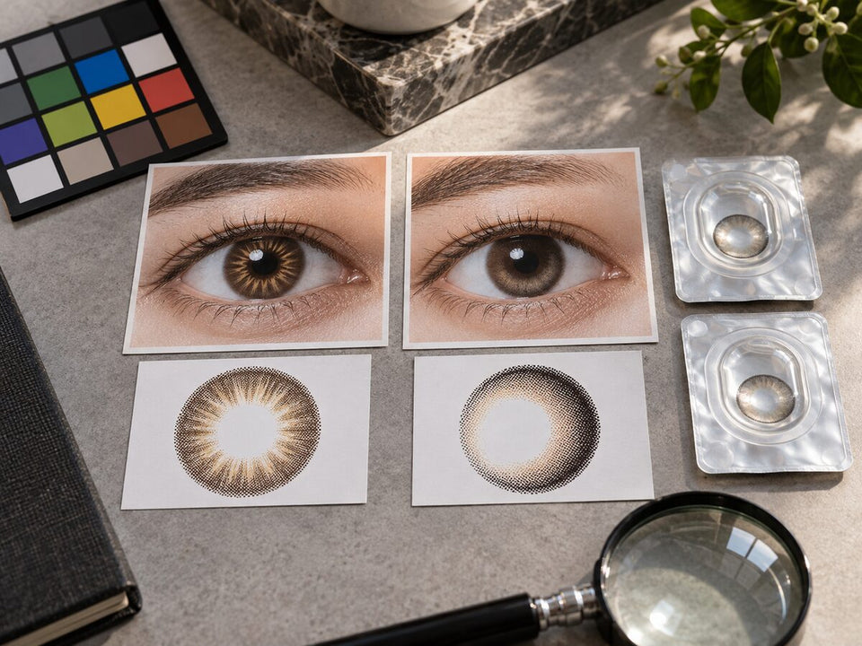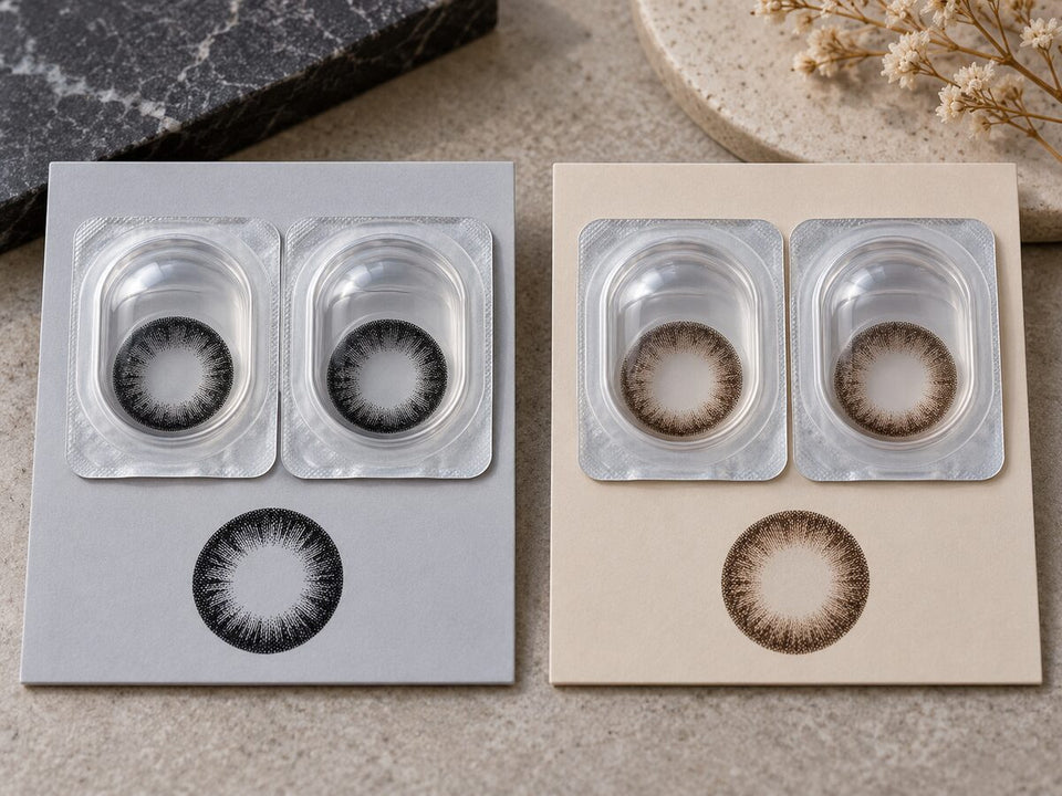

Size & design
Why Your Natural Eye Color Shows Around the Center of a Colored Lens
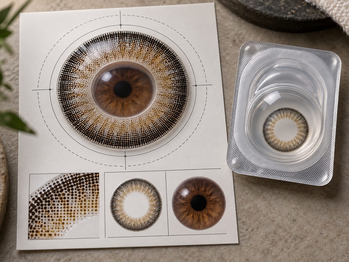
Your natural eye color can remain visible near the center of a colored lens where the design leaves it uncovered or less visually obscured. The contrast between that color and the surrounding pattern can make the transition noticeable. This is an appearance question; discomfort or changed vision needs prompt professional attention rather than an explanation based on the photographed pattern.
In this guide
- Keep the iris, pupil and contact lens separate
- Describe the visible transition before judging it
- Compare contrast as well as the apparent visible area
- Do not read a center size from graphic diameter
- Build a reference set for the actual visual question
- Stop the design comparison if there are symptoms
- Choose the next comparison according to your preference
- Questions and answers
Keep the iris, pupil and contact lens separate
The iris is the colored tissue of the eye, while the pupil is the opening in its center. The FDA's eye terminology glossary defines those structures and explains that pupil size changes with lighting. The glossary is cited here for basic anatomy, not as advice about eye surgery.
A colored contact lens is a separate device worn over the front of the eye. Its printed appearance should not be confused with the physical pupil underneath. When you inspect a photograph, distinguish the dark central opening, any visible natural iris color and the surrounding printed design rather than treating them as one feature.
Understand what a clear center describes
When a lens description refers to a clear central area, it describes a part of the lens without the decorative color pattern, not necessarily a physical hole through the lens. Do not use the word pupil for every central area you see in a product image. The eye's pupil and the lens's design area are different things.
If a specific product's construction is unclear, ask for its own authoritative description. A general explanation cannot supply an undeclared central measurement or establish the geometry of every lens in the catalog.
Describe the visible transition before judging it
Look from the center outward in a clear, identified reference. You may be able to distinguish the pupil, a region of natural color and the beginning of the lens pattern. If the image does not show enough detail, leave the sequence uncertain rather than drawing precise boundaries on a blurred photograph.
The transition can be part of what you like about the image, or it may be more noticeable than you prefer. Neither aesthetic reaction is a diagnosis. A visible brown area beside a gray-looking pattern can be a useful feature to compare without claiming that the lens fits correctly or that a symptom is normal.
Use descriptive rather than corrective language
Try “I prefer a less obvious contrast near the center” instead of “the lens is failing to cover my eye.” The first identifies a style goal. The second assumes a product requirement that may not have been promised or documented. Check the exact design information before treating a visible transition as a defect.
The model comparison guide helps keep reference images in proportion. The light-eye blending guide addresses the same question from a lighter starting-eye perspective.
Compare contrast as well as the apparent visible area
A center transition may draw your attention because the neighboring colors look different in depth or direction. That is a visual observation, not a measurement of the clear zone. An image with a small but conspicuous contrast can interest you more than one with a larger-looking area whose colors appear closer together.
For a quieter aesthetic brief, investigate references where the transition has the level of contrast you prefer. You do not need to assume that every brown lens will merge with brown eyes, or that every gray lens will create a sharply divided center. Compare the exact pattern and available evidence.
Decide whether the transition is something to keep
Some shoppers enjoy a visible mixture of colors near the center. Others prefer a less distinct transition. Write the preference without ranking one as universally more realistic. Your desired style may involve either a close relationship or an obvious contrast.
Explore brown-family comparisons, gray lens contrast or green lens choices according to the color relationship you want to investigate. Those guides do not replace the need for a relevant center reference.
Do not read a center size from graphic diameter
Graphic diameter and overall lens diameter do not, by themselves, supply the size of a central unprinted area. The current KPOP2 records below show useful documented dimensions, but the checked fields do not provide a central clear-zone measurement for these products.
| Checked field | OLENS ViVi Ring Brown | OLENS ViVi Ring Gray | OLENS Seolem 3 Color Blue |
|---|---|---|---|
| Graphic diameter | 13.0 mm | 13.0 mm | 13.3 mm |
| Overall diameter | 14.0 mm | 14.0 mm | 14.0 mm |
| Base curve | 8.6 mm | 8.6 mm | 8.6 mm |
| Replacement category | Monthly | Monthly | Monthly |
| Central clear-zone measurement in checked fields | Not provided | Not provided | Not provided |
See ViVi Ring Brown, ViVi Ring Gray and Seolem 3 Color Blue. The 13.3 mm graphic value for Seolem does not prove a larger or smaller clear center than either ViVi Ring record. Likewise, matching ViVi Ring graphic values do not establish identical center transitions.
Keep an absent specification absent
Do not estimate a central size by subtracting unrelated measurements or scaling an uncalibrated photograph. An apparent boundary may also be difficult to identify in a reflection or compressed image. If that measurement matters to a professional assessment, obtain the exact product information rather than inventing it from the catalog.
The graphic diameter versus lens diameter guide explains the documented measurements. The tone-count guide addresses another tempting shortcut: a three-color name does not disclose the central geometry either.
Build a reference set for the actual visual question
Look for a clear close-up of the exact lens version and, when available, a full-face image. The close-up helps you inspect the transition; the portrait helps you decide how much the detail matters to the overall look. Do not assume a feature that dominates a magnified crop will receive the same attention at ordinary viewing distance.
Record whether the starting eye color is stated and whether the product version is clearly identified. A lens-family name without a daily or monthly specification can leave an important uncertainty. The image may still be useful inspiration, but it should not be assigned to an exact product without evidence.
Ask a question that the reference can answer
“Does this photograph show a sharply visible inner transition?” is a visual question. “Will this lens fit my eyes?” is not answerable from the same photograph. Keeping the two apart prevents a detailed image from receiving authority it does not have.
Use customer photo comparisons to label the evidence. The portrait and close-up guide helps you choose the relevant viewing format. If the only available reference is unclear at the center, state that limitation rather than treating the missing detail as a smooth blend.
Stop the design comparison if there are symptoms
A photographed color transition cannot explain away pain, unusual redness, discomfort or changed vision. The FDA's contact lens risk guidance advises removing the lenses and contacting an eye care professional promptly when relevant symptoms occur. Do not reinsert the involved lens to take another photograph or test whether the center looks different.
The same FDA guidance advises keeping the involved lens for possible professional assessment rather than throwing it away. Follow your practitioner's instructions about the lens and case. This is different from the ordinary disposal routine for an uneventful daily disposable wearing occasion.
Do not reposition the lens to copy a model's center appearance, choose a different power to change the look, or treat a new decorative pattern as a solution to a vision problem. The FDA's buying guidance emphasizes exact product identity and professional approval before substitutions.
Read when discomfort needs help for the symptom pathway. For a product question without symptoms, use prescription verification and ask your eye care professional about the exact lens before changing it.
Choose the next comparison according to your preference
If the concern is purely aesthetic, write down the feature you would like to change and the one you want to keep. For example, “keep the gray direction, investigate a less noticeable center contrast.” This is more specific than rejecting all gray lenses or assuming a different graphic diameter will automatically solve the issue.
Consider two candidates whose records are clear and whose visual references address that feature. One may offer a useful close-up but no portrait; another may show the overall look while leaving the center detail uncertain. Record those gaps so the next step is a focused request for information, not an unsupported product ranking.
The what to compare after a dramatic result guide helps organize that next decision. The first-order checklist keeps lens identity, prescribed use and package quantities in view while you evaluate the design.
An honest conclusion can be modest: “I understand which transition I prefer, but this listing does not disclose a central measurement and the photographs cannot guarantee my result.” That is enough to guide a sensible next question. You do not need to invent a technical specification to explain a personal aesthetic preference. Save the exact product name and the reference view with that note. A later comparison will be easier if you can distinguish the actual evidence from the impression you remember, especially when several related versions share a similar name.
Questions and answers
Why can I see brown near the center of a gray lens?
Natural iris color can remain visible where the decorative pattern leaves it uncovered or less visually obscured. The contrast with the surrounding pattern can make it noticeable. The exact product's design and relevant references are needed for a more specific appearance comparison.
Is the clear center a hole through the contact lens?
Do not assume that. A description of a clear central area generally concerns the absence of decorative color there, while the eye's pupil is a separate anatomical opening. Ask for the exact product's construction information if the wording is unclear.
Does a 13.0 mm graphic tell me the center size?
No. Graphic diameter does not by itself provide a central clear-zone measurement. The cited ViVi Ring records do not supply that measurement in the checked fields, so this guide leaves it unknown instead of estimating it.
Can a visible center transition prove the lens fits correctly?
No. A photograph of the pattern cannot assess lens fit or establish that symptoms are harmless. Appropriate fitting and professional guidance remain necessary regardless of whether you like the photographed center appearance.
What if the center looks unusual and my vision is blurry?
Remove the lenses and contact your eye care professional promptly. Do not reinsert the involved lens for another comparison. Follow FDA guidance and your practitioner's directions about retaining the lens for possible assessment.
Should I choose a different color if I dislike the transition?
A different color is one possible aesthetic comparison, but first identify the feature you want to change. You may prefer another pattern within the same color family. Any product change still needs appropriate professional approval.
Product records checked September 11, 2026. AI-assisted guidance using KPOP2 product fields and the linked sources. Catalog images and design discussions are not controlled wear tests.