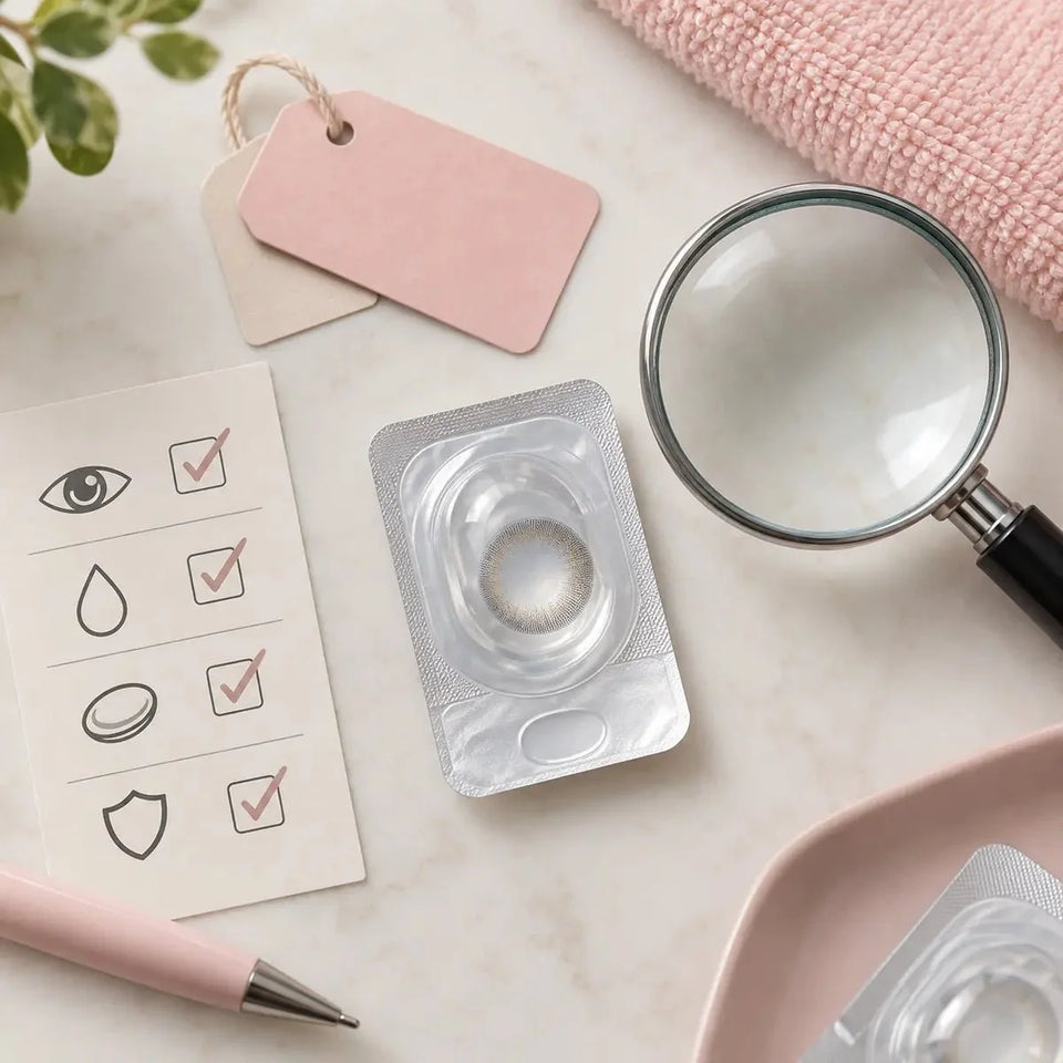
Care & authenticity
Brown vs. Hazel Contacts for Blue Eyes: Shade & Coverage Guide

Brown and hazel contacts can create different effects on blue eyes, but shade names are not standardized across brands. Brown designs generally aim for a more clearly brown impression; hazel designs may mix brown with golden, amber, or green tones. The exact print, coverage, your natural iris, and lighting shape the result. Compare the precise product version rather than relying on its color name alone.

Brown and hazel: what the names usually suggest
“Brown” can describe a warm honey, golden chestnut, neutral cocoa, or deep chocolate print. “Hazel” often suggests a mixed impression that may include brown with amber, gold, or green details. These are common styling cues, not a universal color standard. Manufacturers may use the same shade name for designs with different print density, undertone, and contrast.
On blue eyes, a brown print may make the overall iris look warmer or more brown while leaving some blue visible, depending on its coverage. A hazel print may create a more blended multicolor effect. Neither label guarantees complete coverage, a specific hue, or a natural-looking result. Check images and written details for the exact model and shade.
| Style cue | What to look for | What remains uncertain |
|---|---|---|
| Brown | Golden, reddish, neutral, or deep brown tones; one color or several layers. | How much blue will remain visible on your iris. |
| Hazel | A mixed brown impression with amber, gold, or green-looking details. | Whether the blend will read more brown, green, or golden in your lighting. |
| Coverage | How dense or translucent the printed color appears in product images. | The exact result on an individual eye. |
How a blue iris changes the effect
Your natural iris is the background beneath the printed design. Blue eyes vary in depth, gray or green undertones, central rings, and visible spokes. A translucent print may allow more of those details to show through. A denser pattern may cover more of the underlying color, though photos cannot tell you precisely how much it will cover on your eye.
Consider the desired result in practical terms: retain a recognizable blue edge, create a warmer mixed shade, or make the brown or hazel print the most noticeable feature. These visual goals help you compare designs more accurately than deciding only by whether a listing says “brown” or “hazel.”
Compare print coverage and transition
Look at the printed center, the transition near the pupil, and the outer edge. A soft gradient may blend differently from a sharply defined ring. Radial details can leave more of the natural iris visible, while a denser print can appear more uniform in a photograph. The same shade family can include both subtle and high-contrast designs.
Do not treat graphic diameter as a color-coverage score. It describes the approximate size of the printed area; it does not by itself tell you how opaque the pigment is or whether the blue iris will show through. If you want a circle-lens effect with a stronger outline, compare the exact edge pattern and consult the brown circle-lens design guide for how ring definition changes the visual impression.
Read product photos carefully
Use product images to shortlist a design, not to promise yourself a precise outcome. Natural iris color, pupil size, lighting, makeup, camera exposure, retouching, and screen brightness affect color and contrast. A close-up makes small print details easy to inspect but can exaggerate them; a normal-distance view can suggest how noticeable a shade may be in conversation.
- Check that the image names the exact model and shade, not just the collection.
- Compare examples taken under similar lighting and with a similar starting iris when possible.
- Look at both the full eye and the close-up to separate overall color from print detail.
- Treat edited before-and-after photos as inspiration rather than a guaranteed preview.
Choose the effect for your style
For a softer change, compare less sharply defined edges, blended transitions, and shades close to the effect you want. For a stronger change, inspect the print’s visible coverage and contrast. Hazel may suit a mixed golden or green-brown direction; brown may suit a more consistently brown direction. Product naming varies, so let the image and exact listing guide the style comparison.
Think about where you plan to wear the lens. Daylight, warm indoor light, and flash can make the same design appear different. If you are choosing for an event or photos, test makeup and lighting separately from lens wear and follow the exact product’s instructions. Do not extend wear to get a particular look.
Verify prescription and fit before choosing a color
Appearance is only one part of selecting contacts. Use a current contact-lens prescription and confirm that the exact model is appropriate for each eye. Matching a product’s base curve or diameter to another lens does not prove that it is interchangeable or fits the same way.
In the United States, the FDA says colored and decorative lenses require a prescription, even when they do not correct vision. Check the rules where you live and ask an eye-care professional to evaluate the exact product. A product photo, shade name, or customer review cannot establish fit.
Check the live listing for the exact manufacturer, model, prescription options, replacement schedule, and package quantity. If your required correction is missing, do not choose a nearby value. Ask the prescriber about alternatives, then compare brown and hazel among the options that are suitable for you.
A short comparison checklist
- Decide whether you want a brown impression or a mixed hazel effect.
- Compare undertone, print density, pupil transition, and edge definition for the exact shade.
- Check whether the photos show the same product version and a similar starting iris.
- Keep the style decision separate from the prescription and fit decision.
- Verify the full product and prescription details before ordering.
Frequently asked questions
Will brown contacts completely cover blue eyes?
Not necessarily. The result depends on the exact print and its coverage, your natural iris, and lighting. Product photos cannot guarantee complete coverage.
Will hazel look more natural than brown?
There is no universal answer. Naturalness depends on the shade, pattern, edge, starting iris, and setting. Compare exact product images as examples.
What is the main visual difference between brown and hazel contacts?
Brown usually aims for a more clearly brown impression; hazel often suggests a mixed brown effect with amber, gold, or green tones. Brands use these names differently.
Does G.DIA tell me how much blue the lens will cover?
No. It describes the approximate diameter of the printed area, not pigment opacity or the exact color result.
Can I choose based on product photos alone?
Use photos to compare style, but confirm the exact lens and fitting with an eye-care professional.
Source: U.S. FDA guidance on colored and decorative lenses.
This article provides general styling and shopping information. It does not replace an eye examination, contact-lens prescription, professional fitting, or product-specific care instructions.