Toric & prescription
Plano Colored Contacts for Dark Eyes: Fit and Color Guide
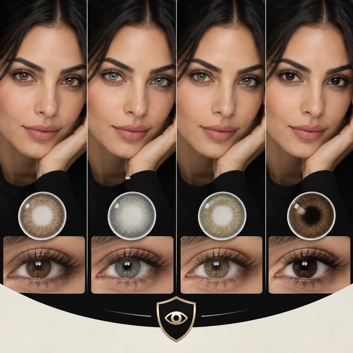
Plano colored contacts can create a subtle or visible change on dark eyes, but 0.00 is only an optical power value. It does not describe pigment coverage, guarantee a color result, or exempt the lens from fitting and care. First identify an exact plano lens that your eye care professional has fitted or approved. Then compare that version's print on a similarly dark starting iris in realistic lighting. Keep the visual decision separate from prescription, product identity, and safe wear.
In this guide

The answer in three checks
Power: 0.00 or plano means the lens does not add distance-vision correction. Fit: the lens still sits on your eye and requires appropriate professional evaluation. Color: the print, your natural iris, and lighting determine what you see. Those three answers are connected in one product, but one does not prove another.
If you do not need vision correction, a properly fitted plano lens may serve a cosmetic goal. If you do need correction, 0.00 will not replace it. Do not stack a colored plano lens over a clear corrective contact to create both effects. Ask your eye care professional about an appropriate lens and vision plan.
In the United States, decorative contact lenses are regulated medical devices. The CDC states that they require a prescription and proper fitting, even when used only to change appearance. Rules may differ by destination, so follow the applicable local requirements and the guidance for the exact lens. A website label such as “non-prescription” should be read as a power description, not a waiver of fitting.
Zero power does not mean zero risk
A contact lens prescription identifies more than a power number. The exact brand or model, fitting details, and current validity matter. The FDA advises buyers to use a current valid contact lens prescription and verify the exact lens brand, name, power, and relevant specifications. Do not substitute a similar-looking model merely because both pages offer 0.00.
An eyeglass prescription does not establish which contact lens fits. If you have never worn contacts, arrange an examination and fitting instead of using 0.00 as a do-it-yourself starting point. If you have used another lens before, do not assume matching base curve and diameter numbers authorize a brand switch. Lens design and individual response need proper assessment.
Even a lens that feels acceptable for a short time may not be appropriate. A selfie can show color and perhaps apparent centering at one instant, but cannot assess movement, tear interaction, or eye response over a wearing period. Another wearer's comfort report is not a safe-wear schedule for you.
What changes when the starting iris is very dark?
Dark brown eyes can make a lightly printed shade look more muted than a product swatch suggests. The natural iris remains part of the final color whenever the print allows it to show through. A sheer blue design might read as a cooler dark brown or smoky gray rather than a bright blue. A layered hazel design might add warmth and definition rather than fully replace the brown. These are possible visual directions, not predictions for every exact product.
Dark irises also vary. A warm brown iris with visible amber detail in daylight and an almost black iris in the same light can produce different results under one lens. Compare before-and-after photos that show the bare starting eye. If the base color is missing, treat the after image as styling inspiration. Seek more than one wearer or lighting condition before judging visibility.
The strongest question is not “Which color works?” but “What change does this exact print make on a dark base close to mine?” Decide whether you want richer brown depth, a warmer honey or hazel center, a visible olive shift, a cool gray cast, or a high-contrast editorial effect. Then inspect patterns that can plausibly deliver that direction. A shade name alone is too broad.
Read the center, middle field, and outer edge
The center transition is where the colored print meets the pupil opening and any visible natural iris. On dark eyes, a clear central zone may leave a deep brown ring within a lighter printed shade. Some wearers like that depth; others prefer a smoother blend. A close, unfiltered photograph helps you see the boundary, while a normal-distance view shows whether it is noticeable in daily life.
The middle field carries the principal color impression. Layered dots may look complex in a macro image but soften at conversation distance. A solid color field can appear clearer on a dark iris, yet the final result may vary with natural texture and light. The outer edge shapes apparent definition. A dark ring can create an eye-enlarging impression even if the color field is subtle.
Do not assume printed opacity has a direct relationship to comfort or eye health. It describes a visual feature. Fit, lens design, and your eyes need separate evaluation. A more dramatic print does not automatically mean a worse fit; a natural-looking print does not make a lens safe for everyone.
Use photos as evidence, not a promise
Choose images that identify the full brand, model, shade, and replacement version. A daily and reusable product from the same family may not share identical details. Favor a bare-eye reference from the same wearer, similar camera distance and exposure between before and after, ordinary indoor light, and diffuse daylight. Add a full-face photo to the iris close-up so you can judge the effect at normal distance.
Ring lights, flash, makeup, and beauty filters can increase the perceived change. White balance can push gray toward blue or hazel toward gold. A cropped after image can make an outer ring appear more eye-enlarging. If the conditions are unknown, record the result as “interesting style reference” rather than “expected outcome.”
One unfiltered video can add information about how the lens appears when the wearer turns toward and away from light. It still cannot prove fit, comfort, or an identical result on your iris. When two images disagree, ask which variable changed—light, starting eye, version, camera processing, or makeup—instead of selecting only the brighter one.
Choose a visual direction before a shade
Quiet enhancement
For dark-eye definition with minimal color change, compare brown or cocoa patterns with a soft center and controlled ring. The result may be richer depth rather than a lighter iris. Judge it in an ordinary indoor full-face view, not only in bright sun.
Soft lightening
For a warmer, lighter impression, compare layered hazel, honey, or olive-brown designs on similarly dark eyes. Look for enough visible pigment to create the intended effect while keeping a center transition you like. “Natural” is subjective, so decide how much contrast feels right to you.
Clear gray or blue shift
For a cooler change, inspect dense and layered gray or blue designs in more than one light. A pale campaign image on light eyes is a poor predictor for nearly black eyes. Pay close attention to the natural center and the outer edge, which may become more obvious when the midtone contrasts strongly.
Defined circle-lens look
If the goal is more apparent iris size, compare the outer-ring density and printed extent at conversation distance. A compact dark ring can seem stronger than a wider diffused print. Physical lens size must follow fitting advice; do not select a different overall diameter to chase this effect.
Three useful dark-eye comparison examples
A deep brown iris and a sheer blue print
The after image looks slightly cooler in daylight but barely different indoors. The lens may still be useful if you want a quiet, smoky effect. If you expected a clearly blue iris, seek a denser print from an exact suitable lens, with unfiltered images on similarly deep brown eyes. Do not interpret the shade name as evidence that the result will be bright blue.
A nearly black iris and a defined brown ring
The middle color barely changes, yet the outer edge looks sharper in a full-face image. That is a legitimate visual effect: definition rather than lightening. Compare the edge at normal distance because a close crop can overstate apparent enlargement. A graphic measurement can help describe the print, but it cannot prove physical fit.
A gray lens looks dramatic in one photo and muted in another
One image uses a ring light; the other shows ordinary indoor lighting. The wearer's pupil appearance and camera processing may also differ. Record the two conditions rather than deciding one image is “true” and the other is “false.” If you will mostly wear the lens indoors, the indoor frame is the more useful prediction for your routine.
Each example assumes the exact lens has already cleared the separate prescription and fitting decision. None of these visual observations can establish comfort, movement, or a safe wearing time. If a candidate has excellent photo evidence but its version or fitting status is unknown, keep it as inspiration until those facts are resolved.
G.DIA and DIA answer different questions
Graphic diameter, sometimes listed as G.DIA, describes printed coverage when the manufacturer or seller provides it for the exact version. Overall diameter, DIA, describes the physical lens width and is relevant to fitting. A graphic number is not a recommendation for your eye's size. Neither number alone predicts visible color because pattern density, edge design, and the starting iris also matter.
Do not estimate graphic diameter from a selfie. Camera distance, crop, gaze, lashes, and eye shape change apparent proportions. Read the verified current product specification and use photographs for their proper purpose: seeing how a known print appears on a known starting iris. If a specification is missing, mark it unknown rather than copying it from another model.
Plan the replacement and care format
A daily disposable follows its one-day use schedule and is discarded afterward. A reusable lens follows the manufacturer's replacement schedule and requires the specified cleaning, disinfecting, and storage steps. Neither format is automatically best for every wearer. Ask which exact suitable models are available, then consider whether you can realistically follow their care instructions.
Check the package count before comparing price. A listing may show individual pieces, pairs, or a single lens. If the two eyes have different requirements, the order may need separate selections. A 0.00 option can appear in several product families, but those families may differ in print, quantity, and schedule. Do not transfer care directions from one version to another.
The CDC advises against sharing decorative lenses, storing them in water, or cleaning them with water or saliva. Follow the recommended disinfecting solution and replacement schedule for the exact lens. Even occasional wear requires proper handling. Remove the lens and contact an eye care professional if discomfort occurs.
Build a traceable decision record
For each candidate, keep two short columns: clinical facts (exact approved model, power for each eye, version, and care plan) and visual evidence (starting iris, print, and daylight or indoor result). Mark missing information as unknown. For example: “Deep brown iris; exact gray daily model identified; clear in daylight; indoor result unknown; fitting status unresolved.” That note shows the next question without turning a photo into a purchase approval.
Before checkout, confirm the current seller process, exact model and shade, eye-specific power, package count, replacement schedule, and return terms. Verify the sealed package and label before wear. Browse KPOP2's colored contacts for dark eyes for visual ideas, then check the live listing and prescription verification and wear and care pages for current steps.
Sources: CDC decorative contact lens guidance and FDA buying guidance. Confirm destination-specific rules and current exact product details before ordering.