Care & authenticity
Dense vs. Feathered Colored Contact Rings: Which Looks More Defined?
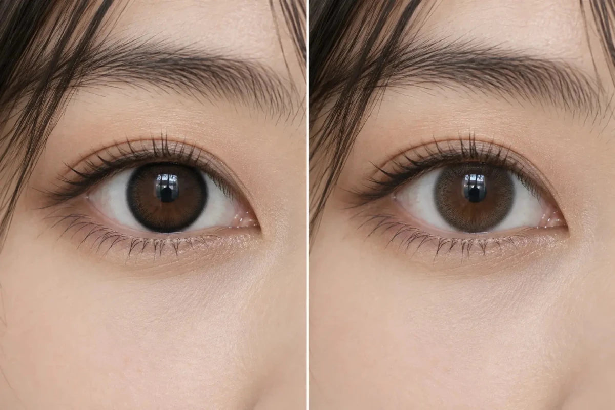

A dense outer ring usually makes a colored contact’s iris outline look more defined. A feathered ring spreads or fades the print toward the edge, which can make the boundary look softer. Neither style always wins: darkness, width, color contrast, the natural iris, and viewing distance all affect the result.
What “dense” and “feathered” describe
A dense ring has printed marks close enough together to read as a continuous or nearly continuous band at the scale you are viewing. A feathered ring thins or breaks into dots or strokes toward its edge. These are visual descriptions, not standardized measurements. Product labels such as “soft edge” may not define how the pattern is printed, so inspect the exact lens image when available.
Keep four features separate: ring darkness, ring width, mark density, and edge softness. A narrow charcoal band can look more defined than a wider pale fade. A feathered edge can still create a strong frame if the color field is dark or the fading area is broad.
Why the same ring can read differently
The wearer’s natural limbal line—the boundary around the iris—also contributes to the outline. If the natural edge is already dark, a lens ring may blend into it or reinforce it. A similar print on a lighter iris may stand out more. Lighting and camera processing can further change how clearly the dots or band appear.
Use a close-up to inspect the print and a face-distance photo to see whether the edge remains prominent in context. A macro shot can exaggerate tiny details; a portrait can hide them. Compare images with similar light, angle, natural eye color, and camera distance before deciding that one design is more defined.
Compare the exact designs
- Match the product. Confirm the exact model and colorway rather than relying on a related shade name.
- Describe the ring. Note its darkness, width, density, and whether its edge ends abruptly or fades.
- Check the wearer’s starting iris. A bare-eye image helps show how much definition comes from the natural border.
- Look at two scales. Use a flat or close-up image for print detail and an ordinary-light portrait for the overall look.
- Choose the effect you want. Decide whether you prefer a visible outline, a softer transition, or something between them.
A useful note is specific: “The dark ring remains clear in a face-distance photo, while the lighter design fades into the iris.” That is more actionable than labeling one universally “natural.” A transparent outer margin is another design feature; see our guide to transparent outer edges for how it differs from the printed ring itself.
Appearance does not establish fit
Ring style can help you choose an aesthetic, but it cannot show whether a contact lens is appropriate for your eyes. In the United States, the FDA advises buyers to use a current, valid contact lens prescription and check the exact lens information. Follow local requirements and ask your eye care professional before changing models. Do not choose a lens or adjust specifications to achieve a stronger outline.
Frequently asked questions
Does a dense ring always make eyes look larger?
No. It can make the iris boundary more noticeable, but perceived size depends on the complete design and wearer.
Is a feathered ring always natural-looking?
No. A dark or wide fade may still look bold, and the wearer’s natural iris changes the contrast.
Can a product photo tell me which ring is more defined?
It can show the print pattern. Compare similar wear photos to judge how each edge appears on an eye.
The takeaway
A dense ring often gives a clearer outline; a feathered ring often softens the boundary. Compare the exact lens by darkness, width, density, edge, natural iris, and face-distance images. Treat the result as a style comparison, not a fit assessment.