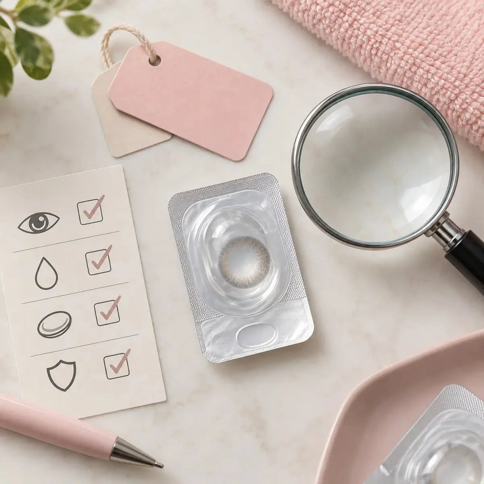
Care & authenticity
Korean Brown Contact Lenses: Undertone, Contrast & Lighting Guide

Korean brown contact lenses range from subtle iris definition to a brighter, more visible color shift. To compare them, look beyond the shade name: note the undertone, print density, edge definition, graphic area, your natural iris color, and the light in which you expect to wear them. Product photos help you shortlist a look, but they cannot guarantee the same result on every eye or confirm that a lens fits.
In this guide
- Start with the look you want
- Compare brown undertones
- Read contrast and print density
- Understand edge definition and graphic area
- Account for natural iris color
- Compare lighting and photographs
- Choose by the setting and styling
- Verify the exact Korean lens
- Keep prescription and fit first
- Use a comparison checklist
- Frequently asked questions

Start with the look you want
“Brown contacts” can describe a wide range of designs. One lens may add a soft warm tint; another may create a pale hazel impression, a dark outer ring, or a distinct printed pattern. Before opening product pages, decide whether you want your natural iris to remain the main feature or prefer the lens to create a noticeable change.
Think in terms of visible details rather than only a shade name. Is the target warm or cool? Light or deep? Does it have a clear ring, a blended edge, or flecks of another color? Should the result look understated at conversation distance, or should the pattern be recognizable in a close-up photograph? These questions make product comparisons more specific.
Save a small set of reference images in consistent lighting. Include the natural eye color you are comparing against, the candidate product photo, and a photo of the look or mood you prefer. Mark what you like about each one. A product photo is an example of a design, not a promise of the exact result on your eye.
Compare brown undertones
Undertone describes the subtle warm, cool, or neutral cast within a brown color. Product names such as cocoa, honey, ash, chestnut, or olive are marketing descriptions, and brands use them differently. Compare the image and print rather than assuming every product with the same label has the same tone.
- Honey and caramel browns: often show golden or amber warmth. They may look brighter in direct light and more subdued in a dim room.
- Chestnut and warm medium browns: balance brown depth with a red or golden cast. They can complement warm makeup or hair colors, depending on the exact print.
- Cocoa and chocolate browns: tend to look deeper and more saturated. A dark lens may define the iris without creating a light hazel shift.
- Ash and taupe browns: lean cooler or more muted. Some read as brown-gray in certain light rather than as golden brown.
- Olive and hazel browns: can include green, gold, or gray details. The secondary tone may be subtle or prominent depending on opacity and pattern.
Use these as broad style families, not fixed technical categories. A brand’s “honey” can look lighter or more amber than another brand’s honey. Product images may also use warm color grading. If a manufacturer provides multiple photos or a shade card, compare the exact model and version, and treat the images as references rather than exact previews.
Read contrast and print density
Contrast describes how strongly the colored print stands apart from the natural iris and from the edge of the lens design. A low-contrast blend may look softer or more integrated in some settings. A high-contrast pattern can make the eye appear more defined or stylized. The outcome depends on your natural eye, the lens graphic, and surrounding light.
Print density and opacity also affect how visible a color may appear, but a product listing rarely gives enough information to predict an exact result. A lighter brown can look subtle on a light iris and more muted on a dark iris. A stronger print may show more clearly, but it can also feel more graphic than the wearer expected. Compare photos that show the exact product on more than one iris color if available.
Check how the pattern transitions toward the pupil. Some designs use a gradual center blend; others have visible spokes, flecks, or a defined color boundary. The center detail can be especially noticeable in close-up images, while the overall hue may dominate at a normal viewing distance. Choose based on how you expect the lens to be seen rather than judging only a cropped product image.
Understand edge definition and graphic area
A limbal ring is the darker or more defined outer edge around the iris. A pronounced ring may create a crisp, illustrated appearance. A softer edge may blend more gently with the natural iris. Neither treatment is automatically more natural; the preferred look depends on the character of the design and the wearer’s eye.
Graphic diameter (sometimes listed as G.DIA) refers to the printed area. Total diameter (DIA) refers to the full lens. Those measurements describe different things. Graphic diameter can help compare how much of the iris the print covers visually, but it does not show whether the lens fits or how large the eye will appear. Overall size and fitting suitability must not be inferred from one number.
Consider the edge, center, and graphic area together. A large printed area with a dark ring may produce a strong effect. A smaller graphic area with a soft center may appear more restrained. Product photos are still limited by lighting, camera distance, and editing, so use measurements as product details to confirm—not as guarantees of appearance or comfort.
Account for your natural iris color
Your starting eye color can influence the visible result. On a lighter iris, the lens pattern may blend with natural variation. On a darker iris, the same design can appear deeper or less bright. However, products vary in print density and coverage, and two people with similar eye colors can still see different results.
When reviewing model photos, check whether the natural iris color is stated and whether the image shows the exact shade and product generation. Ask whether the photo is a studio image, a customer image, or a manufacturer sample. Use it to compare broad design features—warmth, ring, pattern, and brightness—rather than expecting a one-to-one match.
If you are unsure between two browns, compare them in the same lighting and at the same distance. A color that looks quite different in two separate product pages may actually be photographed under different conditions. If there is no comparable image, keep the uncertainty in mind and choose by the design features you can confirm.
Compare lighting and photographs
Warm indoor lighting can make brown tones appear more golden or reddish. Cool daylight may reveal gray or olive nuances. A dim room can make a deep brown print look nearly black, while bright direct light can make a honey or amber shade appear more luminous. Camera white balance, exposure, makeup, and screen calibration can shift a product photo further.
For a fair comparison, use photos taken in similar conditions. Compare a close image for pattern and edge, then a farther image for the overall impression. If you are preparing for an event or photo shoot, think about the actual lighting and distance where the lens will be seen. A shade selected for a warm indoor dinner may read differently on a bright outdoor day.
Do not use a phone screen to judge the precise color you will see on your own eyes. Use product imagery to narrow the style direction, then set expectations that the appearance can vary. If exact shade matching is important for a shoot, makeup and lighting can help coordinate the look without assuming a lens will reproduce an edited reference exactly.
Choose by the setting and styling
For a quiet everyday look, consider whether you want just a little warmth, a softened iris edge, or a more noticeable brown shift. A muted tone and gentle pattern may look less graphic in some contexts, but the wearer’s natural iris and the exact design remain important. For portraits or stage styling, a stronger ring, brighter honey tone, or multitone pattern may read more clearly at a distance.
Coordinate the lens with hair, makeup, brows, and clothing. Warm browns may harmonize with gold or peach tones; ash browns may complement neutral or cool styling. Those are visual starting points, not rules. A contrasting lens can be an intentional focal point, and the same shade can feel different when the rest of the styling changes.
Before choosing a model, ask whether the look should be visible at conversation distance or mostly in close-up. A detailed print can be subtle from afar; a pronounced ring may be noticeable even in a casual portrait. Choose one or two desired effects and identify what you would be willing to compromise—brightness, ring strength, or exact undertone—if the best-looking design is not offered in the prescription you need.
Verify the exact Korean lens
Products associated with Korean beauty brands may come in multiple collections, shades, diameters, materials, prescriptions, and wear schedules. Confirm manufacturer, exact model, color name, lens type, replacement interval, available powers, base curve, total diameter, graphic diameter if provided, and box contents. A familiar brand name does not guarantee that every product line has the same parameters.
Check whether each box contains one prescription power or a mixed set. If your right and left eyes use different powers, calculate the needed boxes accordingly. Do not assume a pair is included because the product photo shows two eyes. Compare the chosen product and prescription at checkout with the exact listing and your clinician’s record.
Some product information may be translated or abbreviated. Keep a screenshot or link to the exact model and look for a manufacturer code on the packaging. If two product pages show similar colors but different names or specifications, treat them as separate products until reliable manufacturer information confirms the relationship. Ask the seller to clarify any uncertainty before ordering.
Keep prescription and fit first
Colored contact lenses are still medical devices in many markets. In the United States, the FDA says decorative lenses require a prescription and professional fitting even if they are worn only to change appearance. The FDA’s consumer guidance recommends an eye examination and a prescription that identifies the brand and lens measurements. Check local regulations and consult a qualified eye-care professional where you live.
Use a current contact lens prescription and keep the right and left eye details separate. Do not convert an eyeglass prescription yourself, round a power, or ignore cylinder and axis when they are prescribed. If the exact brown lens is not available in the needed correction, ask your prescriber about a suitable alternative rather than choosing the closest menu option.
Base curve and diameter are not do-it-yourself fit tests. A lens with a similar measurement can still differ in material, shape, or behavior. The professional evaluates the exact lens on your eye and checks how it fits and how you see through it. Do not wear someone else’s lens or stack a colored lens over a clear contact lens.
Compare a short list of brown designs
Once you have identified products that may fit your prescription, compare two or three exact versions side by side. Record what is visible in the product information and keep unknown details separate from style impressions.
- Write down the desired undertone: golden, warm chestnut, deep cocoa, ash, olive, or another visual target.
- Decide how much contrast and edge definition you want.
- Check the print pattern and graphic area on the exact product page.
- Compare photos under similar lighting and natural iris colors when possible.
- Record the exact manufacturer, model, shade, schedule, and box contents.
- Confirm the full contact lens prescription for each eye and ask a professional to evaluate the exact lens.
- Verify local purchase requirements, care instructions, and seller information.
- Keep glasses available and follow the wearing and replacement schedule.
If the product listing does not identify the exact model or the available correction does not match your prescription, pause and ask questions. The visual goal can be adjusted through makeup, lighting, or styling; guessing the lens is not a reliable shortcut.
Frequently asked questions
What shade of Korean brown contacts looks the most natural?
There is no universal answer. A softer print or muted undertone may look subtle in some settings, but natural iris color, lighting, and the exact lens design affect the result. Compare images as examples, not promises.
Do honey brown contacts look lighter than chocolate brown?
Often the product names signal a lighter golden direction versus a deeper brown, but naming is not standardized. Review photos and product details for the exact lens.
Can brown contacts make dark eyes look hazel?
Some designs include golden or olive tones that may create a hazel impression for some wearers. Coverage and color vary by product and natural iris, so the result cannot be guaranteed from the shade name alone.
Does graphic diameter tell me how large my eyes will look?
No. Graphic diameter describes the printed colored area. It does not establish fit or predict the overall appearance by itself.
Are Korean brown lenses available with prescription?
Some models offer selected powers, while others may have limited options. Check the exact model against a current prescription and ask your eye-care professional whether it is appropriate for you.
Can I choose between brown lenses by base curve only?
No. A matching base curve does not prove that different products are interchangeable. The exact lens should be professionally evaluated.
This article offers general styling and shopping information. It does not replace an eye examination, prescription, contact lens fitting, or manufacturer instructions.