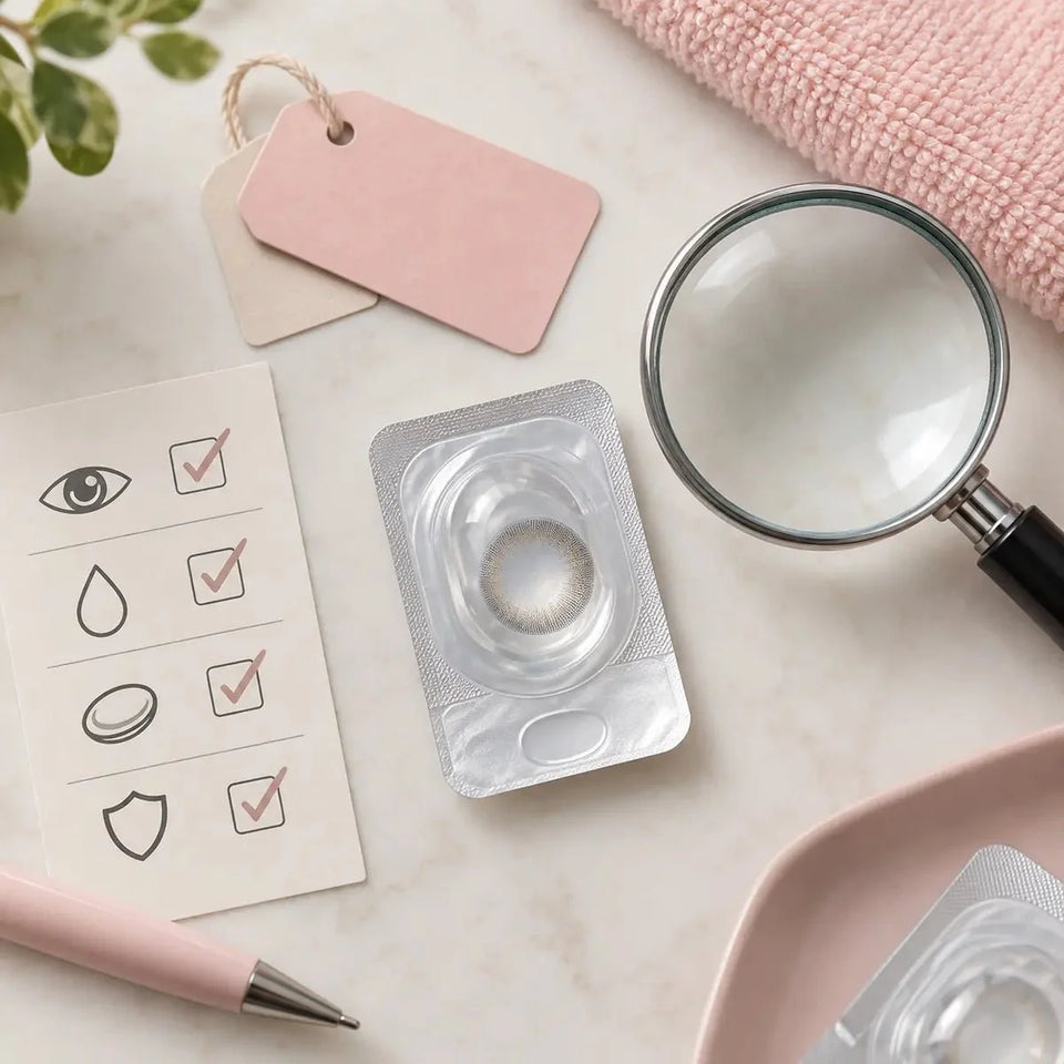
Care & authenticity
Natural Colored Contacts for Dark Eyes With Zero Power

Zero-power colored contacts can create a subtle look on dark eyes, but “zero power” describes vision correction, not whether a lens needs professional fitting. Begin with the exact lens approved for your eyes, then compare its printed center, mid-iris color and outer edge on a starting iris similar to yours. A natural result is a styling preference; suitability depends on the prescribed product and your eye-care professional's instructions.
In this guide

What “zero power” actually says on a listing
Zero power is often shown as 0.00 or “plano.” It generally means the lens does not provide spherical vision correction. It says nothing by itself about whether the lens fits, how long it may be worn, whether its print will be visible on dark brown eyes, or whether a prescription is required in your location. Do not read “non-prescription” marketing language as a promise that medical evaluation is unnecessary.
The U.S. FDA treats decorative contacts as medical devices and advises an eye examination, a prescription and use of the exact lens selected with an eye-care professional. If your destination is outside the United States, confirm the applicable local requirements rather than treating U.S. wording as universal law. In every location, correct fitting and care matter because even a cosmetic lens sits on the eye.
If you need vision correction, do not select plano only because the shade is available in 0.00. Ask your eye-care professional how your visual correction and cosmetic preferences can be addressed together. Another plan may be needed, and the appropriate answer depends on your eyes and prescribed options. A lens that seems to give a clear view is not proof that its fit is suitable.
Keep the exact model name on your prescription or fitting record next to the product listing. Similar shade names can occur in different series or replacement formats. A matching number such as 0.00 does not make two designs interchangeable, and a familiar color is not a substitute for the prescribed brand or parameters.
Define “natural” before browsing shades
“Natural colored contacts” can describe several different goals. One person wants dark brown eyes to remain recognizably brown but a little more defined. Another wants a subtle hazel warmth. Someone else wants a green or gray shift that is noticeable but still blends smoothly at the pupil. These goals are not identical, so a generic natural-look label is too broad to guide the choice.
Write a one-sentence brief. For example: “Keep a dark-brown overall impression, avoid an obvious ring, and soften the center transition.” Or: “Add an olive tone that can be noticed at conversation distance without a sharply printed edge.” This makes it possible to assess an identified photo against the actual result you want, rather than accepting someone else's definition of natural.
Think about the setting too. A lens that looks quiet in a face photograph may show its pattern under a phone flash or direct midday sun. A very subtle tint may be almost invisible in a dim restaurant. Decide where you want the look to work most of the time, and use images from that kind of light if available.
Do not assume the lightest advertised color creates the smallest visual change. A pale opaque middle can contrast strongly with a very dark iris, while a darker warm print may blend. Naturalness depends on pattern boundaries and contrast as well as hue.
Use your starting iris as the comparison point
Dark eyes are not a single uniform color. Some show warm brown or amber detail in daylight; others appear nearly black at an ordinary distance. A transparent print interacts with that base. The same lens may look like a soft tint on one eye and a much deeper shade on another. Before shopping, inspect your own iris in unfiltered daylight and familiar indoor light.
When you review model photos, ask whether the starting iris is shown or at least described. A finished look on light brown eyes may not predict the print's visibility on very dark eyes. Skin tone and makeup can change your impression of a campaign image, but they do not reveal the iris color beneath the lens.
If a lens is shown only as a flat swatch, use the swatch to inspect the artwork, not to forecast its final shade on you. A lens photographed off-eye has no dark iris behind it. A swatch can still show how much clear space appears in the print and whether the outer ring is strong, which are useful design clues.
Keep the expectation modest when evidence is limited. “It may look warm and blended” is a more honest reading of a sparse image set than “It will look exactly like this model.” The goal is a better-informed shortlist, not certainty the photos cannot provide.
Inspect the center before choosing a shade name
Most colored lenses include an unprinted or less-printed central area. Your natural brown iris may be visible around the pupil where the center meets the colored design. On dark eyes, that transition can be a defining part of the result. A hard boundary between a pale middle and a dark center can make a lens look more graphic, while a gradual or warm inner print may look more blended.
Examine a close-up of the exact version if one exists. Ask whether the inner boundary is abrupt, dotted, feathered or softly layered. Then look at a full-face photo, because a sharp line in a macro crop may be less obvious at normal distance. Neither view alone captures the whole appearance.
Visible brown near the pupil is not automatically a defect. It can be an intentional part of the design. Do not try to remove every trace of natural iris by selecting a different center opening without professional advice about the exact lens. If you notice visual disturbance while wearing a lens, treat it as a reason to seek professional assessment, not simply a styling issue to solve with another print.
Remember that pupil size varies with lighting. A photo in bright light may show a different balance of dark center and printed color from one taken in a dim room. That is another reason to seek more than one ordinary-light example.
How much mid-iris color do you want?
The middle printed zone often determines whether a new shade reads at conversation distance. Sparse strokes and transparent gaps may preserve much of the original dark-brown impression. A denser pigment field may create a more recognizable hazel, gray or green result. Neither is inherently more natural; the question is whether the coverage suits your stated goal and starting iris.
Retail opacity descriptions are not standardized across every brand. A product called “soft” or “medium coverage” should be assessed through identified images and the visible print, not compared as though the label were a universal measurement. The same adjective can describe very different artwork.
Warm brown, amber and muted olive details may visually blend with a brown base. Cool gray or green can provide contrast even when the edge is soft. These are broad visual tendencies, not guaranteed outcomes. The exact pigment distribution, light, camera settings and your iris determine what another person will see.
If you want the eye to remain clearly dark brown, a subtle mid-zone may serve you better than a saturated light color. If you want a recognizable change but still value a blended appearance, look for a moderate middle paired with a gradual inner transition. Use real-eye examples rather than trying to infer a precise result from color names alone.
Separate edge definition from apparent enlargement
A dark limbal ring outlines the iris. It can create a crisp, defined look even when the middle color barely changes. A softly faded edge may look quieter at a distance. Some shoppers describe a strongly defined ring as “natural” because it resembles a pronounced iris border; others find it too graphic. Your preference matters more than a generic rating.
Graphic diameter describes the printed area, while overall diameter describes the physical lens. They are different specifications. A larger graphic diameter does not automatically look less natural, because ring density, fade and inner pattern also influence the impression of size. Nor should a shopper change the physical lens size independently to chase a smaller-looking effect.
Compare two views of the same exact lens: a close-up to inspect the outer print and a face image at an ordinary distance. Ask what you notice first. If the ring attracts attention before the eye color, decide whether that supports your brief. If you wanted only a quiet warm tint, a pronounced border may be an unwanted tradeoff even if the shade itself is lovely.
Do not use “enlarging” as a fitting term. A printed ring may change apparent size, but fit is a separate clinical matter. The professional decision about the lens's physical parameters cannot be made from an appearance photo.
Grade the evidence behind a natural-look claim
Strong appearance evidence identifies the exact brand, design, shade and replacement version, shows a comparable dark starting iris, and includes an ordinary-light view. A close-up provides pattern detail; a full-face photograph provides social context. Together they are more useful than either one alone.
Weaker evidence includes a flat product swatch, an unlabeled series photo, an image on a much lighter iris, or a studio portrait with heavy editing. Such images can inspire a shortlist but cannot establish how the exact lens will look on you. Mark the missing information instead of silently filling it in.
Photographs can also mislead when camera exposure changes between before and after views. Bright light may reveal amber detail in the original iris and make the new color look clearer; dim light may hide both. Filters can alter shade and skin tone together. Look for consistency in distance, light and editing when a side-by-side comparison is offered.
Reviews may help when the wearer describes their starting eye color and names the exact lens. Still, “comfortable,” “natural” and “realistic” are personal assessments. A reviewer's experience does not establish your fit or a guaranteed outcome. Use the review to ask better questions about the design, not to replace professional advice.
Build a shortlist with an uncertainty column
For each candidate approved for your eyes, record five items: the exact product and replacement format; the intended visual change; what the center, middle and edge appear to do; the strongest identified image; and what remains unknown. A simple note can prevent shade names and campaign images from blurring together.
One candidate may have a soft center but no indoor photo. Another may have a clear full-face reference but a starting iris lighter than yours. Compare those limits openly. You might prefer the first design even though the color is less certain, or favor the second because its overall impact is easier to judge. The right choice depends on which uncertainty you are comfortable accepting.
Do not transfer specifications or photographs between similarly named products. A daily and reusable version may have different artwork, materials or care requirements. A zero-power listing may be available in one range but not another. Check the current exact product page before ordering, because availability and product details can change.
If none of the identified examples supports your modest goal, ask the seller for more exact-version evidence or wait. Buying the lightest shade simply because it is advertised as natural is not a reliable way to get the smallest possible visible change on dark eyes.
Confirm the exact product, then follow its care plan
Before checkout, compare the model, shade, 0.00 power where appropriate, replacement schedule and other fitted parameters against the professional's record. Confirm each eye's requirements and the package quantity. A pair may not be packaged as a pair, so read whether a box counts individual lenses. Preserve the exact product identity when the delivered package arrives.
Follow the instructions for the prescribed lens. Daily disposables are used once and discarded; reusable products require the specified cleaning, disinfection, storage and replacement routine. The CDC's prevention guidance covers clean hands, avoiding water and proper care. Never share contact lenses, even if they have no corrective power.
Stop wearing a lens and seek prompt eye-care advice if you have pain, persistent redness, light sensitivity, discharge or blurred vision. The natural appearance of a design cannot tell you whether an uncomfortable lens is safe to continue wearing. Keep its box or product details available for the professional.
Browse Natural Colored Contacts to see possible styles, then verify the exact prescribed options on each listing. KPOP2's prescription verification page explains the order step. For visual comparison of daily designs on brown eyes, see the daily colored contacts guide.
KPOP2 Editorial Team · Reviewed September 27, 2026. “Natural” is a styling judgment, not a clinical measurement. Appearance descriptions are editorial observations, not wear tests or guarantees. The U.S. prescription distinction and care guidance use the linked FDA and CDC resources; check applicable local requirements.