Buying guides
Natural-Looking Colored Contacts: Why Results Differ by Person
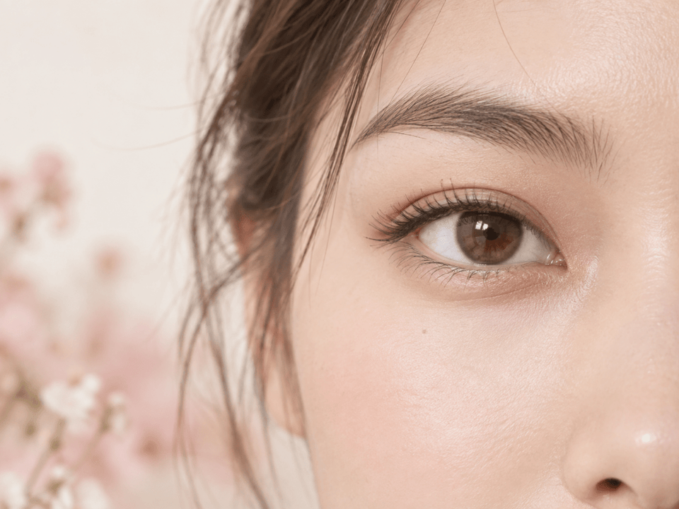
Natural-looking colored contacts do not produce one identical result on every wearer. Natural iris color and pattern, lens print, pupil size, lighting, camera processing and personal style preferences all influence how a design appears. Compare the exact lens features and use product photos as examples, not promises.
In this guide

Why natural-looking colored contacts differ by person
A colored lens adds a printed design over the natural iris. The final impression comes from the combination of that design and the wearer’s eye, the viewing conditions and the person’s own idea of a natural look. A shade that appears subtle on one model can look more noticeable on another, even when the same product is shown.
“Natural-looking” is a style description, not a guaranteed result or standardized product category. One shopper may mean a small color shift that stays close to their natural iris. Another may want the eye to appear softly defined, while still clearly changed. To compare options well, translate the style word into specific features: color distance from the natural iris, pattern contrast, blend, printed coverage and edge definition.
Natural iris color and pattern
Natural irises contain variation. A person may notice a dominant brown, gray, green, blue or hazel impression while the iris also has lighter or darker details. Images may not show all these features equally. A lens design with several tones may interact visually with those details differently from a more uniform print.
The starting color matters when judging a product image. A light iris and a deep brown iris are different backgrounds for the same printed colors. Do not assume that a product photograph on one model predicts a matching result on your eyes. Ask whether the product page shows examples on more than one natural eye color, and treat each as an illustration rather than a test.
Look at your own eyes in neutral daylight and in the settings where you usually expect to wear the lens. Avoid making decisions from a filtered selfie alone: phone exposure, flash, white balance and image editing can change how natural eye color is recorded. This is a visual comparison aid, not a clinical assessment.
Lens design details that change the impression
Color family and undertone
A color name may cover a wide range of shades. “Gray” can lean blue, green or silver; “brown” may look golden, reddish or deep; “hazel” may combine multiple tones. Compare the actual image and the undertone rather than assuming that names mean the same thing across brands.
Print contrast and tonal variation
Compare the brightness and contrast between the main color and the printed accents. Low-contrast flecks or spokes may look quieter in product photography. Sharper lines or high-contrast details can appear more graphic. The scale matters too: details visible in a macro image may be less noticeable at normal viewing distance.
Inner blend and clear pupil area
Inspect how the colored print transitions toward the clear central opening. A gradual, irregular transition can give a different impression from a distinct boundary. The pupil area must remain clear for vision; imagery of the pattern should never be read as a lens covering the pupil.
Outer edge and limbal ring
The edge of the design can be soft, defined or strongly contrasted. A darker ring may visually outline the iris, while a blended edge may make the print seem less separate from it. Neither edge is automatically more natural. Consider what matches your preferred effect and compare its strength with the rest of the design.
Printed coverage and graphic diameter
Printed coverage describes the colored design, while total lens diameter describes the entire lens. If graphic diameter is listed, use it to compare the printed area between products, not to predict fit or a guaranteed enlargement effect. Product dimensions should be confirmed for the exact lens and reviewed with an eye-care professional.
Lighting, photography and face context
Lighting changes how colors are perceived and how cameras capture them. Bright studio light, a ring light or flash can make details more visible in a photograph. Warm indoor light can make some shades read warmer; cool light can make them read cooler. Exposure and editing also affect contrast.
Viewing distance changes the impression of small print details. A close-up emphasizes spokes and rings; a more distant view shows how the eye reads as part of the whole face. Makeup, brow color, hair color, clothing and surrounding colors can influence style perception too. These context effects do not change the lens itself, but they may affect whether the look feels cohesive to you.
For a fairer visual comparison, look for images taken at a similar distance and lighting, and compare close-ups separately from full-face examples. Do not infer a precise fit, safety or exact on-eye result from photographs.
A practical comparison method
- Choose your intended effect. Write down whether you want a minimal shift, a blended enhancement or a clearly visible color change.
- Start from your natural iris. Note its overall color impression and any details you want to blend with or contrast against. Use ordinary light, not only edited photos.
- Compare the same design features. For each lens, record shade and undertone, pattern contrast, inner blend, outer edge and graphic diameter when listed.
- Review the image conditions. Note lighting, image scale and whether you are viewing a close-up or a model photo. Avoid comparing images as if they were shot identically when they were not.
- Decide which feature matters most. If you prefer a softer look, you might prioritize a low-contrast print and blended edge. If you want more definition, you might prefer a clearer pattern. These are preference cues, not outcome guarantees.
- Confirm exact product details. Read the current listing for brand, model, replacement schedule, material, prescription options and measurements. Do not fill gaps with assumptions from a similar product.
- Separate appearance from suitability. Ask an eye-care professional to confirm the exact lens and fitting for your eyes and prescription. A product can match your preferred look and still require professional assessment.
| Feature | What to compare | Why it matters visually |
|---|---|---|
| Shade | Main color and undertone | How close or different the design may appear from the natural iris |
| Pattern | Flecks, spokes and contrast | Whether the print reads softly or graphically in an image |
| Inner blend | Transition near the clear center | How the color meets the pupil area |
| Outer edge | Soft, blended or defined ring | How strongly the iris is outlined |
| Graphic area | Printed diameter, if specified | Extent of the cosmetic print, not lens fit |
For a focused breakdown of shade, print, contrast, and edge, see our seven design features for natural-looking contacts.
Set your own definition of natural
There is no universal natural-looking formula. Some people consider a visible but blended color change natural; others prefer an almost imperceptible shift. A recognizable iris pattern may feel realistic to one shopper and too noticeable to another. Your own preference is a better guide than a marketing label.
Before choosing, compare at least two designs and say what you like about each in concrete terms. For instance: “I prefer the warm brown undertone, but I want the edge softer,” or “I like the pattern, but the contrast feels too strong.” This turns a vague search into a clearer product comparison.
If a product page shows a simulated try-on, treat it as a visualization, not a fit tool or exact color preview. Digital overlays can simplify the iris and may not account for individual pupil size, natural color, light or camera settings. Use them to narrow style preferences, then confirm specifications and professional suitability separately.
Three ways to use the comparison checklist
When your natural iris is deep brown
Do not assume every lighter shade will show the same degree of change. Look for examples with a comparable natural iris when available, then inspect the published print and undertone. Ask the seller or manufacturer to clarify exact product details rather than relying on a broad claim about coverage.
When you want a subtle enhancement
Compare the lens shade with your natural eye in ordinary lighting. You may prefer a small color difference, lower pattern contrast or a softer edge, but those are style choices rather than guarantees. Check a close-up for print details and a full-face example for overall styling, keeping the difference in image scale in mind.
When the product photo looks bolder than expected
Separate the factors: is the main color much brighter, is the outer ring sharply defined, or are the printed spokes high contrast? Identifying the feature that stands out helps you find a design with a different visual balance. Do not expect a different shade name alone to solve the difference.
Prescription, fitting and care checks
Colored contact lenses are medical devices. In the United States, decorative lenses—including lenses that do not correct vision—require a prescription and professional fitting. Review the FDA’s guidance on colored and decorative contact lenses. Rules differ by location, so check the requirements where you live and where an order will be delivered.
Use a current contact lens prescription and confirm the exact brand or model and the prescribed parameters for each eye. A similar color, matching measurement or the fact that a friend wears the lens does not establish that it is suitable for you. Follow the product’s wear and replacement instructions and the advice of your eye-care professional.
Keep lenses away from water and follow safe handling and care instructions. The CDC’s contact lens prevention guidance covers practical wear and care. If you experience pain, unusual redness, light sensitivity or blurred vision, remove the lens and contact an eye-care professional promptly.
Questions and answers
Why do natural-looking colored contacts look different on different people?
Natural iris color and pattern, lens print, pupil size, lighting, camera settings and individual style preferences all affect the impression. Product images show examples, not guaranteed results.
What makes colored contacts look natural?
There is no single formula. Compare shade, undertone, print contrast, inner blend and outer edge, then decide which features fit your own preference.
Will the contact lenses look like the model photo?
Not necessarily. The model’s natural iris, lighting, camera exposure, image scale and editing affect the photo. Treat it as one example.
Can a natural-looking lens be worn without a prescription?
In the United States, decorative lenses require a prescription and fitting even when they do not correct vision. Check local rules elsewhere.
Does a soft ring guarantee a natural result?
No. A soft edge is one design feature. Shade, pattern, natural iris and image conditions also influence appearance, and “natural” is subjective.
Should I choose a lens by graphic diameter?
Graphic diameter describes the printed area when provided. It is not a fit recommendation. Confirm the exact product with an eye-care professional.
Editorial note: Appearance guidance is descriptive, not a promise of individual results. U.S. prescription and care statements are linked to current FDA and CDC information. This article does not replace an eye examination, professional fitting or current prescription.