Care & authenticity
Blue Contacts for Brown Eyes With Zero Power: What to Check
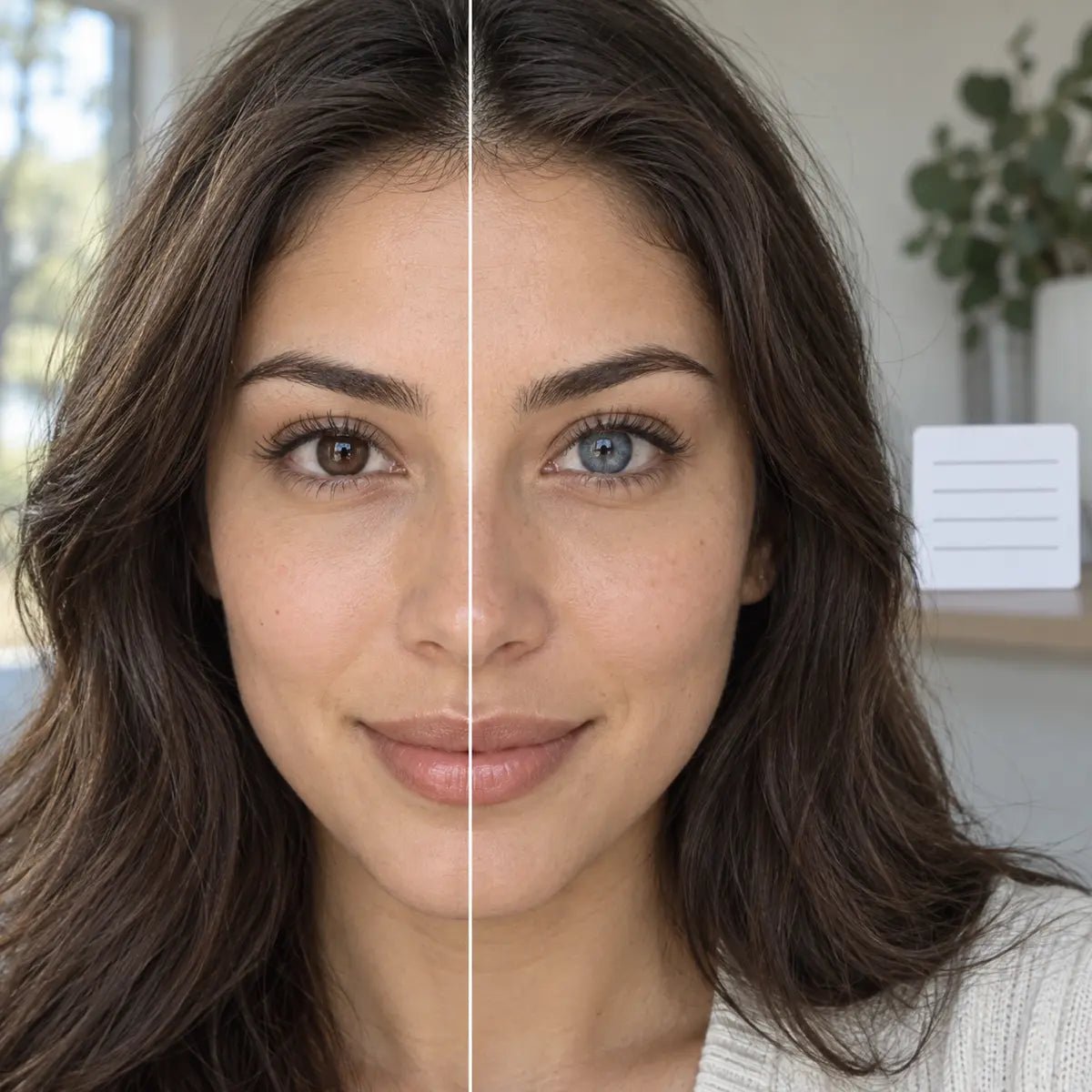
Blue zero-power contacts can look muted, gray-blue or distinctly blue on brown eyes, depending on the exact print and lighting. “Zero power” describes the absence of spherical vision correction; it does not replace a professional fitting or, in the United States, the prescription required for decorative lenses. Confirm the exact suitable lens first, then compare its blue mid-zone, visible brown center and outer edge on a similar starting iris.
In this guide

What zero power does and does not mean
Plano or 0.00 generally indicates no spherical corrective power. It does not mean the lens is medically trivial, one-size-fits-all or guaranteed comfortable. The physical lens still has a material, shape, replacement schedule and care instructions. The exact brand and model matter, even when you can see clearly without lenses.
If you need vision correction, do not select zero power just because the most attractive blue shade is listed only at 0.00. Ask your eye-care professional about suitable corrective choices and how your visual needs should be met. A color preference cannot settle the prescription. A fitting for one lens also does not automatically authorize a related blue design with a different construction.
Keep the word “non-corrective” separate from “non-prescription.” It describes the optical effect, not the purchasing rules that apply in your destination. For U.S. readers, the FDA guidance is explicit about decorative lenses. For international readers, confirm local requirements rather than relying on a product tag or a general blog claim.
Decide what counts as blue for your goal
A buyer wanting a discreet cool accent may be happy with a result that is only clearly blue close up. Someone planning a striking portrait may want the color to remain obvious across the whole face. Before browsing, choose which of those outcomes would satisfy you.
Use practical descriptions such as muted blue-gray, bright blue contrast, or a blue outer accent. Do not assume these phrases are standardized product categories. They describe the look you are seeking and help you ask better questions about photographs.
Also decide what you are willing to retain from your starting eye. If you dislike any visible brown near the center, a reference with a blended brown-to-blue transition may not meet your goal even if another shopper calls it natural.
Consider the role of the brown iris in your preferred result. Some people like a warm brown center surrounded by cool blue because it looks dimensional. Others prefer the blue to read as a more continuous color. Neither preference is wrong, but they call for different print designs. State that preference before the first product comparison so that an appealing campaign photo does not quietly change your goal.
Think about distance as well. If you want a visible change in everyday conversation, a blue detail that appears only in a macro crop may be insufficient. If you want a hint of blue that becomes visible mainly in bright light, a subtler design may be exactly right. The word “blue” on the box cannot tell you which experience you will have.
Avoid the blue-plus-brown formula
It is tempting to predict that a translucent blue will always look green, medium opacity will always look blue-gray, and a dense print will always look pure blue. Those are not reliable rules. Different pigment colors, gaps in the pattern, center designs, and lighting can produce different impressions on brown eyes.
Instead, inspect what the exact evidence shows. Is blue visible across the middle of the iris or mainly at the edge? Is the center warm brown, gradually blended, or sharply outlined? Does the outer ring make the overall eye look darker even though the printed color is light?
These questions explain why a darker photograph is not necessarily evidence that the lens has “failed to cover” the eye. It may show the design’s intended contrast, the wearer’s starting iris, or different exposure. Without comparable conditions, keep the explanation tentative.
A pale print is not automatically the brightest blue on dark eyes. If it is sparse, the brown background may dominate. A deeper, denser blue can be more recognizable in some settings, while a dark outer ring can make the whole eye appear deeper. Those are possibilities, not a universal formula. Compare the exact printed distribution instead of using shade names as performance ratings.
Lighting changes what you can see through and around the print. A translucent pattern may seem more colorful when direct light reveals the starting iris, then look darker indoors. Camera white balance can move blue toward gray or teal. When two reference photos disagree, ask whether the light and camera setup changed before assuming the product itself is inconsistent.
Read center, middle and edge as separate design choices
Center: Inspect the unprinted opening and the first colored strokes around it. Brown may remain visible near the pupil, creating a warm core. A gradual blend can make that transition less abrupt; a crisp border can make it more graphic. Bright and dim light may change the apparent size of the dark center, so seek more than one ordinary-light photo.
Middle: The colored mid-iris area usually determines whether the result reads as blue beyond a close-up. Look for pigment density, stroke size and transparent gaps. A dotted blue print can add cool detail while preserving much of the original brown. A fuller print may carry the color at a distance. Neither outcome is guaranteed on every iris.
Edge: A dark limbal ring can define the eye even if the blue middle is faint. A soft edge may appear quieter on the face. Decide whether you want ring definition independently from blue coverage. A product can excel at one effect and be modest at the other.
Review all three zones in the same exact version. Two products both named “sky blue” can have different center transitions and edges, and those differences may matter more to you than the nominal shade. A flat swatch is useful for reading the design, but the on-eye image is needed to judge its interaction with brown.
Use a reference that matches the question
For everyday wear, prioritize an exact-product reference on a similar brown iris in ordinary indoor light. For photographs, also inspect the lighting you plan to use—but do not assume a brightly lit image represents the result all day. Check whether the page identifies the replacement format and shade rather than only the brand.
Read the full-face impression before zooming into the pattern. Then use the close-up to examine the center and edge. If a photo is heavily filtered or does not show a bare-eye reference, it provides less certainty about how much the lens changed the original color.
A useful message to the seller is: “Does this image show the exact blue daily or monthly version in this listing, and is there an ordinary indoor reference on dark brown eyes?” It asks for information the seller may be able to supply without demanding a guarantee about your eye.
Check ordinary light before believing a dramatic photo
For a daily-life decision, compare diffuse daylight with familiar indoor light. Ring lights, flash and direct sunlight can emphasize printed blue and fine detail that may disappear in a normal room. A dim restaurant image can show whether the blue remains legible at lower light, but it may also be underexposed. Look for a consistent starting eye and realistic camera settings.
Use a full-face image to judge the social impression. Is the color noticeable at conversational distance, or is the main effect a darker outline? Then use the close-up to understand why. Reversing that order can overvalue tiny details that other people will not see in ordinary interaction.
If the only supplied image is on a light iris, keep the prediction for dark brown eyes uncertain. A seller may be able to provide an identified dark-eye example, but should not promise an exact outcome for you. Record the limit of the evidence next to the candidate instead of filling it with a confident guess.
Verify the exact blue version actually offers your fitted option
Do not assume that every shade in a series offers the same powers or replacement formats. Open the product options for the exact blue version and confirm 0.00 only when that is the lens prescribed for your plan. A “non-prescription” collection label does not establish that the selected product is correct for you.
The FDA states that decorative lenses without vision correction still require a prescription in the United States. In other markets, confirm applicable rules. If you need correction, discuss a suitable powered option or another correction arrangement with your clinician rather than selecting plano just to obtain a color.
Keep the product’s clinical identity separate from its blue effect. A matching base curve or diameter is not enough to establish that an unfamiliar model is interchangeable with your fitted lens.
Check the current listing for the full brand, model, blue shade, replacement format and available 0.00 option. Read the product's other required parameters beside your fitting record. A blue design in the same series may have different material, artwork, sizing or replacement instructions. Never substitute an unverified version because the name and power look similar.
Graphic diameter and overall lens diameter describe different things. The graphic figure concerns the printed area; overall diameter concerns the physical lens. Neither one number predicts fit or color brightness. If a product page does not clearly identify a parameter, mark it unknown and ask the seller or eye-care professional rather than copying a value from a related shade.
Keep a practical comparison record
When two approved products seem promising, compare them against the same questions. Write the exact version name, the starting iris shown in the best available photo, and whether blue is visible in indoor light. Note the center transition, the strength of the outer ring and the replacement format. Finally, add one sentence about what you cannot tell. This prevents a polished image from turning an unknown into an assumed advantage.
Suppose one candidate has a strong blue middle but only a studio photo on light brown eyes. Another has a quieter blue print shown in a normal room on a dark brown iris. The first might still produce the change you want, but its evidence is weaker for your specific starting point. The second may be more predictable even if it looks less dramatic in an advertisement. The best choice depends on whether you value the possibility of a bolder result or the confidence of a more comparable example.
Also separate the color decision from the correction decision. If your professional has recommended a specific zero-power model, keep the comparison within that approved selection. If you need corrective power, record that requirement prominently; an attractive 0.00 listing should not become a workaround. Ask about a suitable powered option or another professional plan before ordering.
Revisit your original goal before checkout. A lens that looks blue only at arm's length may be ideal for a subtle accent and disappointing for a portrait. A vivid design may read clearly on camera but show a more abrupt center at close range. Choosing knowingly between those tradeoffs is more useful than asking which product is “best” for every brown-eyed wearer.
Care and stop signs are part of the choice
Follow the instructions for the exact fitted lens. Daily disposables are used once and discarded; reusable lenses require the specified cleaning, disinfection, storage and replacement routine. The CDC's contact lens prevention guidance covers hand hygiene, avoiding water and proper care. Blue pigment does not create permission to extend wear or improvise a cleaning method.
If you notice pain, persistent redness, light sensitivity, discharge or blurred vision, remove the lens and seek prompt eye-care advice. A vivid blue appearance is a cosmetic observation, not evidence that the lens is safe to keep wearing. Keep the box or exact product name available for the professional.
Before checkout, confirm the lens count and whether the package contains individual lenses or pairs. Verify the replacement schedule and the instructions that come with the product. If you have different needs in the two eyes, check both sides separately. These routine details determine whether the chosen color can be used as intended.
Related KPOP2 resources
Browse Colored Contacts to compare exact blue listings, then use prescription verification. For a less obvious change, see the conservative natural-look comparison guide.
Reviewed September 27, 2026. Color descriptions are editorial observations, not controlled results or guarantees. The linked FDA source supports the U.S. prescribing distinction; confirm applicable local rules and current product details.