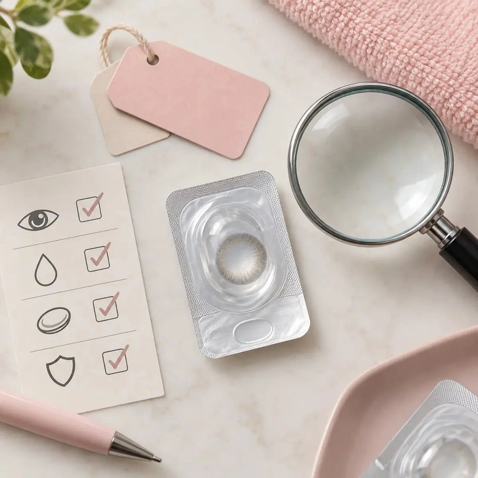
Care & authenticity
Colored Contact Lens Design Guide: Compare Color and Pattern

Choose a colored contact lens design by first naming the effect you want, then comparing the exact shade, print, coverage, edge, and graphic area shown for each product. These details help you compare style; they do not establish prescription, fit, or a guaranteed appearance. Confirm the exact lens with an eye-care professional before wearing it.
In this guide
Start with the effect you want
Colored contacts can create a subtle shift, a brighter color, a more outlined iris, or a graphic pattern. Begin with the look you want rather than assuming one lens is best for every wearer. Write down a few observable details, such as “cooler blue,” “more visible color,” “defined edge,” or “soft transition.”
A product’s shade name may be creative rather than a precise color description. Compare the exact product images and specifications after confirming the correct model and available options. For a checklist focused specifically on what can make a lens appear natural, see our natural-looking colored contacts feature guide.
Compare six design details
- Base shade and undertone: Observe whether the pictured color appears warm, cool, or neutral. Similar color names can refer to different shades across brands.
- Color coverage and opacity: Check how much of the iris appears colored in product examples. Photos cannot guarantee the same coverage on your natural eye.
- Print pattern: Look for layers, spokes, dots, flecks, or a more diffuse design. Fine details may be more visible in macro photos than at ordinary distance.
- Outer edge: A defined ring may create a more outlined look in an image; a softer edge can create a different impression. Neither describes lens fit.
- Center transition: Compare how the print approaches the clear pupil area and whether the border appears sharp or gradual in the product image.
- Graphic diameter (G.DIA): When listed, this describes the printed colored area. It is different from total lens diameter and cannot by itself predict the result.
These are ways to describe visible design details, not standardized ratings. Record what the product page actually states and what you infer from its images separately.
Match features to your style goal
Compare the same details for each candidate:
- Choose the intended effect: a color shift, more contrast, a defined ring, or a more graphic pattern.
- Confirm that each image shows the exact brand, model, shade, and version.
- Compare the base shade, coverage, pattern, edge, center transition, and G.DIA when available.
- Note details the listing does not provide instead of guessing from a similar product.
- Ask a seller or manufacturer to clarify product specifications; ask an eye-care professional about the exact lens and fit.
If your goal is a more enlarged-looking circle lens, see our guide to comparing print and proportion for a big-eye style effect. For definitions of overall DIA and G.DIA, use the circle lens measurement guide.
Compare product photos carefully
Product photos show examples rather than controlled previews. Natural iris color, lighting, exposure, camera distance, image crop, editing, and screen settings can change the pictured effect. A macro view is useful for examining print detail; a portrait can show how the design is presented with the full face.
When comparing two designs, use similar image types and check that the selected shade matches the exact listing. A digital try-on can help you think about style, but it cannot confirm a prescription, fitting, or exact result for you.
Check the exact product listing
Verify the brand, model, selected color, prescription options, package quantity, lens type, and replacement schedule for the exact product. Product catalogs can place several shades or models on one page, so recheck your selected variant and cart before checkout. Do not copy measurements, material, or care instructions from another lens in the same collection.
If a product detail is missing or conflicting, ask the seller or manufacturer which value applies to the version you are considering. A photo or style description is not a substitute for model-specific instructions.
Keep design separate from prescription and fit
A cosmetic pattern does not show whether a contact lens fits your eye. In the United States, decorative colored lenses require a prescription and professional fitting even when they do not correct vision. Requirements differ by country. Ask an eye-care professional to assess the exact product, prescription for each eye, and applicable parameters.
Do not select a lens, change its parameters, or substitute a different model based on color, G.DIA, or similar-looking specifications. Follow the wearing, removal, cleaning, and replacement directions for the exact lens. If you experience pain, unusual redness, light sensitivity, discharge, or blurred vision, remove it and contact an eye-care professional promptly.
Frequently asked questions
How do I choose a colored contact lens design?
Name the visual effect you want, then compare the exact shade, coverage, print, edge, and center transition for each product.
Does a larger G.DIA guarantee a more dramatic look?
No. Pattern, contrast, coverage, natural iris, lighting, and photography also affect appearance. A number alone does not guarantee a result.
Is overall DIA the same as G.DIA?
No. Overall DIA is the complete lens diameter; G.DIA refers to the printed color area when stated.
Can product photos show exactly how a lens will look on me?
No. Product photos are examples under particular conditions and cannot guarantee an individual result.
Does choosing a color confirm that the lens will fit?
No. Style choice and professional fitting are separate. Ask an eye-care professional about the exact model.
Editorial note: Design descriptions and images are comparisons, not promises of appearance or fit. U.S. prescription and fitting information is based on FDA guidance. Requirements may differ outside the United States. This article does not replace an examination, fitting, or prescription.