Lens reviews & comparisons
Colored Contacts vs Natural Irises: How to Compare the Look

“Natural-looking” colored contacts are still manufactured lenses with printed designs placed over an individual iris. They can echo visual cues such as layered color and a soft edge, but they cannot reproduce another person’s natural iris exactly. Compare observable design details and treat photos as examples, not guarantees.
In this guide
- What “natural” means in lens descriptions
- How natural irises and printed patterns differ
- Features to compare when judging the look
- Translate appearance claims into questions
- How to evaluate product photos
- A practical process for comparing designs
- Three comparison examples
- Keep appearance separate from prescription and fit
- Frequently asked questions

What “natural-looking” means in a colored contact description
When people call a colored lens “natural,” they may mean that the color transition looks soft, the printed pattern is subtle, or the lens blends with the wearer’s natural eye color. The word is a subjective style description. It is not a regulated performance grade, a clinical finding, or evidence that the lens is invisible at every distance.
It helps to translate that description into details you can actually compare: How many colors appear in the print? Is the edge sharply outlined or softly blended? Are there visible spokes or repeated shapes? How large is the printed area? Does the clear opening around the pupil transition smoothly? A product page that describes these features gives you more useful information than the word “realistic” by itself.
Even a design created to look understated remains a printed lens placed over an individual iris. A subtle design may appear more noticeable under flash or close-up lighting, while a stronger print may look softer in a portrait. Your natural iris, the lens pattern, lighting, camera settings, and individual perception all affect the impression.
How natural irises and printed patterns differ
Natural irises vary from person to person. Their color and visible texture are not a uniform graphic. A colored contact lens, by contrast, uses a manufactured pattern in defined zones. Some designs use several tones, dots, spokes, gradients, or an outer ring. These printed details can echo visual cues people associate with natural eyes, but the pattern is still produced as a repeatable design.
This distinction is useful when a description suggests that a lens “copies” or “matches” a real eye. A product can imitate a general visual effect, such as a softer transition or layered color, without duplicating the unique details of any one person’s iris. Look for the exact design evidence and avoid reading an image as proof of biological identity or a guaranteed outcome.
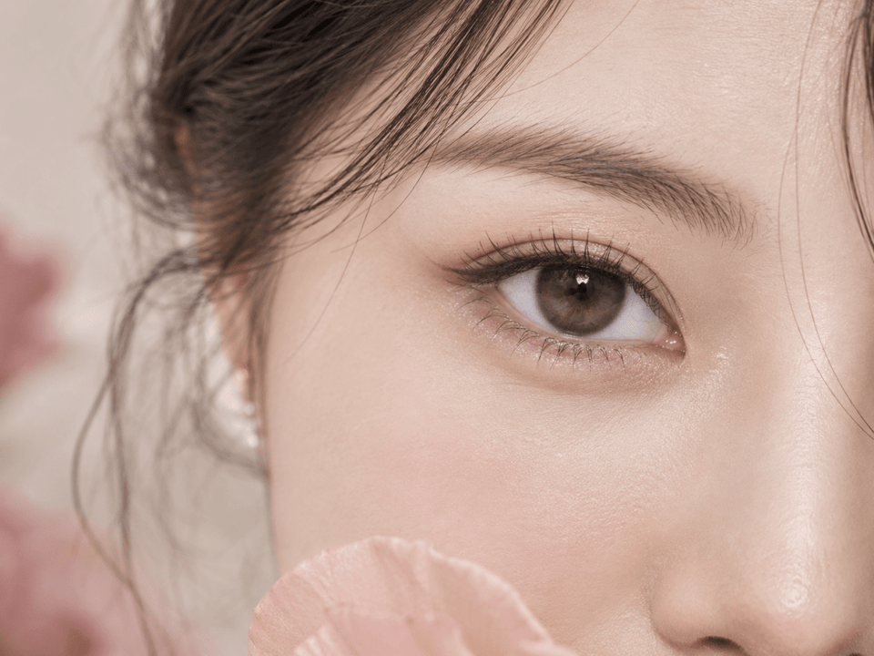
A close-up photograph can make texture appear more pronounced than it does at face distance. Conversely, a heavily edited or small image may hide the print. That is why it is helpful to use both a close-up for pattern detail and a normal portrait for the overall effect.
Features to compare when judging the look
| Feature | What to observe | What it can help you assess |
|---|---|---|
| Color layers | One main tone, several blended colors, or contrasting inner and outer zones | Whether the design looks flat, layered, or more expressive |
| Printed repeat | Dots, radial spokes, repeated shapes, or a more diffuse pattern | How clearly the manufactured print may show in a close view |
| Edge definition | A visible ring, a softened border, or a gradient into the natural iris | Whether the look feels more framed or blended in the example |
| Center transition | How the printed color approaches the clear pupil opening | Whether the color boundary looks abrupt or gradual in the image |
| Graphic diameter | The diameter of the printed colored area, which can differ from the lens diameter | How much of the iris the design is intended to cover; it does not establish fit |
| Photo context | Lighting, camera distance, image crop, retouching, and model’s natural iris | How cautiously to interpret the displayed result |
Keep observations separate. For example, note “soft outer edge” as a visible design feature and “may blend more gently in this photo” as an interpretation. Avoid jumping from a single feature to a universal conclusion such as “invisible” or “looks natural on everyone.”
Translate common appearance claims into specific questions
Product descriptions often use language such as “natural,” “realistic,” “blended,” or “enlarging.” These terms may help you understand the intended style, but they can mean different things across brands. Ask what feature the word refers to. Does “blended” describe a gradient at the edge, several colors in the print, or the way the model photo was styled? Does “realistic” refer to a close-up pattern or an overall portrait? A concrete answer helps you compare designs more fairly.
Likewise, “subtle” does not mean unnoticeable for every wearer. The apparent effect can depend on natural iris color, print coverage, contrast, distance, and light. “Enlarging” in a product description generally refers to a visual impression; it does not mean the lens changes the physical size of the eye. Check product details such as graphic diameter separately from aesthetic claims, and ask a professional about fit measurements.
Try rewriting a claim as a question you can answer from the page: “Can I see the edge transition?” “Is there more than one printed tone?” “Are the images for this exact color?” If the page does not show enough evidence, mark that detail as unknown rather than filling the gap with a guess.
How to evaluate product photos without overreading them
Product photographs help you compare style, but they are not controlled tests. White balance, exposure, flash, makeup, image editing, screen settings, and the model’s natural eye color can change the appearance. If a lens is shown only in a tightly cropped, brightly lit macro image, you may be seeing more detail and contrast than you would at ordinary face distance.
- Confirm the exact lens: Match the brand, model, shade, and product version to the listing. Similar shade names can refer to different prints.
- Use multiple views: Compare a close-up with a full-face or normal portrait view when available.
- Check the natural iris shown: It may help explain the sample, but it does not predict your result exactly.
- Consider lighting: Look for natural-light and indoor examples instead of relying on one studio image.
- Read specifications separately: Product photos do not show prescription options, fitting parameters, replacement schedule, or care instructions.
- Treat user images as personal examples: Their lighting, camera, and eyes may differ from yours.
If the seller does not identify the exact product or the specifications are unclear, ask for the product details before ordering. A descriptive label such as “real iris” or “natural blend” cannot replace a clear product identity.
A practical process for comparing two designs
- Choose your goal: Do you want a subtle color shift, more contrast, or a clearly styled effect?
- Start with your natural iris: Use a neutral-light photo as a reference, knowing that your screen can still shift the colors.
- Record the exact products: Note brand, model, shade, and version so you compare the right items.
- Compare one feature at a time: Look at the edge first, then the color layers, print pattern, center, and graphic diameter.
- Review the context: Compare similar crops and lighting; do not rank designs from dissimilar photos alone.
- Separate observation from prediction: Describe what the product image shows, then remember that your own result may differ.
- Confirm suitability independently: Ask an eye-care professional about the exact lens, prescription, and fit before wearing it.
For example, if two lenses use a similar brown shade, one may have a soft gradient while the other has a pronounced ring. You can compare those visible details and decide which style you prefer without claiming that either will disappear on your eye. A careful description is more trustworthy and makes product comparison easier.
Three comparison examples
Imagine one design with a soft brown gradient and another with a dark outer ring. The useful comparison is that the first appears to have a more gradual edge in the product image while the second appears more defined. You can describe those features and choose the style you prefer. You cannot conclude from the image alone that the first will be invisible or the second will look the same on everyone.
Now compare the same lens in a macro image and a face-distance portrait. The macro may show repeated print details clearly, while the portrait may show how the shade integrates with makeup and the rest of the face. Both views answer different questions. If only one view is available, keep that limitation in mind.
Finally, suppose two retailers use nearly identical shade names. Check the manufacturer, product line, model, and package details before treating the listings as equivalent. Product naming can be similar even when the printed designs differ. Comparing the exact item avoids turning a naming shortcut into a product assumption.
A compact note can make a comparison easy to revisit: write down the lens name, visible edge, colors in the print, photo distance, and any missing product detail. Add a separate line for questions about fit and prescription to take to your eye-care professional. This keeps the visual review useful without making a photo carry more weight than it can support.
For a focused example comparing brown circle lens shades and patterns against blue eyes, see our brown circle lens shade and pattern guide.
Keep appearance separate from prescription and fit
A visual description cannot show whether a lens fits your eye. In the United States, colored and decorative contact lenses require a prescription and professional fitting, even when they do not correct vision. The FDA explains the prescription requirement for colored and decorative lenses. Its contact lens buying guidance also says to verify the exact brand, power, and applicable fitting details; rules outside the U.S. may differ.
Ask an eye-care professional to confirm the exact brand or model, prescription for each eye, and product-specific parameters before choosing a lens. A prescription for one lens does not automatically establish that another product with a similar color or measurement is suitable. Use the exact instructions for wearing, cleaning, replacement, and follow-up.
If a lens causes pain, unusual redness, light sensitivity, discharge, or blurred vision, remove it and contact an eye-care professional promptly. Do not keep wearing a lens because a product image looked appealing or because the design was described as natural.
These examples show why a useful comparison separates what you can observe from what you cannot know from a photograph. Describe the image first, identify what the product page confirms, and reserve personal appearance predictions for trying a professionally fitted lens under appropriate conditions. That approach is helpful for browsing and avoids overstating what marketing pictures demonstrate.
Frequently asked questions
Can colored contacts look exactly like a natural iris?
A printed lens may imitate broad visual cues such as layered tones or a soft edge, but it remains a manufactured pattern over an individual iris. No product photo can guarantee an exact match.
Does “natural-looking” mean a lens is invisible?
No. “Natural-looking” is a style description. The design may still be visible at close range, under flash, or in certain lighting.
Which view is best for judging a lens design?
Use both a close-up to inspect the print and a normal portrait to consider the overall effect. Compare images made in similar lighting when possible.
Can a macro photo prove that a lens is realistic?
No. A macro can reveal pattern detail, but it may exaggerate texture and does not show how the lens will look on every wearer.
Is graphic diameter the same as the full lens diameter?
No. Graphic diameter refers to the colored printed area. It is different from the lens’s overall diameter and does not confirm whether the lens fits your eye.
Do decorative or plano colored contacts need a prescription?
In the United States, FDA guidance says decorative colored contacts require a prescription and professional fitting, even if they do not correct vision. Check the applicable rules where you live.
Editorial note: U.S. prescription and purchase information is based on current FDA decorative lens guidance and FDA buying guidance. Styling observations are editorial and do not claim a controlled wear test, guarantee a result, or replace an eye examination, professional fitting, or current prescription.