Lens reviews & comparisons
Colored Contacts for Dark Eyes: How to Compare Color and Design
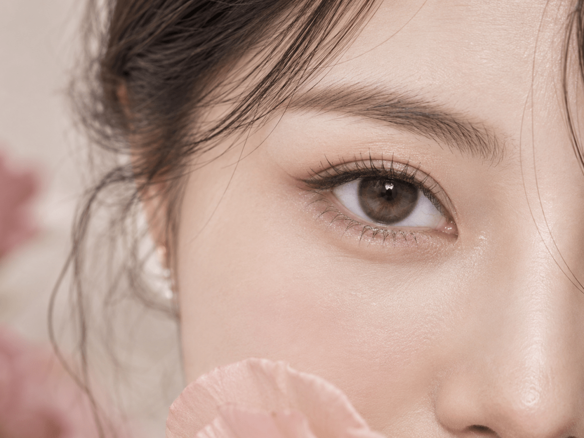
Colored contacts for dark eyes can look soft, bright or highly defined depending on more than the shade name. To compare designs realistically, look at the printed color, coverage, iris pattern, inner blend and outer edge together, then check the exact lens and prescription details before choosing.
In this guide

Why the same color looks different on dark eyes
The short answer is that a lens is a printed design placed over a natural iris. The visible result depends on how the design interacts with the wearer’s natural eye color, the lens’s printed area, the distribution of pigment and the lighting. Two lenses both labeled “gray,” “hazel” or “brown” can therefore produce different impressions.
Dark eyes do not all have the same iris color or pattern. Some appear deep brown in most lighting; others show amber, reddish or lighter details up close. The lens design also matters: a broad, relatively uniform color field reads differently from a pattern that leaves fine spaces between printed elements or blends several tones. These visual differences can affect whether a lens appears like a gentle shift, a stronger color change or a more outlined iris.
There is no universal rule that one color will cover every dark iris or look natural on everyone. Use close-up images as a way to compare the design itself, not as a guarantee of the final color. If the retailer provides an on-eye image, treat it as one example with its own lighting, camera and eye color.
Five design details to compare
1. Printed color and coverage
Check how much of the visible iris appears to carry printed color and whether the design uses one main tone or several. A more continuous printed area can create a more noticeable color shift, while a layered pattern may preserve visible variation. Product photos may not reveal the exact coverage under every condition, so compare several views when available and read the product’s description rather than inferring coverage from the color name.
Coverage is not a clinical measure and does not determine whether a lens fits. It is a visual design feature. A color that appears vivid in studio photography may read differently against a particular natural iris, in dim indoor light or in bright daylight.
2. The inner blend around the pupil
Look at how the printed pattern approaches the clear pupil opening. Some designs use a gradual transition or small irregular details; others have a more visible boundary between the printed iris and the clear center. This transition can influence whether the color appears softly integrated or distinctly patterned.
Compare the central area at full image size. A small thumbnail can hide the details that make a design look blended or graphic. Also check that product imagery does not suggest that the colored portion covers the pupil; the pupil must remain clear for vision.
3. Spokes, flecks and tonal variation
Many lens designs use radial lines, flecks or multiple tones to suggest iris texture. Ask whether those details are subtle or high contrast, evenly repeated or irregular, and close to the main color or noticeably different. Fine, low-contrast details may feel quieter in a product image, while sharp lines or contrasting accents may read as more stylized.
These are descriptions of the print, not promises about how a wearer’s iris will appear. A design’s visual character depends on the complete pattern and viewing distance. The same small detail can be prominent in a macro photograph and barely noticeable in an ordinary conversation.
4. The outer ring
The limbal area is the outer region of the iris. In product designs, a darker printed border can make the iris appear more outlined. Compare the ring’s width, darkness and edge: a crisp, dark border creates a different impression from a narrow, softly blended one or a design without a distinct ring.
A pronounced ring is not automatically more natural or more flattering. If you want a subtle effect, consider whether the edge blends with the rest of the design and whether the natural iris remains visually connected to it. If you want a graphic or defined look, a clearer boundary may fit that style better.
5. Graphic diameter and visible iris size
Some designs print color across a wider portion of the iris than others. Compare the colored graphic area shown in the product specifications if it is provided, and distinguish it from the lens’s overall diameter. These measurements describe different things. A lens’s total diameter includes the portion that sits beyond the visible colored print.
Do not choose a lens size by appearance alone. The printed diameter is a design detail; the lens’s overall dimensions and base curve relate to the specific product and professional fitting. A larger printed area does not guarantee a particular enlargement effect or a suitable fit.
Set realistic expectations for dark eyes
Color names are not standardized descriptions of the final result. “Olive,” “gray,” “honey” and “hazel” can refer to very different undertones and print patterns across brands. When comparing colored contacts for dark eyes, use the name to narrow the search, then use the actual design, product images and specifications to understand what is being sold.
Look at the product image’s lighting and presentation. Is the eye photographed under bright, even studio lighting? Is the model’s natural iris visible elsewhere? Has the image been retouched? Is there more than one example? These questions help you avoid treating a single polished image as a universal outcome.
On-eye photos can be useful, but only as individual examples. Natural iris color, pupil size, the amount of light, camera exposure and image editing can all change how a color is recorded. If you compare photos, try to use images with similar lighting and viewing distance. Do not assume that a result shown on one model will be identical on your eyes.
“Natural-looking” is also a personal preference rather than a technical guarantee. One person may prefer a visible ring and an obvious color change; another may prefer a low-contrast pattern close to their natural iris. Decide which features you want to see instead of treating naturalness as a single objective scale.
A step-by-step comparison method
- Choose the visual direction. Decide whether you want a subtle change, a warmer or cooler tone, a stronger color shift or a more defined iris outline. This narrows the design features worth comparing.
- Compare the same kinds of images. Review a close-up of the lens pattern, any on-eye examples and the product details. Avoid comparing one brand’s macro image with another brand’s heavily lit model photo as if they were equivalent.
- Inspect the inner and outer edges. Note how the color transitions near the pupil and whether the outer ring is absent, soft or clearly defined. These two edges often change the overall impression more than the color label.
- Look for more than one tone. Identify the main shade and any accents. Consider whether the contrast between them looks delicate, obvious or graphic in the available images.
- Check what the listing actually specifies. Confirm the exact lens model, replacement schedule, material information, available powers and product measurements. Do not infer missing specifications from a photograph.
- Separate style from suitability. Once you have a preferred design, confirm with an eye-care professional that the exact lens is appropriate for your eyes and prescription. A good visual match does not establish fit.
- Recheck before checkout. Match the product name and parameters in the cart to the exact lens you reviewed. Similar names or colors can belong to different models.
| Design detail | Questions to ask | What it helps you compare |
|---|---|---|
| Main color and coverage | Is the print mostly one tone or layered? How much of the iris appears colored? | Potentially subtle versus more noticeable color shift |
| Inner blend | Does the pattern fade toward the clear center or form a visible boundary? | Soft versus more graphic transition |
| Pattern contrast | Are the flecks and spokes close in tone to the base color? | Quiet texture versus pronounced detail |
| Outer ring | Is its edge absent, soft, narrow or dark and crisp? | Less outlined versus more defined appearance |
| Graphic diameter | What area is colored, and how does it differ from the full lens diameter? | Printed design area, not a fit decision |
How different design combinations may read
A design with a soft inner blend, similar-tone flecks and a subtle edge may read as a gentler change in some images. A design with brighter pigment, a sharper ring and high-contrast spokes may look more defined or stylized. These examples describe combinations of visible design features; they do not predict an individual wearer’s result.
If you are choosing between two lenses, compare them one feature at a time. For example, if both have a similar base shade but one has a darker ring, ask whether the ring is the difference you want. If the colors differ as well, you cannot tell from those images alone which single feature accounts for the overall impression.
For a more controlled comparison, write down the product name and note four details: main shade, inner transition, print contrast and outer ring. Then add the published graphic diameter if available. This simple record makes it easier to compare models without relying on memory or marketing terms.
For a broader comparison across colored lens designs and visual goals, see our colored contact lens design guide.
Prescription and product checks before buying
Colored contact lenses are medical devices, including decorative lenses that do not correct vision. In the United States, the FDA says decorative lenses require a prescription and proper fitting. Read the FDA’s guidance on colored and decorative contact lenses. Requirements elsewhere may differ, so check the rules where you live and where the order will be delivered.
Use a current contact lens prescription and confirm the exact brand or model and the parameters prescribed for each eye. A glasses prescription is not a substitute for a contact lens prescription. Do not borrow another person’s lenses, swap to a similar-looking model or change a prescribed power based on a style preference.
Before ordering, verify the seller’s prescription process, product label, replacement schedule and care instructions. Once opened, use and replace lenses according to their exact manufacturer instructions and your eye-care professional’s guidance. The CDC’s contact lens wear and care guidance covers hygiene and safe handling. If you experience pain, unusual redness, light sensitivity or blurred vision, remove the lenses and contact an eye-care professional promptly.
For KPOP2 product browsing, use the colored contacts collection to explore available styles, then open the exact product page and review its current options and specifications. Availability can change; confirm the selected model and prescription details in the listing before ordering.
Questions and answers
Which colored contacts show up best on dark eyes?
There is no single design that will look the same on every dark iris. Compare the exact print, color coverage, contrast and on-eye examples, and remember that lighting and natural eye color affect the appearance. Product photos cannot guarantee your individual result.
Can colored contacts completely cover dark brown eyes?
Do not assume complete coverage from a shade name or studio photo. Printed color and natural iris color interact, and images are not controlled wear tests. Review the product details and available examples, and ask the seller or manufacturer about product specifications if they are unclear.
Do dark eyes need a special lens color?
Not necessarily. The right comparison depends on the visual effect you want and the exact lens design. A color that looks vivid in one example may appear different in another person’s lighting and iris.
What makes colored contacts look more defined?
A more noticeable outer ring, stronger contrast between print tones or a clearer pattern can make a design appear more defined in product images. This describes the print, not a guaranteed result on an individual eye.
Does a larger graphic diameter mean the lens will fit differently?
Graphic diameter describes the colored print area. It is different from the full lens diameter and does not establish fit. Have an eye-care professional confirm the exact lens and its fit.
Can I wear colored contacts without vision correction?
In the United States, decorative lenses without vision-correction power still require a prescription and proper fitting. Check your local rules in other countries and use an eye-care professional for individual suitability.
How can I compare natural-looking and bold designs?
Compare the same features for each lens: shade, print coverage, inner blend, pattern contrast, outer ring and graphic diameter. “Natural-looking” is subjective, so decide which details you personally prefer.
Editorial note: Visual descriptions in this guide are design comparisons, not promises of a particular appearance. U.S. prescription and handling statements are linked to current FDA guidance and CDC guidance. This article does not replace an eye examination, contact lens fitting or current prescription.

