Lens reviews & comparisons
Brown Contacts for Dark Eyes: How to Compare Photos and Patterns

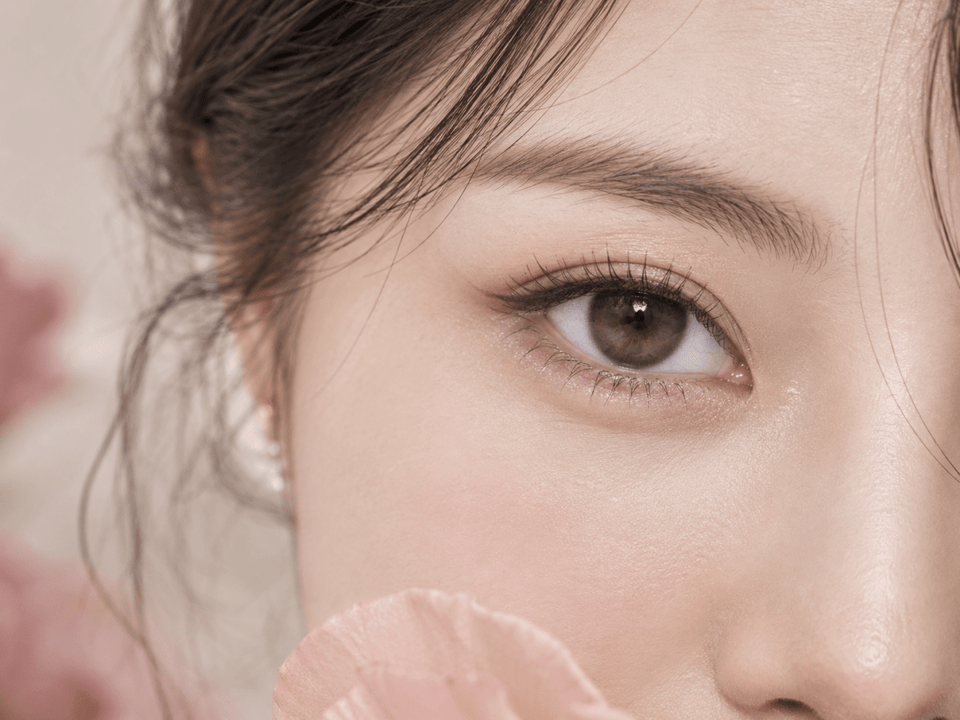
Compare brown contacts for dark eyes with two kinds of evidence: exact-product pattern details and photographs taken under comparable conditions. The outer edge, mid-iris coverage and inner fade explain what the print is designed to do. A close-up shows those details; a face portrait shows whether the finished eye reads subtly brown, warm hazel or more defined in context.
In this guide

Start with the brown-eye result you actually want
“Brown contacts for dark eyes” covers several different looks. You may want a slightly clearer version of your existing brown, a warmer honey or hazel cast, or a defined darker outer ring. These are different goals. Write yours in a short sentence before reviewing images so a bright studio photograph does not quietly change the brief.
For a subtle result, ask whether the lens adds texture and depth at normal face distance. For a visible color change, ask whether the mid-iris print remains noticeable on a similarly dark natural iris in ordinary light. For definition, pay attention to the outer edge rather than assuming a lighter brown will create it.
“Natural,” “choco,” “latte” and “mocha” are not standardized pigment or opacity grades. A lens in one named family can be lighter, darker, warmer or more graphic than another brand's version. Compare the exact print and verified product record, not just the words in the title.
Read the exact lens from outer edge to center
Outer edge: definition and apparent size
A dark or continuous ring can sharpen the iris boundary. It may also make the colored area seem wider. A broken or feathered edge can give a softer transition. If you want a quietly defined eye, look for a perimeter visible at portrait distance without becoming a heavy black circle. If you want a doll-eye effect, a strong ring may be a deliberate choice.
Mid-iris: color coverage and texture
The mid-zone often decides whether a brown lens looks different on a dark iris. Dense lighter strokes can create a visible honey or caramel change. Transparent openings let your original brown show through and can make the result more layered. A product swatch helps reveal print placement, but it cannot show the final combined color on your eye.
Inner zone: the meeting with your natural iris
A gradual fade near the pupil can avoid a hard circle between printed and natural color. Amber, beige or transparent inner details can change the warmth of the finished eye. Pupil size changes with light, so the inner transition may appear different in daylight and dim conditions.
Describe these three zones separately for every candidate. “Thin brown edge; open caramel mid-zone; soft amber fade” is more useful than “pretty brown.” It lets you compare two exact products even when their catalog names and photograph styles differ.
Each image type answers a different question
| Image | Useful for | Main limit |
|---|---|---|
| Print swatch | Color layers, pigment placement and transparent spaces. | No natural iris behind the print. |
| Lens-on-white close-up | Outer ring and inner transition. | White background can make pale pigment look brighter. |
| Identified eye close-up | One example of the print over an iris. | Lighting, editing and natural iris vary. |
| Full-face portrait | Whether the effect reads subtle or bold at social distance. | Makeup, camera and face context influence perception. |
Do not let a print swatch answer the portrait question. A beautiful pattern can disappear into a dark iris at distance. Likewise, a portrait that looks natural may hide the exact print construction. Use both to understand why a result appears as it does.
Check image identity every time. Is the photograph labeled with the exact brand, series, shade and daily or reusable format? A category banner may show a different lens. A customer photograph may omit the variant. If the match is uncertain, record it as a possible example rather than product evidence.
Make photo comparisons fair enough to be useful
Try to compare images on similarly dark natural irises. A caramel print on a medium brown model eye may show more color than it does on a nearly black-brown eye. The exact outcome still varies within those categories, but a similar starting base is more informative than a random model image.
Lighting matters. A bright daylight photo may reveal amber spokes that disappear under warm indoor light. A darker photo can make even a layered pattern look uniform. Camera exposure and white balance affect the shade shown on screen. If one image is much brighter than another, do not call the brighter lens “more pigmented” on that basis alone.
Keep viewing scale consistent. A macro image that fills the screen with the eye exaggerates fine print detail. A portrait shows the result in a face. When comparing two products, use similar crops, similar head angle and similar light if you can. A front-camera selfie taken close to the face is not equivalent to a portrait from farther away.
Look for unfiltered images, but remember that “unfiltered” does not mean controlled. Phone cameras still process contrast and color. Treat photographs as qualitative examples. If a detail is missing, such as the model's natural iris or camera setting, state that limit rather than turning the image into a guarantee.
Compare common brown design directions
Deep choco or espresso
Darker prints can add a stronger boundary and make the iris look more defined while staying in a familiar color family. Inspect whether the center contains lighter strokes or transparent areas; a uniformly dark disc may look flat on an already dark eye. A strong ring can create a deliberate rounded look.
Warm honey or caramel
Lighter warm pigment can be more visible on dark brown eyes. Check mid-zone coverage and inner fade to see whether the color appears layered or like a separate light ring. A swatch may promise a vivid amber; an identified portrait tells you whether that warmth survives ordinary viewing distance.
Neutral or taupe brown
Cooler brown can add soft dimension without as much golden warmth. It may appear slightly gray in cool light and more brown under warm indoor light. Compare at least two environments if the exact tone matters to you. A shade name alone will not tell you how warm or cool the print is.
These directions are style descriptions, not fixed rankings. The best candidate depends on your iris, desired contrast and the exact product you can be professionally fitted to wear.
A six-step shortlist for dark eyes
- Define the finish. Choose subtle depth, visible warmth or stronger outline as the primary goal.
- Identify each product. Record exact brand, series, shade and replacement format. Keep similar versions separate.
- Describe the three zones. Note outer edge, mid-zone coverage and inner transition.
- Pair images by role. Use an exact-product close-up for print detail and a face portrait for overall effect.
- Compare ordinary conditions. Seek brown-eye examples in indoor light and daylight, and keep exposure differences visible.
- Confirm suitability and stock. Check current specifications, prescription options and your eye-care professional's fitting advice.
Use a note such as “Candidate A has a dark thin edge, open warm mid-zone and subtle indoor result; Candidate B has stronger caramel coverage and a more visible portrait result.” That tells you what the tradeoff is. A stack of unlabeled images makes it easier to confuse products and conditions.
If evidence is poor, ask a narrow question: “Does this eye photo show the monthly shade named X?” or “How many individual lenses are in this box?” A specific answer can resolve a decision faster than gathering more generic marketing photographs.
Check the source before treating a photo as evidence
An image on a product page may be a manufacturer render, a studio photograph, a model image or a customer upload. Each can help, but each has a different limit. A render may represent the intended print cleanly without showing the actual result on an iris. A studio image may be carefully lit. A customer upload may show ordinary conditions but omit the exact variant or camera processing. Label the source in your notes.
If an image is reused across multiple shades or versions, do not assume it documents every product displayed beside it. Open the individual product record and check its caption or variant selection. A before-and-after pair is helpful only if both images use the same eye, lighting, camera distance and editing. Otherwise, the visual difference includes more than the lens.
When customer photos disagree, ask whether both show dark brown irises and the same product version. One wearer may have warm amber detail while another has nearly black-brown eyes. The photos can both be honest. The useful conclusion may be a range of possible outcomes rather than a single promised color.
Return to the current exact product page
Before ordering, verify the brand, series, shade, replacement schedule, pieces per box and available prescription selections. Do not assume a daily and a monthly lens with a similar name have identical prints, materials or wear routines. The product page and manufacturer's information are the source for current catalog facts.
Use a current contact lens prescription for each eye. In the United States, the FDA's buying guidance calls for a valid prescription and warns against unapproved substitutions. Requirements elsewhere vary. A zero-power colored lens is still a contact lens and needs appropriate fitting and care.
A visually similar brown lens is not automatically a suitable substitute for the model your eye-care professional fitted. Matching one number, such as base curve or power, does not prove the products are interchangeable. Ask about an appropriate alternative if the desired exact shade is unavailable in your prescribed configuration.
Wear and care do not come from a photograph
Follow the selected lens's approved replacement schedule and handling directions. The CDC's prevention guidance covers washing and drying hands, keeping lenses away from water, using recommended solution for reusable lenses and carrying backup glasses.
Remove a lens and contact an eye-care professional if you develop pain, persistent redness, unusual light sensitivity, discharge or blurred vision. A model image cannot confirm comfort or safety on your eye. Product support can answer questions about an order, but eye symptoms require professional advice.
Browse Brown Contacts or Colored Contacts for Dark Eyes to discover candidates, then verify the exact product and prescription before checkout.
KPOP2 Editorial Team · Reviewed September 27, 2026. Visual comparisons are editorial observations and do not claim controlled wear tests or guaranteed individual results. Prescription and care guidance follows the linked FDA and CDC resources.