Lens reviews & comparisons
Cocoview Glossy Contacts: Compare Highlight Placement

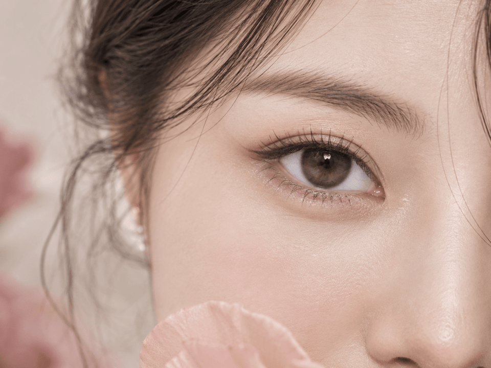
A “glossy” colored contact design can look as though light is caught inside the iris. That effect may come from the printed pattern, real light reflecting from the eye, editing, or several of these at once. To compare Cocoview glossy lenses, identify where the bright printed accent sits relative to the pupil and outer ring, then look at the same design under matched gaze and lighting. A single model photograph cannot promise that the highlight will stay in one position on your eye. Use appearance evidence to build a shortlist, then check the exact lens and your fitting guidance separately.

First decide what you mean by “glossy”
One shopper may mean a small bright accent beside the pupil. Another may mean a broad, diffused shine across the colored field. A third may be responding to a photographer’s catchlight, which is a reflection from a lamp or window rather than a printed lens detail. Before comparing products, point to the exact area you like. Is the appeal the highlight’s shape, its position, the surrounding color, or the contrast against a dark outer ring?
A product name such as “Glow” or “Crescent” can help you find a design, but the name is not evidence of how the pattern will appear on every eye. A dark iris, a light iris, and different lighting can change how much of the print is visible. The printed feature is also only one part of the look: outer-ring density, inner blending, graphic size, and makeup affect the full-face impression.
Decide whether you want a highlight that appears near the pupil, toward the outer iris, or between those zones. A tighter inner accent may draw attention to the pupil area; a broader outer accent may create a more expansive shimmer. These are styling descriptions, not measured claims about any Cocoview model. Verify the actual print on the exact product images you are comparing.
Map the printed highlight before judging it on an eye
Begin with a flat pattern image if the listing supplies one. Imagine the pupil at the center of a clock face. Record whether the bright or pale printed area is concentrated near the top, bottom, left, right, or distributed around the circle. Also note whether the accent is continuous, broken into points, or blended into the base shade. This simple map makes it easier to recognize a printed feature in later on-eye photos.
Then check how close the accent sits to the clear central opening. A bright inner band can create a different effect from a highlight near the outer rim. The clear opening is a visual design feature in this comparison; it is not a fit measurement. Do not infer suitability, vision quality, or pupil coverage from a marketing close-up. Those questions require the actual lens specifications and professional guidance.
Record the surrounding color. A pale printed stroke in a deep brown design may look pronounced, while a similar stroke in a light gray design may be subtler. The perceived shine comes from contrast as much as from the highlight’s size. Compare patterns at a similar image scale rather than placing a large macro photograph beside a small thumbnail.
Finally, note whether the design is asymmetric. A highlight concentrated in one sector may look different as the lens moves. A repeated or distributed pattern may appear more even from multiple angles. Neither design is automatically better; the choice depends on whether you want a noticeable editorial accent or a quieter, more consistent shimmer.
Printed highlight or real reflection? Use matched lighting
A real catchlight is created by the lighting setup and can appear over any eye, with or without colored contacts. It often has the shape of a window, ring light, or softbox. The lens’s print is physically part of the colored pattern. In a photograph, the two can overlap, and heavy editing can make the distinction difficult. Do not call every white spot a printed highlight.
Look for several images of the exact same model and shade. If a pale accent remains in a consistent place within the print pattern while the light source changes, it may be part of the design. If the bright spot changes shape or follows the lamp, it may be a reflection. A flat lens photo and an on-eye photo together are more informative than either alone. When only one promotional image exists, label the origin of the shine as uncertain.
Keep gaze direction similar while comparing products. A person looking straight at the camera and a person looking sideways reveal different parts of the iris. The eye may also be partly covered by an eyelid or lash. If one image has a strong ring light and another is taken in soft daylight, you are comparing photography as well as lenses. Match the light first, then describe the pattern difference.
Filters and color grading can shift the shade and contrast. A glossy effect enhanced in an advertisement may look quieter in ordinary room light. Seek a full-face view as well as a close-up. The close-up shows pattern placement; the full-face image answers whether that placement creates the effect you actually want for everyday styling.
What lens movement means for a localized highlight
A soft lens can move with blinking and gaze. A printed accent that appears high in one still photograph may not stay in exactly the same orientation during wear. Some product names include terms such as “axis-fixed,” but a name alone does not prove how the design will orient on your eye or whether it is clinically suitable. Ask for manufacturer details and professional assessment when orientation is central to the look you want.
Do not confuse visual movement with a diagnosis. If the lens repeatedly shifts, blurs vision, feels uncomfortable, or seems off-center, remove it and speak with your eye-care professional. A blog article cannot determine whether the cause is fit, handling, or another issue. Never try to solve a fit concern by selecting a different base curve or diameter yourself.
For a visual comparison, watch a short unedited video of the exact lens if one is available. Observe whether the bright sector changes position when the wearer blinks or looks to the side. A video still cannot predict your result, but it can show more than one frozen moment. If no such evidence exists, describe the printed location but keep worn orientation unresolved.
A simple method for comparing two glossy designs
- Name the exact models. Write the complete Cocoview product title and shade for each candidate. Do not merge daily and monthly versions under one color name.
- Identify the print. Use a flat pattern image to map the accent’s zone, shape, and surrounding color.
- Match on-eye views. Compare photos with similar gaze, light, crop, and starting iris color where possible.
- Check a full-face view. Decide whether the shine reads as an obvious highlight or a subtle texture at ordinary distance.
- Mark uncertainty. Note when the apparent shine might be a catchlight, editing, or an unverified orientation.
- Check the product facts. Confirm the exact replacement format, package contents, specifications, and prescription options before moving a candidate into your cart.
| Field | Candidate A | Candidate B |
|---|---|---|
| Exact model and shade | Write the full listing title | Write the full listing title |
| Bright print position | Inner, middle, outer, or distributed | Inner, middle, outer, or distributed |
| Highlight shape | Arc, flecks, band, or blend | Arc, flecks, band, or blend |
| Outer edge | Defined or diffuse | Defined or diffuse |
| Photo conditions | Record gaze and light | Record gaze and light |
| Unresolved point | List missing evidence | List missing evidence |
Do not score a lens as “better” merely because its highlight is brighter in one image. The useful choice is the design whose placement and overall effect suit your intended look under reasonably comparable evidence.
Use exact Cocoview listings as your starting points
KPOP2 currently lists Cocoview Glow Brown (10p) and a separate Cocoview Glow Brown monthly product. It also lists Glow Gray (10p) and Glow Blue (10p). These are useful names for a glossy-look shortlist, but the label “Glow” alone does not establish where a highlight is printed or how it will look on your eyes. Open each live page and inspect its pattern images.
If you want to compare a different kind of accent, consider current Crescent Brown and Crescent Gray listings. For a more localized design question, current Axis-Fixed Heart Ruri Brown is another exact product to inspect. The phrase “axis-fixed” is a product name, not a guarantee that a printed highlight will remain fixed on every wearer.
These links are examples, not a promise that every option is currently in stock or suitable for a particular prescription. Product specifications and availability can change. If a listing’s images do not make the print location clear, ask KPOP2 for a product-specific pattern view before ordering. Do not substitute an image from another shade or version.
Before ordering, separate design from fit
The FDA advises buying contacts with a current valid prescription and checking the exact brand and lens details. Colored contacts remain medical devices even when the reason for buying them is visual styling. Confirm the model prescribed or approved for you, the required values for each eye, and the current listing’s physical specifications and replacement schedule. A visual match between two Cocoview designs does not make them interchangeable.
Check right and left eye selections separately. A color may be available without your exact required power or other parameter. Do not choose a nearby value to complete the look. Confirm package count and the unit of sale in the current cart. A daily box and a monthly lens can require different care routines even when their product photos look similar.
Follow the product’s wearing and care instructions. Daily disposables are discarded after their stated single use; reusable lenses need the compatible cleaning and disinfection process. If you have pain, redness, discharge, light sensitivity, or worsening blur, remove the lenses and contact an eye-care professional promptly. Do not keep wearing them to test whether a highlight looks more even after a few hours.
Frequently asked questions
Does “glossy” mean the lens has a printed white highlight?
Not necessarily. The look may come from pale print, layered color, real light reflection, or photo editing. Inspect the flat pattern and multiple on-eye images of the exact lens.
Will a printed highlight stay at the top of my iris?
Do not assume it will. Lens movement and individual fit can change how a localized print appears. Ask about the exact product and your fitting if orientation matters.
Can I compare highlight position from two different studio photos?
Only cautiously. Gaze, lighting, crop, and editing may differ. Look for matched conditions or leave the comparison unresolved.
Does a larger graphic diameter create more shine?
No single number determines the glossy effect. Highlight location, contrast, surrounding color, and lighting also influence the impression. Graphic diameter does not establish fit.
Are Cocoview Glow daily and monthly products the same lens?
They are separate listings and replacement formats. Compare each exact model’s current specifications, images, and care instructions; do not assume interchangeability from a shared name.
What if a lens appears off-center or feels uncomfortable?
Remove it and contact your eye-care professional. Do not try to solve an apparent fit problem by changing lens measurements yourself.
Safety references: FDA: Buying Contact Lenses and CDC: Preventing Eye Infections When Wearing Contacts. Cocoview product examples were checked in KPOP2’s catalog in September 2026; verify current details on each live page.
Editorial method: this guide compares visible design evidence without claiming a controlled wear test or a guaranteed orientation for any highlighted pattern.