Lens reviews & comparisons
Eye Definition vs. Enlargement in Colored Contacts: What Changes the Look?
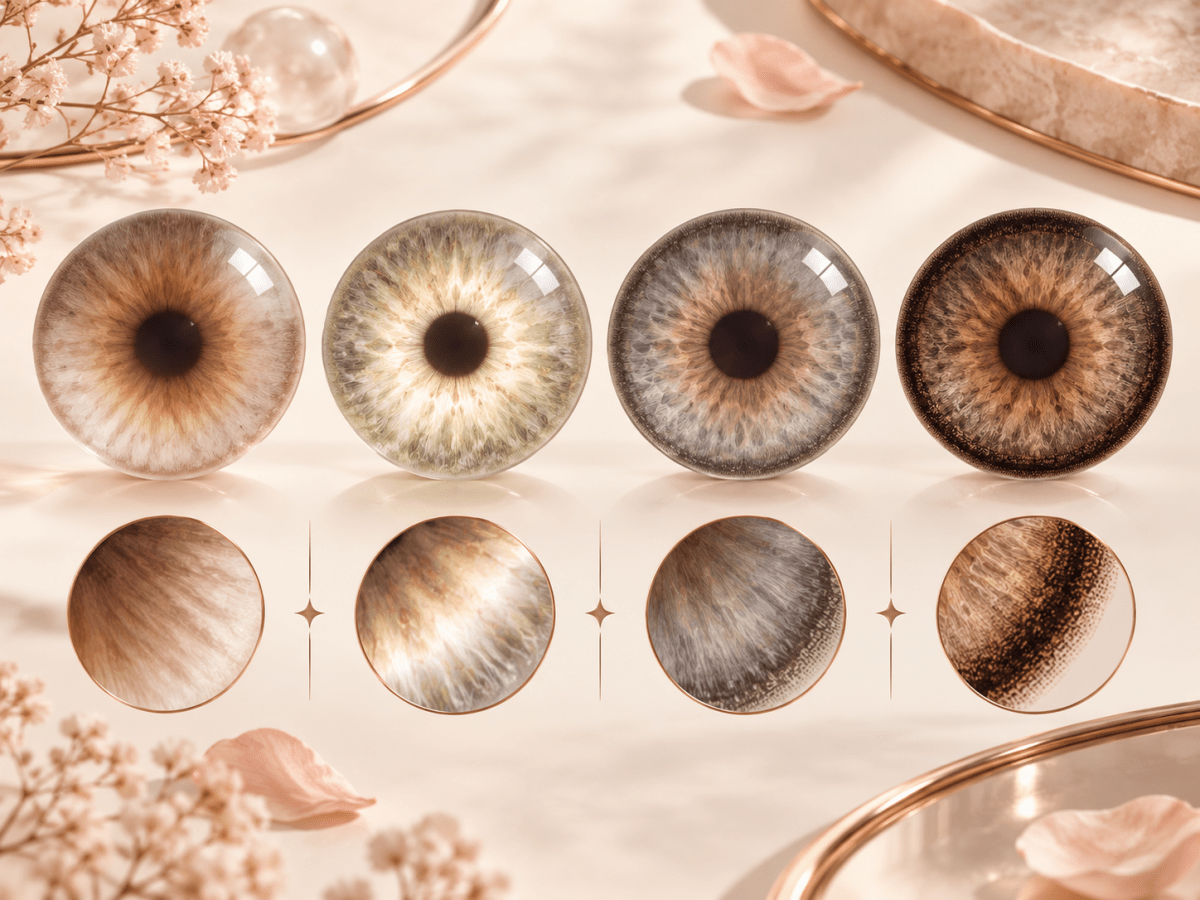
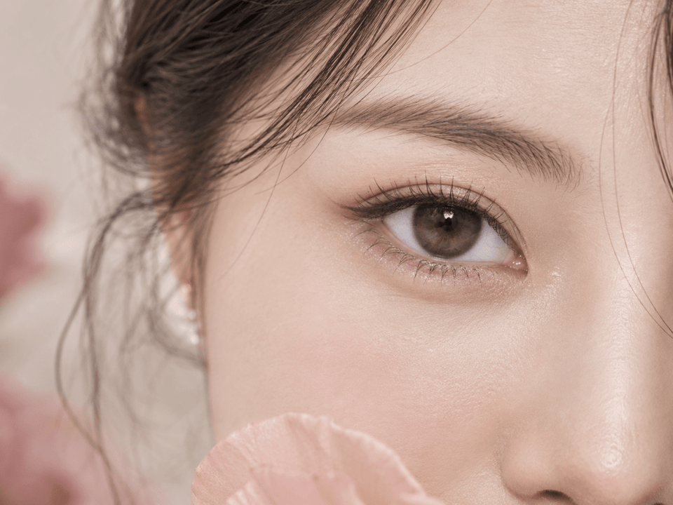
Definition and enlargement are separate effects in colored contacts. Definition makes the iris boundary or texture easier to see. Enlargement makes the printed iris area appear wider. A lens can create one effect, both, or neither. To compare designs fairly, evaluate edge contrast and printed spread separately before deciding which look fits your brief.
In this guide

Definition vs. enlargement: the practical difference
Imagine two questions at portrait distance. First, can you see the iris boundary more clearly than before? Second, does the colored area seem to occupy more of the visible eye? A “yes” to the first describes definition. A “yes” to the second describes apparent enlargement. The same lens may satisfy both, but answering them separately prevents a vague term such as “bigger eyes” from deciding your purchase.
Definition can come from a narrow limbal edge, clearer radial strokes or a color that increases contrast with the surrounding white of the eye. It is a matter of clarity and emphasis. Enlargement usually comes from a printed pattern that appears to extend farther outward, sometimes supported by a darker ring or an opaque outer gradient. It is a visual impression, not a physical change to your iris.
A lens may also make the eye look more noticeable without doing much to either boundary or size. A vivid central color can draw attention through hue alone. This is why shoppers should record “brighter color,” “sharper outline” and “wider-looking iris” as different outcomes. Product photos often combine them, while marketing labels may collapse them into a single adjective.
Look at the whole face as well as the eye. At close range, a fine ring may appear strong. At normal conversation distance it may read as a clean outline. Conversely, a broad printed area that looks balanced in a macro photograph can create a conspicuous size effect in a face portrait. Your preferred result is best judged at the distance where you expect to wear the lens.
Four design factors that change the result
| Design factor | Definition effect | Enlargement effect | What to inspect |
|---|---|---|---|
| Outer edge | A visible boundary can sharpen the iris outline. | A broad dark border may also increase apparent size. | Width, opacity and whether the edge is solid or broken. |
| Printed spread | Placement near the natural edge can emphasize shape. | Pigment that visually extends outward can widen the colored area. | Exact-product diagram, G.Dia when listed and identified images. |
| Opacity and contrast | Greater contrast can make texture and boundary clearer. | Opaque outer pigment may make the whole print read as a larger disc. | Natural iris color, neutral light and inner blending. |
| Pattern scale | Fine radial marks can create crisp detail. | Large spokes or gradients may attract attention without the same width change. | Close-up plus portrait image at similar scale. |
The factors work together. A dark edge on a restrained print may give strong definition with limited apparent enlargement. A wider translucent pattern may add size without a hard border. A highly opaque ring can do both. Do not infer the final appearance from one field while leaving the others unchecked.
These descriptions are editorial observations about design, not measured performance grades. Different brands use “limbal ring,” “natural,” “circle lens” or “enlarging” differently. A useful comparison stays tied to the exact lens version and the evidence provided for it.
The four outcomes you may see
Defined, with restrained size
The boundary looks clearer, while the visible colored area remains near your natural iris size. A slim or softly interrupted outer line is a common design route. This is the direction to explore if you want a polished eye in daily conversations. The result still varies with your natural iris and image conditions.
Enlarged, with a soft boundary
The printed area appears wider, but the perimeter is feathered rather than sharply outlined. This may create a gentle roundness. If you dislike a distinct ring yet want a slightly fuller-looking iris, compare outer gradients and printed spread. A product photograph must show the exact design to support that judgement.
Both defined and enlarged
A wider print combined with a strong perimeter can make the iris look rounder and more emphatic. This can suit a deliberate editorial or doll-eye style. Check full-face images because the size and contrast effects may be much stronger there than in a product swatch.
Neither strongly defined nor enlarged
A soft translucent pattern can change hue or add texture while leaving the boundary and apparent size relatively quiet. This is useful when you mainly want a subtle color shift. On a dark natural iris, low-opacity pigment may be less visible than the catalog image implies.
These are visual categories, not clinical lens types. They help you name the result you want, while fit, prescription and lens care remain separate requirements. A visually appealing category never makes a lens suitable for an individual eye on its own.
How to read diameter without overreading it
Overall diameter refers to the physical contact lens. Graphic diameter, commonly abbreviated G.Dia, refers to the approximate diameter of the printed design when a brand publishes it. The physical size is part of a fitted lens specification; it is not a style slider to adjust without professional guidance. Graphic diameter can help compare visible designs, but even that number does not reveal opacity, edge width or pigment distribution.
Two products can share a G.Dia and create different impressions. Picture a 13.2 mm print with a narrow broken edge and another 13.2 mm print with a heavy dark rim. The figures match, yet the second could appear more enlarging because the eye reads its outer shape more strongly. Conversely, a slightly broader translucent print may look softer than a smaller high-contrast ring.
Use measurements only for the exact brand, series, shade and replacement format. A collection can include daily, reusable, spherical or toric variants with different designs. If a product page does not show a reliable graphic diameter, record it as unknown. Do not estimate a specification from pixel measurements on a model photograph.
Diameter is also not a substitute for evidence of fit. The FDA's lens-type information describes different lens categories. Your eye-care professional determines what lens and parameters are appropriate for your eyes. A visually pleasing G.Dia tells you nothing definitive about comfort or medical suitability.
A fair way to compare product images
Start with image identity. Is the photo labeled with the exact shade and lens version, or is it a general collection image? Only the former can support a specific product comparison. If the model's natural iris color is stated, keep that note; the same print can look different on a darker or lighter base.
Compare a close-up and a face portrait for different reasons. Use the close-up to inspect edge texture, color layers and the center transition. Use the portrait to judge whether the iris boundary is clearer and whether the colored area seems wider at an ordinary distance. Neither image alone answers every question.
Keep lighting as consistent as possible. Bright frontal light can reveal fine strokes and make the pupil smaller. Dim light can enlarge the pupil, obscure the inner print and shift the apparent color. Exposure, white balance, camera distance, makeup and digital processing add further variation. Treat images as qualitative examples rather than controlled wear tests.
For a shortlist, create two columns: “boundary clarity” and “apparent printed width.” Put a short observation and its source in each. For example, “thin broken ring in identified close-up” belongs in the first column; “moderate outer spread in labeled portrait” belongs in the second. If you cannot judge one column, leave it blank. Missing evidence is a reason to ask for details, not a reason to guess.
If you can compare an earlier lens you actually wore, use a photograph taken at a similar distance and in similar lighting. Note exactly what you liked: the outline, the color, the texture or the apparent size. Your own image can clarify your style preference, but it cannot establish that a different lens will fit or feel the same.
Choose the effect that fits your styling goal
For everyday definition, prioritize an edge you can see at portrait distance without a broad opaque outer band. Keep printed spread moderate and look for a soft inner transition. If your natural iris is dark, compare real-eye images on a similar base rather than expecting the package swatch to predict the final color.
For a fuller, rounder eye in photographs, decide how much visible size effect you actually want. You may prefer a soft outer gradient over a strong dark ring, or the opposite. Compare full-face images at similar crop so that camera distance does not make one candidate look artificially larger.
For a vivid editorial look, you may intentionally combine high contrast and broad print. That is a valid style choice, but it should be deliberate. A lens that photographs dramatically in a beauty close-up can dominate a low-makeup daytime look. Think through the setting in which you will wear it.
For minimal color change, do not assume a no-ring label is enough. Examine opacity and the pattern inside the iris. A pale opaque design may make a much larger color statement than a thin dark edge. A translucent design may retain more of your original color and look different across wearers.
If you are undecided, choose two or three exact-product candidates and describe each using the same four design factors. The best option is the one that satisfies your stated goal with the fewest unanswered questions, subject to your current prescription and professional fitting advice. Do not let a vague marketing term make the decision for you.
Confirm the lens you can actually order
Once a design reaches the shortlist, open its current product page. Record complete brand, series, shade, replacement schedule, pieces per box and available prescription selections. Verify that any image or specification you used belongs to this version. A daily lens and a monthly lens with a similar name should not be treated as interchangeable.
Read your current contact lens prescription separately for right and left eye. The FDA's buying guidance states that decorative contacts are still medical devices requiring a prescription in the United States. Requirements differ by location, so follow those that apply to you. A plano option does not remove the need for an appropriate fit.
If the exact lens or prescribed parameter is unavailable, do not choose a nearby power, base curve or toric value because the design looks similar. Ask the seller about the exact item and consult your eye-care professional regarding an alternative. Product identity, lens geometry, material and replacement routine can vary beneath a similar shade name.
At checkout, inspect the chosen version, values for each eye, quantity of individual lenses and cart total. When the order arrives, check unopened labels and seals against the order and prescription before use. Keep a discrepancy unused and contact support with clear photographs. That final check links your design choice to the physical item delivered.
Care and limits of a visual guide
Follow the selected lens's wearing, replacement and cleaning instructions. The CDC's contact lens prevention guidance covers hand hygiene, water avoidance and safer wear habits. Disposable and reusable lenses have different routines; the appearance of a colored print does not tell you which one applies.
Remove a lens and seek professional advice promptly if you experience pain, persistent redness, discharge, unusual light sensitivity or blurred vision. Do not keep wearing a lens to test whether the visual effect improves, and do not substitute a different colored lens as a response to symptoms.
Visual outcomes remain individual. Natural iris size and color, pupil size, lighting and face proportions can all change the apparent result. This article helps compare design evidence; it cannot promise a particular color, apparent enlargement, comfort or fit. Keep catalog facts tied to the exact current product listing and individual health questions with your eye-care professional.
Browse Natural Color Contacts or 13.0–13.4 mm Graphic Diameter as discovery routes. Then return to the exact product record and your current prescription before ordering.
KPOP2 Editorial Team · Reviewed September 27, 2026. Design comparisons are editorial observations, not controlled wear testing. Prescription and care guidance uses the linked FDA and CDC sources. This guide does not replace an eye examination, professional fitting or current contact lens prescription.