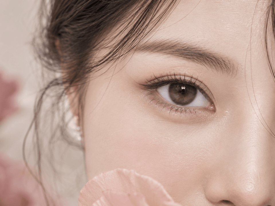
Lens reviews & comparisons
Gray vs. Gray-Brown Contacts: Cool Color or Soft Blend?
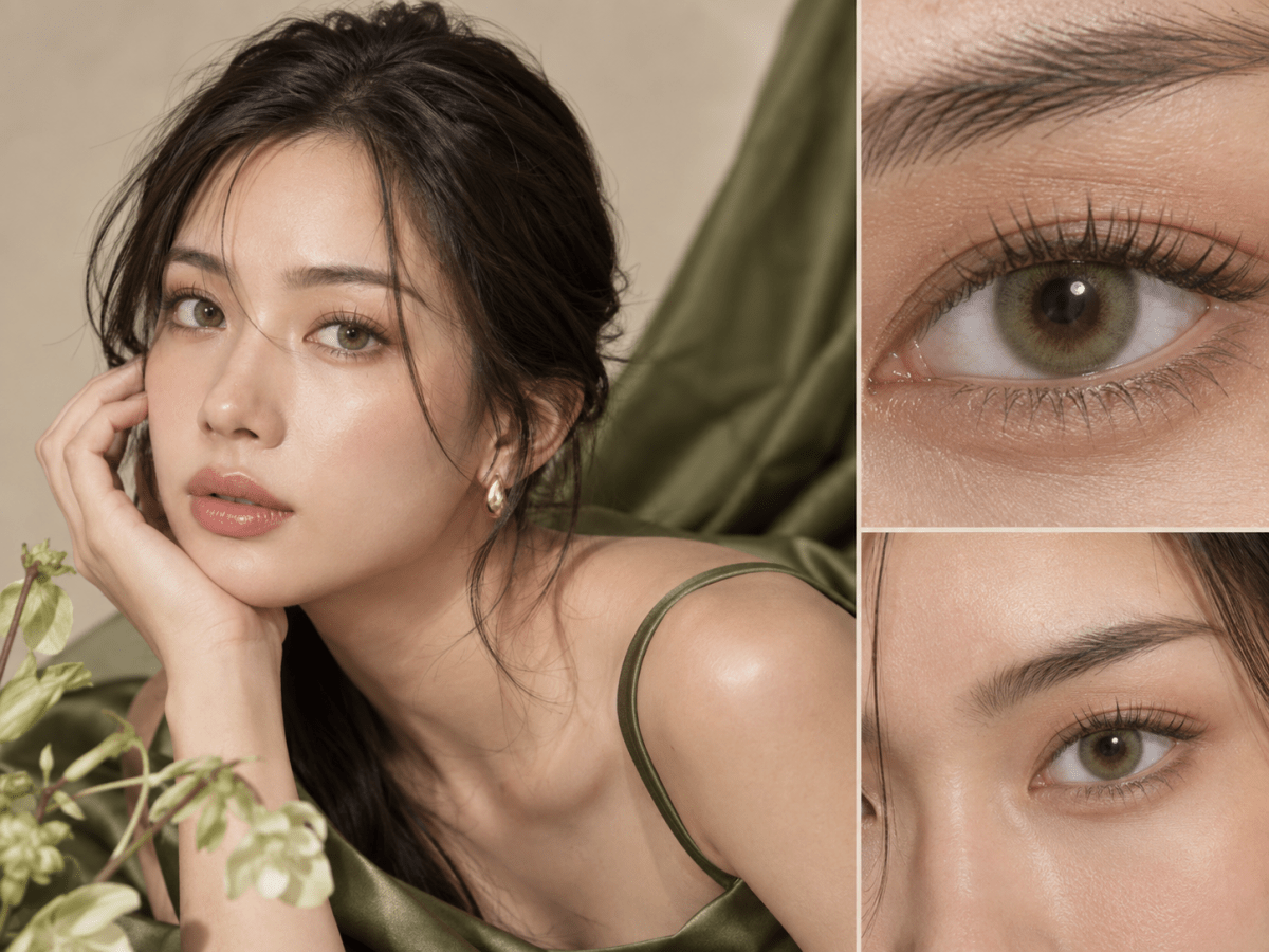
Choose a cooler gray lens when you want a clearer change from brown to gray; consider gray-brown when you want gray notes connected to your natural iris. The shade name alone cannot guarantee either effect. Compare the exact print's undertone, coverage, inner transition and outer edge in ordinary light before deciding.
In this guide

Gray versus gray-brown: what are you choosing?
A gray lens can create a cool, visible contrast with a brown iris. A gray-brown lens may include warm pigment or transparent openings that let the natural iris remain part of the final color. One direction is not automatically better or more natural. The choice is whether you want the eye to read distinctly cooler, or whether you want gray texture within a familiar brown framework.
These are broad editorial descriptions. A charcoal gray with a soft edge may look quieter than a pale gray-brown with dense print. Brands may call a lens “ash,” “smoky,” “taupe” or “gray-brown” for different reasons. Check the actual pigment design and identified wearer images before interpreting the label.
Define your goal at a useful distance. Do you want someone to notice gray across a table, or do you want a muted dimension that appears mostly in closer views? A product swatch may make fine gray strokes vivid, while a face portrait may show them blending into brown. Decide which view matters for your intended wear.
Look for cool and warm components in the print
In an identified close-up, separate the colors you see. A gray design may lean blue, violet, silver or charcoal. A gray-brown design may combine those tones with taupe, amber or soft brown. The mixture can change the finished impression even when both products are sold in the gray family.
A cooler print can contrast clearly against warm dark brown, which is useful if the goal is an obvious transformation. It may also appear blue-gray under cool light. A warmer gray-brown can bridge the difference between print and iris, but under yellow indoor light it may read more brown than expected. Neither behavior is universal; examine the exact shade.
Do not assume a shade name describes opacity. A cool gray can be translucent, and a gray-brown can be dense. The placement and strength of pigment determine how much of the natural iris participates. Ask whether you prefer visible natural texture or a more uniform printed color.
If a product has multiple layers, note which sits at the edge, middle and center. A blue-gray outer ring around a brown center can still read cool from a distance. A charcoal ring around a taupe middle may look defined but less obviously gray. A generic gray swatch cannot communicate all of that structure.
The inner transition can make or break the blend
The area near the pupil is important on brown eyes because it is where the printed shade meets the natural iris. A warm, feathered transition can make gray-brown feel integrated. A hard pale ring can make the print appear more graphic. If you want cool contrast, a clear transition may be acceptable or even desirable; choose it knowingly.
Pattern openings allow the natural iris to show through. On dark brown eyes they can deepen the finished color, making a lens look more layered than its package image. This can soften a cool gray. It can also make a gray-brown lens look mostly brown in dim light. Compare identified real-eye images rather than treating openness as an automatic virtue.
Pupil size changes with light, altering how much of the inner print you can see. A warm inner fade may be more apparent in bright light; a larger pupil may hide part of it in dim conditions. That is one reason the same lens can seem cooler or warmer across photos without any change to the product.
The outer edge affects drama as much as hue
A dark charcoal limbal ring can strengthen definition in either color family. On a cool gray lens it may create a striking editorial eye. On gray-brown it can preserve a familiar hue while making the eye more prominent. If you want a soft everyday finish, inspect whether the edge is slim, broken or feathered rather than solid and broad.
Contrast operates at several points: against the natural iris, at the outer boundary and inside the printed pattern. A lens can have a cool center but a gentle edge, or a warm middle with a strong dark ring. Write these observations separately so one dramatic feature does not get mistaken for the whole color effect.
Graphic diameter gives context about the printed area when the exact product lists it, but it cannot tell you how dark or continuous the edge looks. Overall lens diameter is a different physical specification. Neither number should be adjusted as a style shortcut outside the lens prescribed and fitted for you.
Your brown iris is part of the final color
Brown irises range from deep chocolate to warmer amber-brown and can contain varied radial detail. A transparent gray pattern may reveal those warmer features, producing a gray-brown result even if the print itself has little brown. A denser pale gray may cover more of the base and look cooler. Results vary, so a product photo on one model is an example, not a guarantee.
If your iris is very dark, some subtle warm-gray strokes may only show in daylight. If it has amber detail, a warm inner print may blend more visibly. Do not infer that all dark eyes need high-opacity lenses. Choose how much of your original iris you want visible, then compare the exact pattern's mid-zone coverage.
Makeup and clothing provide a second frame for the eye. A cool gray can pair with black, white or cool-toned styling for deliberate contrast. Gray-brown may sit easily with warm neutrals and minimal makeup. These are styling ideas, not rules about skin tone. Use your own preferred palette and ordinary wearing environment as the test.
Why the color changes from image to image
Warm lamps can emphasize brown or taupe; cool shade can emphasize blue-gray. A phone's white balance may add a color cast to the whole image. Nikon's white-balance guide explains how cameras compensate for different light. If the skin and a neutral wall also look unusually cool, the lens may not be the only source of blue in the photograph.
Compare unfiltered indoor and daylight views at a similar distance. A close crop helps explain the printed layers, while a full-face portrait shows whether the eye reads as cool gray, warm gray or mostly brown. Different exposures and screen settings can change the impression, so avoid judging from a single compressed social image.
When two product photos conflict, confirm that they depict the same exact shade and replacement format. A collection page may show a hero image from another variant. If the identity is unclear, keep the observation tentative and ask for a verified photo or current specification.
Three ways to decide
You want a distinct cool-gray eye
Seek a print with confirmed cool undertone and enough mid-zone pigment to show on a similarly brown iris. Check that the color remains visible in a normal portrait, not only a bright close-up. Decide whether a dark outer ring supports the look or makes it more graphic than intended.
You want everyday dimension, not a color transformation
Look for gray-brown, taupe or softly layered gray designs with an inner fade and moderate contrast. Compare indoor portraits; a candidate that only looks gray in direct sun may still work if your goal is subtle texture. Do not expect a dramatic gray result from a print chosen mainly to blend.
You want flexibility between work and photos
Consider a balanced design with cool strokes over a warm transition and a restrained edge. In ordinary light it may sit close to brown, while brighter light may reveal more gray. Keep the exact product photos and light conditions together so you can judge whether that range meets your brief.
All three scenarios describe appearance. A visually ideal lens still needs current prescription and professional fit confirmation.
Build a useful two-column shortlist
Create columns for “cool gray” and “soft gray-brown.” Under each, record the exact brand, series, shade and daily or reusable format. Then add four observations: printed undertone, mid-zone coverage, inner transition and outer edge. Use an identified close-up for print details and a normal face portrait for overall effect.
State the evidence behind every note. “Cool gray in labeled daylight portrait on dark brown iris” is stronger than “looks gray online.” If the model's natural iris or camera processing is unknown, say so. A missing detail does not automatically reject a lens, but it should prevent a false certainty.
Before ordering, verify the current product listing for replacement schedule, individual lenses per box and available prescription values. Do not assume two colors within one collection share every specification. Save the product URL and date with your shortlist, because listings can change.
Fit, prescription and care are separate from the color choice
In the United States, FDA buying guidance says to use a current valid contact lens prescription and warns against unapproved substitutions. Requirements vary by location. Follow those applicable to you and the advice of your eye-care professional, even if the lens has zero corrective power.
Do not choose a nearby power, base curve or another lens model just because its gray shade is more appealing. Similar appearance does not establish equivalent fit. Ask your eye-care professional about a suitable alternative if the preferred exact product is unavailable.
Follow the selected lens's replacement and care directions. The CDC's prevention guidance covers hand hygiene, avoiding water, correct solution use and backup glasses. Remove the lens and seek professional advice if pain, persistent redness, unusual light sensitivity, discharge or blurred vision occurs.
Browse Gray Contacts and Brown Contacts to discover candidates, then return to the exact product page before purchase.
KPOP2 Editorial Team · Reviewed September 27, 2026. Color comparisons are editorial observations, not controlled wear tests. Photography guidance uses Nikon's white-balance guide; prescription and care information follows the linked FDA and CDC sources.