Lens reviews & comparisons
Natural Brown Contacts: How to Choose a Layered, Lifelike Look

For a dimensional brown contact lens look, inspect tonal variation, transparent pattern openings, the fade near the pupil and the treatment of the outer edge. A shade called “natural brown” can still look flat if its print reads as one uniform block. Compare the exact lens on an iris similar to yours, in ordinary light and at face distance, before deciding.
In this guide

What creates a flat, one-color effect?
A lens can look flat when its visible print reads as an even circle of similar density and hue. A hard inner boundary around the pupil or a solid outer ring can strengthen that impression. The result may be intentional for a graphic look, but it may disappoint someone expecting subtle iris depth. The issue is not simply that the lens is “too brown” or “too light.” It is how the color is distributed.
A light brown lens can still look uniform if one opaque tone covers the mid-iris. A dark brown lens can look dimensional when its print varies in density, lets natural texture show through and softens its boundaries. Do not rank lenses by lightness alone. Inspect the exact pattern from edge to center.
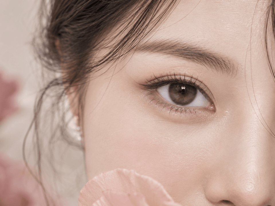
Catalog lighting can create highlights that make any eye look more dimensional. Those highlights may come from the light source, not the lens print. A close-up with strong catchlights is useful for inspiration, but an ordinary-light portrait better tests whether the design retains depth in a setting like your own.
Look for tonal layers, not a tone count on the label
Multiple related browns can create visual variation: perhaps a deeper outer stroke, a mid-brown radial pattern and a warm inner note. Fine changes can matter more than a dramatic light-dark split. At face distance, layered marks can read as iris texture rather than as separate colored bands.
“Three-tone” and similar marketing labels are not standardized measures of naturalness. A design with three strongly separated rings may look more artificial than a two-tone print whose strokes blend gradually. The question is where the tones sit, how they overlap and how they meet your natural iris.
Look at both hue and density. Warm caramel and dark chocolate can create contrast, but if both are printed as broad opaque blocks the result may still feel rigid. A brown-on-brown pattern with tiny transparent gaps may show more depth because the original iris participates. Describe the visual structure instead of counting colors.
If you already have dark brown eyes, a lens that is only slightly lighter may add dimension in daylight and seem nearly invisible indoors. That can be a good everyday result. If you expect a strong hazel effect, choose candidates whose identified real-eye images show that level of change on similarly dark irises.
Transparent openings let the natural iris join the design
Clear spaces between printed dots or radial lines allow your iris texture to remain visible. This can prevent the lens from reading as a sealed painted disc. The openings may be small and irregular rather than obvious holes. In an exact-product close-up, look for places where the background shows through between strokes.
On a dark iris, those openings can deepen the overall brown. On a lighter brown iris, they may reveal golden or amber variation. The same print can therefore look different across wearers. A model photo is an example of one combined effect, not a guarantee for your eye.
More openness is not automatically more natural. If the printed brown contrasts sharply with your own iris, isolated dots can become obvious. If the print is too sparse for your desired color change, the lens may look almost like your bare iris. Balance openings with the tone and placement of pigment.
To compare two lenses, note where openings occur: at the outer edge, across the mid-iris or near the pupil. Mid-zone openings can preserve natural texture, while a transparent center can soften the transition. An opaque perimeter can still make a lens look defined even if the center is open.
The inner transition helps avoid a hard circle
The printed pattern must meet the natural iris around the clear pupil opening. A gradual inner fade, feathered radial strokes or uneven dots can make that meeting less abrupt. A sharply bounded inner ring can look like one colored circle placed over another, especially when the printed brown differs from your natural shade.
Look at the transition under neutral light rather than relying on a highly edited beauty image. In dim light, the pupil may be larger and cover more of the inner pattern; in bright light, more of the fade can become visible. A lens that looks seamless in one photograph may show a clearer boundary in another ordinary setting.
If you want a rich but natural brown, the inner fade is particularly useful. It can keep the original iris color visible near the pupil while the mid-zone adds warmth or definition. For a deliberately graphic look, a harder boundary may be acceptable. Decide based on your style goal instead of treating every visible edge as a defect.
Choose an outer edge that matches the brief
A dark limbal edge can sharpen the iris boundary and make the eyes look more defined. If it is thick and continuous, it may also make the lens look like a separate ring. A thin, broken or blurred edge can provide definition with less of a doll-eye effect. Examine the edge at both close and normal face distance.
Do not assume “no ring” means no definition. Pigment concentrated near the natural iris perimeter can add clarity without a solid border. Conversely, a lens described as subtle may have a dark outer zone that becomes obvious in portraits. The current exact-product photos matter more than a broad category label.
Graphic diameter can support the comparison when the exact lens lists it, but it does not describe the ring's width, darkness or continuity. Overall lens diameter is a physical specification tied to fit. Neither should be changed as an independent styling control outside your professional prescription.
How the result changes across brown eyes
Brown eyes vary from deep chocolate to amber-brown and may have a darker outer boundary or lighter radial detail. A print that blends on one brown iris can contrast on another. When reviewing model images, look for a natural iris similar to yours and note whether that information is actually provided.
For very dark brown eyes, some transparent caramel pigment may be subtle. A deeper printed edge and brighter mid-zone strokes could create more visible texture, but they may also make the lens more graphic. For medium brown eyes, a softly layered lens may let more of the original detail show. These are possible visual outcomes, not fixed rules.
On eyes with amber flecks, warm printed brown may connect smoothly; a cooler taupe may create intentional contrast. Consider whether you want to emphasize warmth, add a cooler shadow or retain almost all of your current color. This is more useful than asking for a universally “most natural” brown.
Read product images for the right question
A product swatch can show the printed colors and clear areas. A lens-on-white photograph can reveal the pattern structure. An identified model close-up shows one interaction with an iris. A full-face portrait shows whether the lens feels subtle in context. Use each image for its strength rather than letting one image answer every question.
Compare similar lighting when you can. Bright studio light reveals fine tones; warm lamps can make brown look more golden; cool light can bring out taupe or gray notes. Camera white balance and editing can change the apparent hue. If two images conflict, record the conditions before assuming one is inaccurate.
Watch for makeup and lashes that add definition independently of the lens. A full-face beauty photograph may make the eyes look deeper because of styling, not because the brown print is more layered. Pair it with a simpler reference if available.
Save the exact shade and version with any image you use. A daily lens and a reusable lens in the same family may not have identical prints. A category banner may show a different color from the product you opened. If the image identity is unclear, do not use it as proof of the exact pattern.
Three brown-lens looks and the design clues to compare
Quiet everyday warmth
Look for related brown tones, small pattern openings and a soft edge. A gentle inner fade can help the print sit within the natural iris. Judge an indoor portrait at normal viewing distance. If it seems nearly invisible, decide whether that is the desired subtlety or whether you want more visible change.
Defined brown eyes without a heavy ring
Focus on radial texture and a softly treated perimeter. A moderate amount of contrast can sharpen the eye while preserving a layered center. Inspect whether the edge is broken rather than a solid black circle, and compare at face distance where the definition should be visible.
Noticeable hazel-brown color
Seek a mid-zone with sufficient lighter pigment to register on your natural iris. Check whether the inner transition remains gradual and whether the outer edge balances the brighter center. A very light swatch does not guarantee a hazel result on dark eyes; identified wearer images are more useful.
A practical comparison checklist
- Identify the exact lens. Record brand, series, shade and daily or reusable format.
- Describe the three zones. Note outer edge, mid-iris variation and inner fade.
- Look for natural participation. Identify clear gaps that allow your iris to show through.
- Compare face-scale views. Use close-ups for print detail and portraits for the whole look.
- Check ordinary light. Compare at least one neutral indoor view and one daylight view when available.
- Confirm the order. Verify current product facts and your prescribed lens before buying.
For a shortlist, write a one-line note for each candidate: “warm mid-brown, fine transparent spokes, soft edge, subtle indoors” is more useful than “natural.” Leave uncertain details blank. A missing exact-product image is a reason to ask for clarification, not to invent the pattern.
Keep fit and care separate from the visual choice
In the United States, FDA buying guidance advises a current valid contact lens prescription and cautions against unapproved substitutions. Other locations have their own requirements. Follow those applicable to you and your eye-care professional's fitting advice, including for decorative lenses with zero corrective power.
Check the live product page for exact model, replacement schedule, individual pieces per box and offered prescription values for each eye. Do not switch to a similar brown design or select a nearby power because the preferred lens is unavailable. Ask your eye-care professional about a suitable alternative.
Follow the lens's wearing and care instructions. The CDC's prevention guidance covers hand hygiene, avoiding water, approved solution use and backup glasses. If pain, persistent redness, unusual light sensitivity, discharge or blurred vision occurs, remove the lens and contact an eye-care professional promptly.
Browse Brown Contacts and Natural Color Contacts for discovery, then return to the exact product before ordering.
KPOP2 Editorial Team · Reviewed September 27, 2026. Design guidance is editorial and does not claim controlled wear testing or a guaranteed result. Prescription and care information follows the linked FDA and CDC resources.