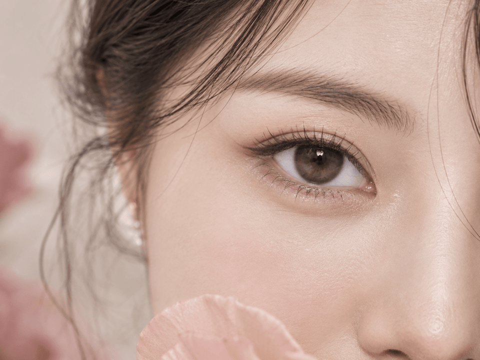
Lens reviews & comparisons
Natural vs. Doll-Eye Colored Contacts: How to Choose the Look

Choose natural-looking enlargement when you want a gently fuller iris that blends into your everyday face; choose a doll-eye effect when a rounder printed area and visible outer ring are part of your intended look. The result depends on graphic placement, ring design, opacity and your natural iris. No single G.Dia number defines either style for every wearer.
In this guide

What do natural and doll-eye enlargement mean?
Natural-looking enlargement is a restrained visual effect. The iris may appear a little clearer or fuller, but the printed edge does not dominate the face at conversation distance. A doll-eye look is deliberately more graphic: a rounder visible iris area, a recognizable perimeter or stronger contrast may be part of the appeal. Neither term is a medical lens category or a universal size band.
Describe the finish you want before opening a diameter filter. “Soft brown definition for work” and “clear round eyes for a styled photo shoot” are different briefs. The first often favors subtle transitions and a modest edge. The second may welcome a strong limbal design. The point is to make the tradeoff intentional rather than assuming every larger-looking lens produces the same kind of beauty result.
A lens can sit between these poles. You might want a visible ring without broad printed spread, or a fuller area with a soft border. This is why a single “natural versus doll-eye” label can be too blunt. Use the label to state your preference, then examine the exact design features that create it.
The natural iris is part of the final image. A dark brown iris can make translucent brown pigment look quiet, while a lighter iris may show more of its printed texture. Pupil size, lighting, makeup and face proportions also influence the impression. Product photos provide examples, not a guarantee of the same result on you.
Start with printed width, then read the pattern
Overall lens diameter describes the physical contact lens. Graphic diameter, often written G.Dia, describes the approximate diameter of its colored print when the brand supplies that value. A wider print can support an enlarging effect, but the number does not tell you whether the border is dark, feathery, transparent or broken. The appearance comes from the pattern and the eye together.
Imagine two exact lenses with a similar stated G.Dia. One has fine pigment that fades softly toward the edge. The other has a wide opaque ring. Even at the same printed width, the second may read as more doll-like because its outer shape is stronger. Conversely, a modest print with a dark outline can seem more graphic than a broader but transparent gradient.
Do not treat a small change in G.Dia as a guaranteed step up or down in visible size. Manufacturer measurements may describe print boundaries differently, and wearer images are affected by camera setup. Use the number to narrow candidates within a known product family, then inspect identified close-ups and full-face views.
A name shared across daily, monthly or toric versions does not prove identical measurements or pattern. Check the specification attached to the exact replacement format and shade. If the current listing does not provide a reliable printed diameter, mark it unknown and compare only the evidence you actually have.
The outer ring often decides how deliberate the look feels
A fine or interrupted outer edge can clarify the iris boundary without a thick circle. That can suit subtle enlargement because the eye looks more defined while the print still blends with the natural iris. A solid, dark, broad ring may build a more deliberate doll-eye boundary. It can be especially visible in a face portrait, where a crisp dark circle reads at a distance.
Look at edge thickness and continuity separately. A thin continuous ring may be more noticeable than a broken edge of similar color. A broad edge that fades into the surrounding iris may look softer than its width suggests. “With ring” or “no ring” is therefore only the beginning of a useful comparison.
Inspect the inner transition too. If the print fades gradually toward the pupil, your natural iris color can remain visible and the design may feel integrated. A hard inner circle makes the colored area more obvious. A doll-eye style may intentionally use that clear printed structure; for a softer look, you may prefer layered or radial pigment.
Watch for an outer gradient that increases apparent width without a black ring. Shoppers sometimes assume that removing a limbal ring automatically removes enlargement. A wider, opaque wash can still make the visible iris area seem broader. Evaluate both the ring and the total placement of pigment.
Color and opacity change the balance
Contrast against your natural iris is as important as the shade name. A muted brown close to your base color may add gentle texture. A much lighter gray or bright blue can draw attention to the lens even if its printed area is restrained. A dark ring around a pale center can create a strong graphic effect. Choose the full design, not just the color swatch.
Opacity tells you how much of the original iris can show through. A more transparent print often blends, though it may have less visible color change on dark eyes. A dense print can deliver a stronger catalog shade, but it may make the pattern more apparent. Neither is automatically better. Decide whether your priority is blending or deliberate contrast.
Compare identified model images on more than one natural iris color when available. A single eye color on the product page cannot represent everyone. Look for similar lighting and a full-face view in addition to close detail. If the examples differ, describe the range rather than picking one image as the promised outcome.
Makeup changes the impression. Eyeliner and lashes can balance a larger-looking lens, while a low-makeup face may reveal the ring more clearly. To choose for everyday use, do at least one comparison with the level of makeup you actually expect to wear. For an event look, judge the lens as part of the complete styling rather than in isolation.
Judge close-up detail and face-level proportion separately
A macro image helps you study printed strokes, edge breaks and the center fade. It exaggerates how much attention you pay to the lens because the eye fills the frame. A face portrait is better for deciding whether the overall effect feels gentle or doll-like at the distance other people normally see you.
Check the scale of portraits before comparing. A tight selfie and a farther camera portrait can produce different facial proportions. Light, phone processing, pupil size and image editing also change contrast. If two pictures disagree, do not assume the lens itself changed; ask whether the camera and light changed first.
Use normal-distance mirror observation alongside photos when you have the exact lens fitted for you. A mirror shows movement and the face in real time. A photo freezes one angle. Neither view alone can quantify apparent enlargement, but together they can tell you whether the lens suits your intended setting.
If you cannot try a lens in a professional fitting, treat photographs as qualitative evidence only. Do not infer comfort, fit or safety from a model image. An attractive doll-eye photograph cannot tell you whether the lens is suitable for your eyes.
Choose the style for the setting where you will wear it
Everyday errands or office
If you want the eyes to look a little more defined while preserving a familiar face, start with restrained printed spread, a soft outer edge and moderate contrast. Evaluate an unfiltered portrait in ordinary indoor light. If a lens is visible only in an extreme close-up, it may be too subtle for your goal; if the ring dominates the face portrait, it may be more deliberate than you want.
Photos, video or an event
A more pronounced ring can survive camera distance and makeup. Decide whether you want a crisp doll-eye boundary or a softer rounded area. Compare several full-face images at similar crop instead of choosing from one beauty close-up. Remember that a lens chosen for a photograph still has to be fitted and worn safely in real life.
Cosplay or a graphic editorial look
Deliberate contrast can be appropriate for the visual concept. Write down whether you need a specific color, a very round silhouette or a visible black perimeter. Then examine candidates for those separate requirements. A lens with the right color but weak ring may not deliver the silhouette, while a strong ring in the wrong hue may fight the rest of the costume.
In every setting, choose the exact lens and wear schedule with professional guidance. Do not size up by switching to an unprescribed lens or altering a required parameter. A style brief helps describe the desired appearance; it cannot replace the fitting decision.
A practical comparison workflow
- State the goal. Write “softly fuller,” “visible ring” or “deliberate doll-eye” and the setting where it matters.
- Record exact versions. For each candidate, note brand, series, shade, daily or reusable format and any stated G.Dia.
- Describe the print. Note outer width, ring strength, transparency, inner transition and contrast. Leave missing details blank.
- Compare equivalent images. Use labeled close-ups for design and comparable portraits for face-level effect.
- Check your own context. Consider natural iris color, expected lighting and makeup without treating anyone else's image as a promise.
- Confirm suitability. Take the shortlisted exact products to your eye-care professional and use your current contact lens prescription for ordering.
A small comparison table can keep the decision honest: product, print width, edge strength, opacity, portrait impression and unresolved questions. The best choice is not necessarily the largest print or darkest ring. It is the exact suitable lens whose evidence best matches the look you actually want.
Prescription, fit and care remain separate checks
Colored contacts, including zero-power decorative lenses, require appropriate fitting and a valid prescription where the law requires it. In the United States, the FDA's buying guidance addresses this requirement. Follow the rules in your location and the advice of your eye-care professional. Similar-looking products are not automatically interchangeable.
Before ordering, verify the current product page for the exact model, replacement schedule, pieces per box and available right- and left-eye selections. If a prescribed option is missing, do not choose a nearby power or lens size to obtain a desired look. Ask your eye-care professional about an appropriate alternative.
Follow the selected lens's wearing and care instructions. The CDC's prevention guidance covers hand hygiene, avoiding water, proper solution use and backup glasses. If pain, persistent redness, unusual light sensitivity, discharge or blurred vision occurs, remove the lens and seek professional advice promptly.
Explore Natural Color Contacts or the 14.0–14.5 mm Graphic Diameter category for discovery. The category name is a browsing aid; confirm all facts on the exact product listing before purchase.
KPOP2 Editorial Team · Reviewed September 27, 2026. Design comparisons are editorial, not controlled wear tests. Prescription and care statements use the linked FDA and CDC guidance. This article does not replace professional fitting or a current contact lens prescription.