Size & design
Why Brown Contacts Can Look Darker Indoors: Lighting and Photo Guide

Brown contact lenses can look darker indoors because the light, the lens print and the camera or screen all affect how the brown appears. A daylight product photo is not a guaranteed preview of a dim room. Compare the exact lens under similar lighting and at a normal viewing distance, then separate that visual choice from prescription, fit and care.
In this guide
Why the same lens can look different
A contact lens sits over your natural iris, so the visible result depends on both the printed design and the eye beneath it. The surrounding light changes what details are easy to see, while a phone or camera may adjust exposure and white balance. A photo can also be cropped, edited or shown on a screen with different display settings.
That combination can make a brown design appear softer in bright daylight and deeper in a dim room, but it does not happen in exactly the same way for every lens or wearer. A product name such as honey, chocolate or natural brown is a label, not a standardized color formula. Treat “looks black indoors” as a specific question about a particular lens, eye color and room—not as a universal product result.
Compare three lighting scenes
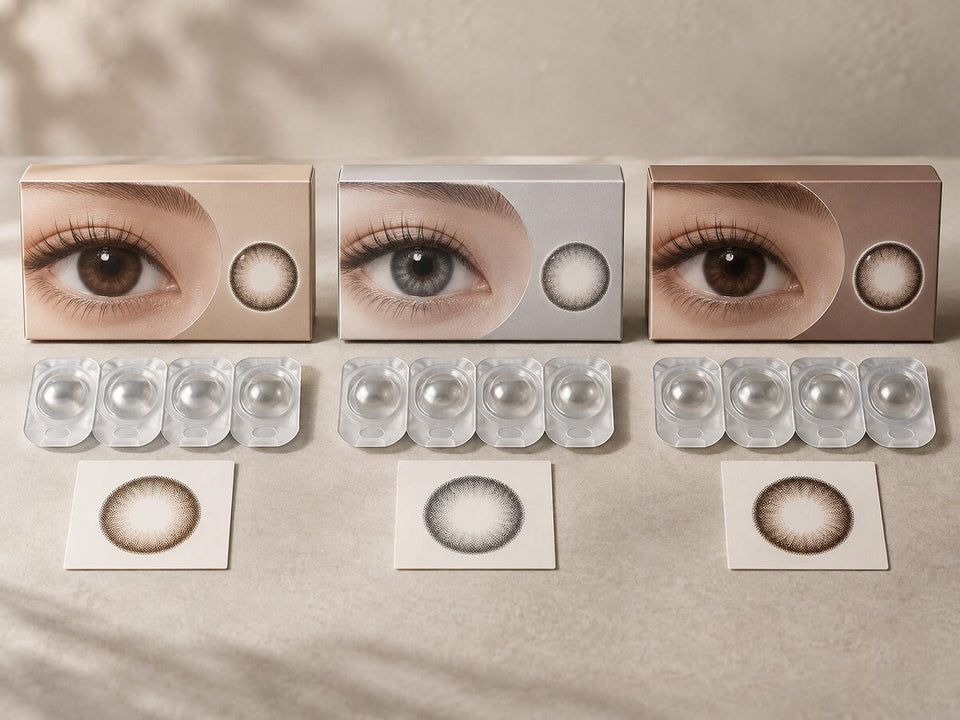
Use the same exact lens in three situations that matter to you: indirect daylight, the room where you usually spend time, and a ring light or other close-up setup if you regularly use one. Keep the viewing distance similar and compare a close eye view with a normal face portrait. Record the light source instead of describing every image as simply “bright” or “dark.”
- Indirect daylight: Use a bright area without direct sun or strong reflections. This helps you inspect color and edge details without treating a studio image as the only reference.
- Ordinary indoor light: Check the lens where you expect to wear it. Warm or low room lighting may make fine pattern details less visible than a close, bright product photo.
- Ring light or flash: Treat this as a separate photo condition. A direct light can create reflections and emphasize the printed edge; it does not represent every room or conversation distance.
Do not compare a daylight close-up with an indoor portrait and attribute every difference to the lens. Distance, angle, makeup, pupil size, camera exposure and lighting may all differ. If a photo does not identify its lens version or lighting, use it as inspiration rather than proof of how the exact product will look.
Check camera and screen processing
Camera white balance can be automatic or manually adjusted. Apple’s camera documentation describes white-balance controls, which is one reason recorded colors may differ from the scene. Exposure, filters and later editing can also change the image. The screen you view it on adds another layer.
For a more useful comparison, look for images of the same exact product made in similar conditions. Check whether a creator names the shade, starting eye color, lighting and camera filter. If one of those details is missing, do not guess it. Prefer several clearly identified references over one highly edited image, and note the limits of each.
When taking your own comparison photos, keep the same camera, distance, angle and light source. Turn off filters and avoid changing image settings between shots where possible. These steps do not make a photo a clinical or color-calibrated test; they simply make the comparison less confusing.
Read the lens design
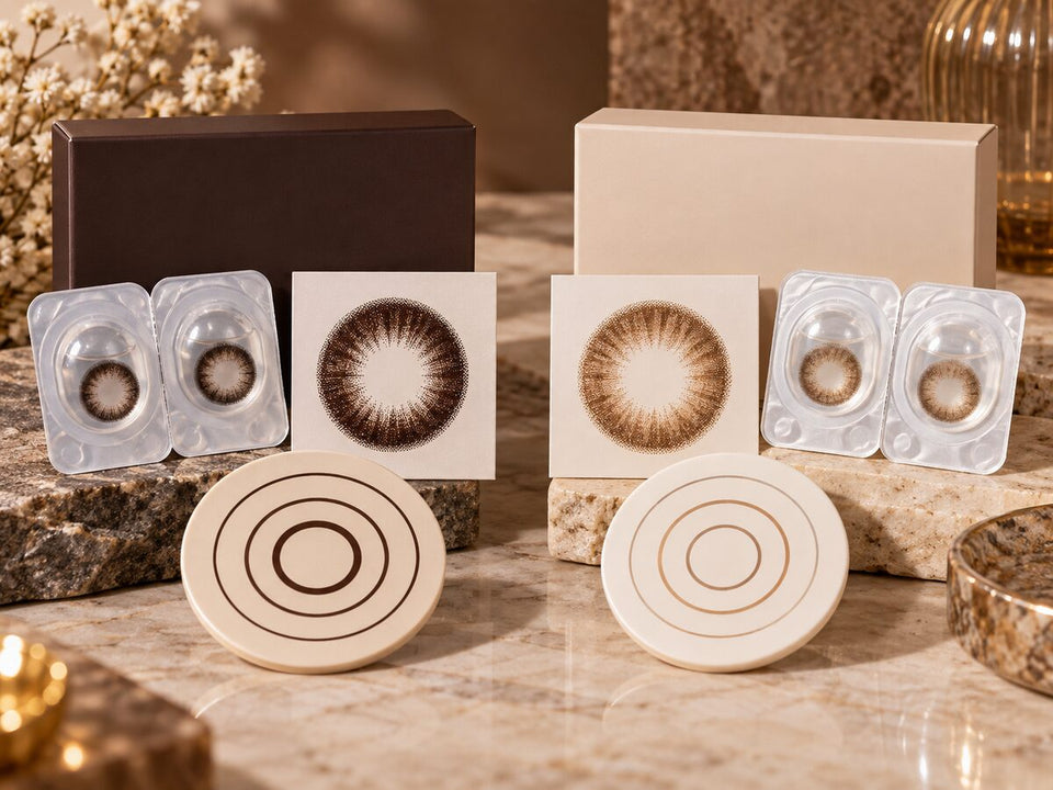
Look at the center, middle and outer edge of the printed pattern separately. A dark outer line may remain noticeable in a dim room even when the center color is subtle. A gradient or blended edge may read more softly, but the exact result still depends on the natural iris and photo conditions. Inspect a product close-up for print placement and a face portrait for how prominent it appears at a normal scale.
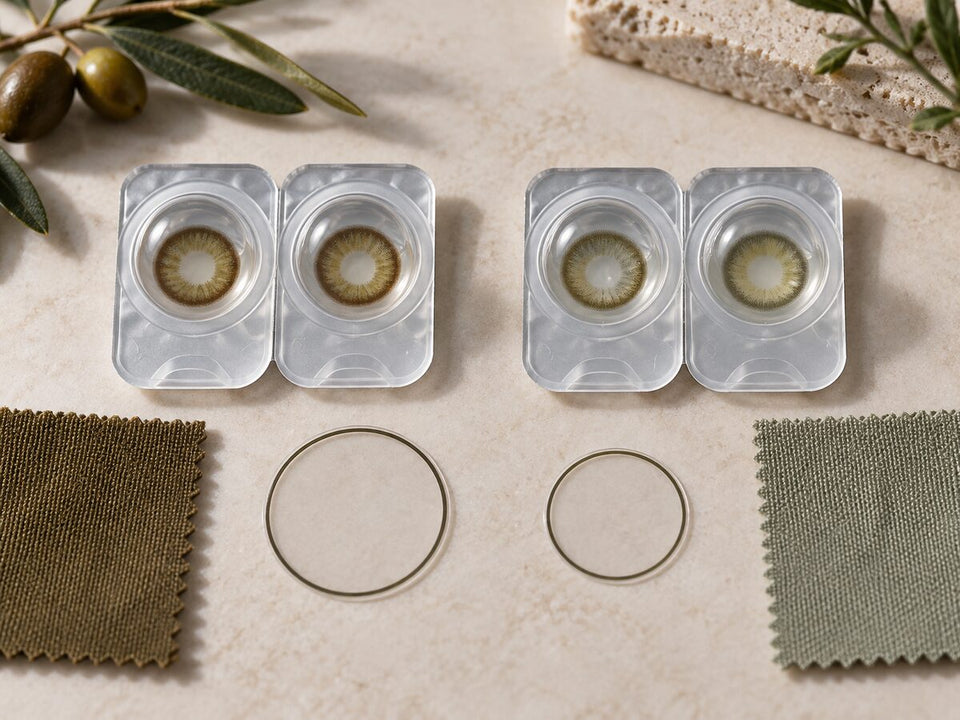
Graphic diameter describes the listed printed area when a brand supplies it; overall diameter describes the full lens. Neither measurement tells you that the brown will stay visibly light indoors or that the lens will look natural on your eye. Use the graphic diameter guide to keep those measurements separate.
Before browsing, decide which result you want: a warmer brown, a visible change from dark eyes, a softer edge or a more defined ring. Those are different visual goals. Compare the exact lens pattern against the goal rather than relying only on a shade name or an “indoors” claim.
Make a repeatable comparison
For each candidate, record five details: exact product and shade, starting eye color shown in the source, lighting, viewing distance and the feature you want to judge. Add one unresolved question, such as “Does the outer ring remain visible in my usual indoor light?” This keeps the comparison focused and makes missing evidence visible.
Start with two or three products rather than collecting many unlabelled photos. Compare candidates one feature at a time: color direction, edge definition, print area and overall prominence. If the image conditions are different, mark the result uncertain instead of ranking the lens as brighter or darker.
For additional photo guidance, read how to compare customer lens photos and how close-ups differ from portraits and video calls.
Keep product and fit decisions separate
A photo can help you describe a style preference, but it cannot confirm that a lens is prescribed or fitted for you. Check the exact product, prescription and current order choices with the relevant professional and seller. The FDA’s contact lens buying guidance advises shoppers to use a current prescription and verify exact product details.
Follow the exact lens’s wear, cleaning, storage and replacement instructions. The CDC prevention guidance covers safer handling and avoiding water exposure. If you experience pain, persistent redness, discharge, light sensitivity or blurred vision, remove the lens and contact an eye-care professional promptly.
Browse Brown Contacts, Hazel Contacts or Colored Contacts for Dark Eyes to discover candidates. Then return to the exact product page to verify its current details and package. KPOP2’s prescription verification and wear and care pages explain store-specific next steps.
KPOP2 Editorial Team · Reviewed September 29, 2026. Lighting and camera examples are visual comparisons, not controlled testing. Product availability and details can change; confirm the exact lens and follow professional fitting and care advice.