Lens reviews & comparisons
Why Gray Contacts Look Blue on Brown Eyes: Color and Lighting

A gray colored contact can read blue on a brown iris when its printed pattern has a cool undertone, the natural iris remains visible through parts of the design, or the light and camera shift the apparent color. “Gray” is a product color name, not a promise of neutral gray on every eye. To understand the result, separate the lens print from the wearer and the viewing conditions.
In this guide

The short answer: several colors are seen together
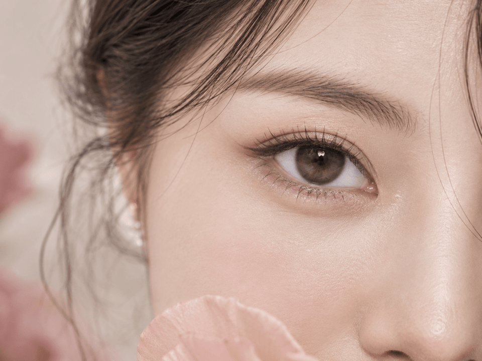
A colored lens is not a solid painted disc covering every part of your iris. Many designs use transparent spaces, layered strokes and a clear opening over the pupil. Your natural brown iris remains visible through some areas and beside the print. The eye and brain read that combined pattern as one overall color. A cool gray layer over a warm iris can therefore be perceived differently from the same lens held in a case or photographed on a lighter eye.
A gray pattern may itself lean toward blue, lavender, green, taupe or charcoal. The word “gray” describes the design family, not its precise undertone. In bright neutral light, the cooler parts of the print may become more visible. Under warm indoor light, those same parts may look softer or less blue. A phone can add another change through its white-balance and contrast decisions.
Do not assume one cause without comparing evidence. If the lens appears blue only in a particular photograph, investigate the lighting and camera first. If it appears blue in several normal-light views, the printed undertone and your iris interaction may be more important. Either way, appearance remains individual and cannot be promised from a shade name alone.
Look at the exact printed gray, not just its name
Start with an identified close-up of the exact shade and version. Does the gray contain cool blue or violet strokes? Is there a charcoal outer ring, a silver center or a warm brown inner layer? These details can push the finished eye toward a different color family. A package swatch may make them easier to see than a distant model portrait, although it cannot predict the result on your iris.
A blue-based gray can feel icy or steel-toned. A taupe-based gray often reads warmer, while a charcoal gray may look darker and less obviously blue at portrait distance. These are descriptive directions, not standardized pigment measurements. Brands may use “ash,” “smoky,” “silver” or “mist” in different ways. Use identified photographs and the current product record to understand a particular lens.
Check the edge and center separately. A cool outer ring can make the entire lens read blue-gray even when the middle contains warmer pigment. A cool inner gradient can become prominent when the pupil is smaller and more iris area is visible. If the product has a broad transparent center, more of the natural brown may remain visible, changing the perceived balance.
Do not treat a color shown in a lens case as a controlled wear result. The background and light behind a loose lens differ from the eye behind it. A color can appear more neutral against white packaging and cooler against the complex brown iris. Use the case view to inspect the printed pattern, then use real-eye examples for possible outcomes.
How the brown iris contributes to the finished color
Opacity describes how much of the underlying iris is visible through the printed areas. A translucent gray pattern allows more brown to participate in the overall appearance. That can create a layered result rather than the uniform gray shown in a catalog swatch. A more opaque pattern can cover more of the original color, but it may also look more obviously printed. Neither choice is inherently better.
Brown eyes are not one uniform base. Some have amber or golden detail, some are deep brown, and others have a cooler outer edge. The same gray pattern can interact visually with these differences. A warm center may make a cool ring stand out; a dark iris may make pale strokes appear more contrasty. Look for identified model images on a natural iris similar to yours, while accepting that the match will never be exact.
A lens can appear different in the two eyes if the natural irises differ subtly or if the light falls unevenly. That does not automatically mean one lens is the wrong shade. If the packaging or label differs, however, stop and verify the exact product before use. Keep style observation separate from product identity.
Higher opacity is not a guaranteed fix for an unwanted blue cast. If the printed gray itself is blue-based, stronger coverage can intensify that direction. If you want less blue, compare undertone first, then consider how much of the natural iris you want to show through.
Light and camera white balance can add a blue cast
Light has color. Open shade, cool indoor lights and warm lamps can make the same lens appear different. Cameras also estimate the scene's white balance, changing how blue and warm tones are rendered. Nikon's white-balance guidance describes how lighting conditions create color casts and how camera settings compensate. A phone's automatic choice may not match what you see in the mirror.
If the lens looks blue only in one photo, check whether the skin, white shirt or neutral wall also looks cooler. A general blue cast across the image suggests a lighting or white-balance effect. The lens may still have a cool undertone, but the photograph has amplified it. Avoid correcting only the iris color in an edited image and then calling that the true product shade.
Flash and HDR can make pale printed strokes appear brighter. A front-camera beauty mode or filter may shift saturation. Screens add a final variable: a phone in a vivid display mode can look different from a calibrated monitor. This is why a single product photo cannot establish exactly how the shade will look to every customer.
For an everyday judgement, compare a neutral indoor view and a soft daylight view. Keep the camera, distance and filter setting consistent. A small range of ordinary environments tells you more than repeatedly photographing under a single flattering light.
How to evaluate gray-lens images
First verify that the image belongs to the exact shade, brand, series and replacement format. A collection hero shot may show a neighboring gray lens. A customer review can show an older or different variant. If the identity is uncertain, note it rather than using the photo as proof.
Use close-ups to inspect undertone, edge and printed density. Use full-face images to judge the overall color impression in the intended setting. A macro crop may make individual blue strokes obvious even when the eye reads as mostly gray at conversation distance. Conversely, a portrait can hide the detail that explains the cool cast.
Record the model's natural iris color if supplied. A gray lens shown on a light brown eye may look different on a dark brown one. If the listing provides only a very dark, heavily edited portrait, the expected outcome remains uncertain. Ask for clearer exact-product examples or compare another candidate with more useful evidence.
When two images disagree, compare lighting, white balance, image scale and editing. Do not choose whichever image supports the result you hoped for. The disagreement is information: it tells you the appearance is sensitive to conditions or that the evidence is incomplete.
Choose the gray direction you actually want
If you want a neutral or smoky gray
Shortlist designs with identified neutral or taupe-leaning print rather than relying on the word “gray.” Compare ordinary-light images on brown eyes and check that the outer ring is not strongly blue or violet. A darker charcoal look may be an alternative if you prefer definition over a pale silver effect, but the exact result still depends on your iris.
If you like a cool blue-gray effect
A cool printed undertone may be a feature, not a flaw. Decide whether you want a subtle steel-gray hint or a clearer blue-gray statement. Check full-face images so the color works with your overall styling. Do not rely solely on a swatch, where the absence of the iris can make the pigment look flatter.
If you want the lens to show on dark brown eyes
Look at opacity and placement as well as hue. A transparent pattern may create a gentle shift but less visible color change; a denser print can show more strongly. Balance that benefit against the possibility of a more graphic, less blended result. Use the exact model's current information and identified wearer examples.
These options are editorial styling directions. The lens still needs to be the exact product prescribed and fitted for you. Do not switch models, base curve or power simply to obtain a different shade.
A repeatable check before judging the color
- Identify the lens. Write down brand, series, shade and daily or reusable format. Keep the exact product URL with your notes.
- Choose two ordinary lights. Use soft daylight and a neutral indoor setting rather than a single dramatic lamp or flash.
- Use consistent camera settings. Turn off filters and keep the same device and camera mode. Include a neutral object in the frame as a clue to overall color cast.
- Compare mirror and photo. Notice whether blue appears in both, or only in the image. Record the difference without forcing a single verdict.
- Judge at two scales. Use a close-up for printed strokes and a face portrait for the color other people are likely to notice.
- Keep uncertainty visible. A product image on another brown iris can narrow expectations, but it cannot promise the outcome on yours.
This method is for visual comparison with a lens you have already been prescribed and fitted to wear. Do not trial an unprescribed lens for color research. If the product received does not match the label or your prescription, keep it unused and ask the seller and your eye-care professional for guidance.
Keep a useful record for future shade choices
When you like or dislike a gray result, save more than the product name. Record the exact brand, series, shade and replacement format; the natural iris color you started with; whether the print appeared neutral, blue-gray, violet-gray or warm gray; and the lighting in which you made that judgement. A short note such as “blue cast in cool office light, more charcoal in daylight” is more useful than “not really gray.”
Store an unfiltered face portrait and one close-up with the record if you are comfortable doing so. The portrait preserves the overall color impression; the close-up shows which printed strokes may explain it. Label the photos with camera and date so you do not later compare a filtered image with a neutral one. If you are shopping for a replacement, bring the record to your eye-care professional along with the exact product information.
Keep a separate line for verified catalog facts. The replacement schedule, prescription options and package count should come from the current exact product page or manufacturer record, not from your color note. This separation prevents a visually similar lens from being mistaken for an equivalent lens. Update the record if the product page changes or the manufacturer releases a different version under a familiar shade name.
Check the exact product and wear it safely
Confirm the current listing's brand, shade, replacement schedule, individual pieces per box and available prescription selections. In the United States, FDA buying guidance says to order with a current valid contact lens prescription and warns against unapproved substitutions. Requirements vary by country, so follow those applicable to you.
Follow the selected lens's wearing and care instructions. The CDC's prevention guidance covers clean hands, avoiding water, correct solution use and backup glasses. If you experience pain, persistent redness, unusual light sensitivity, discharge or blurred vision, remove the lens and seek professional advice promptly. A color discrepancy is never a reason to continue wearing an uncomfortable lens.
For discovery, browse Gray Contacts and Colored Contacts for Dark Eyes. Return to the exact product record and your current prescription before purchase.
KPOP2 Editorial Team · Reviewed September 27, 2026. Color discussion is editorial and does not claim controlled wear testing. Photography guidance uses Nikon's white-balance explanation. Prescription and care information follows the linked FDA and CDC resources.