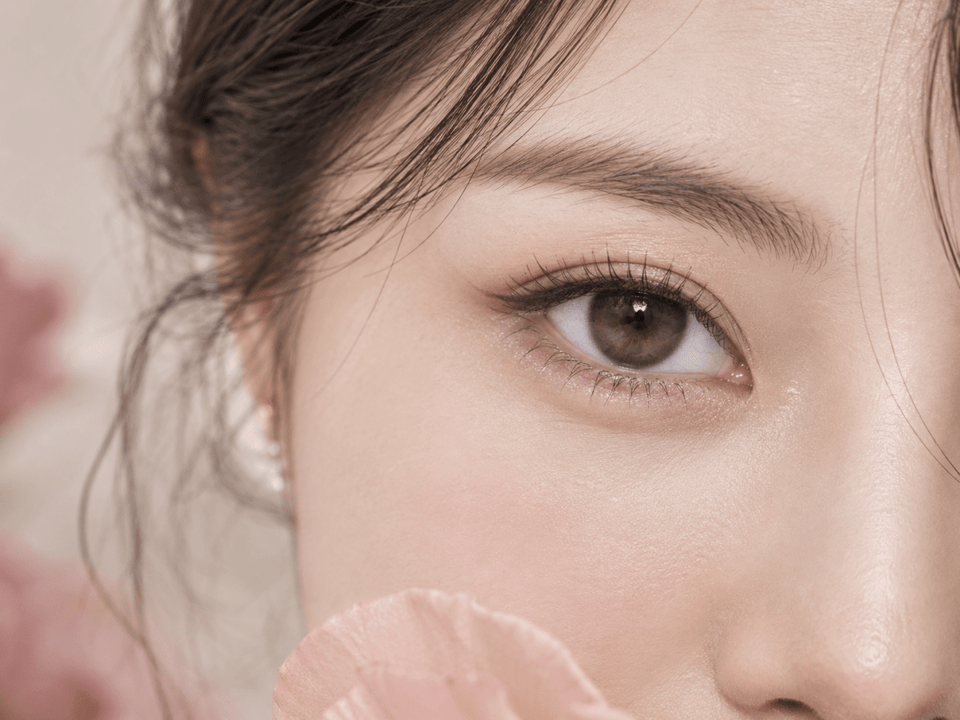
Lens reviews & comparisons
Yellow-Green vs Brown-Green Contacts: Color Comparison
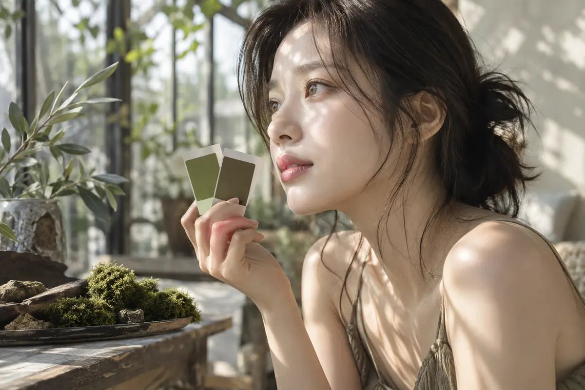
Yellow-green contacts and brown-green contacts can both be labeled “olive,” “hazel,” or simply “green.” The useful difference is the dominant tone you see on an eye under comparable lighting. A yellow-green design tends to show a brighter golden or chartreuse lift, while a brown-green design tends to keep more earthy depth. The wearer’s original iris, the print’s opacity, and the photograph’s white balance can change that impression. Use the exact pattern and on-eye images to decide which direction you want, then verify the physical lens separately.

Yellow-green versus brown-green: the quick distinction
A yellow-green look places more visual emphasis on yellow, gold, or light olive within the green. It may look fresh and luminous when the print is visible under neutral light. A brown-green look gives brown, hazel, or muted khaki more weight, so the green reads as part of an earthy blend. These are descriptions of perceived color, not standardized product categories. Two brands can use the same shade word for very different printed patterns.
Look at the overall impression from conversation distance before analyzing tiny flecks. If the eye reads green first and gold second, you may be seeing a more yellow-green direction. If it reads hazel or warm brown first with green around the edge, the design may be closer to brown-green. A close-up can reveal why, but a full-face image answers whether the difference matters for the look you actually want.
Keep the comparison conditional. On dark brown eyes, a translucent green print can mix visually with the underlying iris and read warmer or browner than it does on a lighter iris. A denser print may show more of its intended hue, but density alone does not guarantee the final shade. The result depends on the precise design and wearer.
How to find the dominant tone in a lens design
Start with the flat print
Use a clear product-pattern image when available. Look separately at the outer ring, the middle color field, and the inner transition near the pupil. A lens can have a green outer edge with golden specks in the middle, or a brown outer ring with a muted olive center. These may be described with the same marketing word but create different impressions on the eye.
Ask which hue occupies the largest visible area and which hue has the strongest contrast. A small bright yellow accent can become a focal point even when most of the print is brown. Conversely, a broad olive wash can look quiet if its opacity is low. A color label alone cannot tell you that balance; the pattern and on-eye view can.
Check the edge and the central opening
A dark outer ring can make either color direction look more defined and slightly deeper. A soft edge can allow the natural iris boundary to remain visible. Near the pupil, a golden or brown transition may be especially apparent on dark eyes. Note whether that transition looks smooth or sharply separated in an unfiltered close-up.
Do not use the visible central opening as a fit measurement. It is part of the printed appearance. The physical lens diameter, base curve, material, prescription, and fitting require separate verification. The same visual tone in two products does not make them interchangeable.
Describe the result in two parts
Use one phrase for the main hue and another for the undertone: “olive green with golden accents,” “hazel brown with a muted green edge,” or “khaki green with a warm brown center.” This is more precise than calling both candidates “green.” If you cannot tell which hue dominates from the available photos, leave that point open and ask for a better on-eye image of the exact model.
Why the starting iris can change the color
Colored contacts sit over an existing iris. With a translucent print, the wearer’s eye color contributes to the final appearance. Dark brown can make a pale green design appear deeper or more olive; lighter irises may reveal the lens print differently. Even a denser design can vary with iris texture, pupil size, and lighting. A model photograph is an example, not a guaranteed preview.
When looking at reviews, record the reviewer’s starting eye color if they provide it. A yellow-green result on a light eye does not prove the same lens will look equally bright on a dark eye. A brown-green result on a dark eye may look more golden in another setting. Keep the exact product identity attached to every comparison; another shade in the same line may use a different opacity or pattern.
Do not infer product opacity from a single edited before-and-after image. Strong exposure or color grading can hide the original iris and exaggerate the green. Find multiple images of the same shade if possible, including a full-face view and a close-up. If a seller shows only one lighting condition, treat the final color on your eye as uncertain.
A fair photo comparison for green contacts
Place two exact product images side by side with similar camera distance, gaze, and lighting. Daylight or neutral indoor light may help you see the base tone, but even “daylight” varies with weather and camera white balance. A warm lamp can make yellow and brown more prominent; cool lighting may emphasize green or gray. Do not compare one warm studio shot with one cool outdoor shot as if the lens colors were measured under the same conditions.
Look at a neutral reference in the image when available, such as the white of the eye or another familiar object. If the entire photograph has a yellow cast, the lens may appear warmer than it is. If the whole image leans blue, the green may look cooler. This is a practical visual check, not a substitute for calibrated color photography.
Compare at two scales. The close-up shows printed flecks, ring structure, and transition. The full-face image shows whether the yellow-green lift is visible at normal distance or whether the brown-green blend reads more natural with your intended styling. A candidate that wins in a macro photo may not be the best fit for the everyday look you described.
| Feature | Yellow-green direction | Brown-green direction |
|---|---|---|
| First impression | Green with golden or yellow lift | Hazel, brown, or khaki depth |
| Print to inspect | Light olive and gold zones | Warm brown base and muted green zones |
| Photo check | Does brightness survive neutral light? | Does green remain visible at full-face distance? |
| Starting iris | May warm or deepen the visible tone | May reinforce the brown component |
| Open question | How much yellow is from lighting? | How much green appears on your iris? |
These are comparison prompts, not fixed rules. A specific lens can combine both directions. Describe what you can actually observe in images of that exact model and mark what remains unknown.
Product pages that can help build a shortlist
For an olive-green direction, current KPOP2 listings include OLENS Eyelighter Glowy 1Day Golden Olive (10p), I-SHA Reborn Olive 1 Day (10p), and LensTown Romantea London 1Day Olive Green (10p). Their titles provide search starting points; inspect the precise pattern and on-eye images before deciding that any one is visibly yellow-green.
For a warmer or browner comparison, current listings include Cocoview Arti Olive Brown (10p), LensVery Silhouette Olive Brown (10p), and OLOLA Purity Shine Hazel Brown (10p). The words “Olive Brown” and “Hazel Brown” suggest a direction but do not prove the final visible balance. Use current photographs and product details for each exact model.
Keep your shortlist small. Choose one design that appears more golden-green and one that appears more hazel-green under comparable images. Add a third only if it tests a meaningful difference, such as a softer outer edge. Record the exact shade, replacement format, photo conditions, and remaining uncertainty for each candidate.
Match the dominant tone to the look you want
A yellow-green accent can draw attention when paired with warm bronze, gold, or a restrained neutral makeup look. A brown-green blend may sit more quietly beside soft brown, taupe, or earthy tones. These are styling ideas, not rules; your skin tone, hair color, iris, and lighting will influence the result. Try to evaluate the lens with your usual makeup rather than only with a highly styled promotional image.
Think about the setting. If you want a visible color change in daylight photographs, look for a design whose green remains apparent at full-face distance. If you want an everyday hint of green, a browner base or softer edge may feel more balanced. The choice is about the effect you prefer, not which color name sounds more natural.
Do not ask the aesthetic decision to solve a product decision. A visually perfect shade is not ready to order until the exact lens meets your prescription and fitting requirements. The two-column approach helps: one column for observed appearance, one for verified product facts.
Verify the exact lens before checkout
Check the full model, shade, replacement schedule, physical specifications, package count, and available prescription values on the live product page. A color name cannot establish the base curve, diameter, material, or suitability for your eye. The FDA advises buying contacts with a current valid prescription and checking the exact brand and lens details. Ask your eye-care professional about any model change.
Review the right and left eye selections independently. Do not choose the nearest available power if the required one is missing. Confirm whether a box contains one lens, a pair, or several lenses. Daily and reusable formats also have different care routines. Follow the instructions for the exact product rather than borrowing a routine from a similarly colored lens.
If a lens causes pain, redness, discharge, light sensitivity, or worsening blur, remove it and contact an eye-care professional promptly. A pleasing color does not justify continued wear through symptoms. For store guidance, see prescription verification and wear and care.
Frequently asked questions
Is olive green always yellow-green?
No. “Olive” can describe a range from golden green to muted brown-green. Inspect the exact printed pattern and on-eye images under comparable light.
Will yellow-green contacts look bright on dark brown eyes?
Not predictably. The starting iris and print opacity can change the visible result. Use examples on a similar starting eye color when available, but do not treat them as a guarantee.
Is hazel the same as brown-green?
Sometimes the terms overlap in marketing, but neither is a standardized pigment measurement. Identify the dominant tone of the exact product rather than relying on the label.
Why does a green lens look brown in one photograph?
Warm lighting, camera white balance, editing, the model’s iris, and the print itself can all affect the image. Compare multiple photos before drawing a conclusion.
Can I choose by color alone if I wear plano lenses?
No. Non-corrective colored contacts still require appropriate fitting and product instructions. Confirm the exact lens with your eye-care professional.
Do graphic diameter and opacity tell me whether a lens will fit?
No. They can help describe appearance, but fitting and prescription need the physical lens details and professional assessment.
Safety references: FDA: Buying Contact Lenses and CDC: Preventing Eye Infections When Wearing Contacts. Product examples were checked in KPOP2’s catalog in September 2026; verify current details on the linked pages.
Editorial method: color directions are described from visual principles without assigning an unverified measured pigment balance to any named product.