Lens reviews & comparisons
Colored Contacts That Define Eyes Without Enlarging: Design Guide
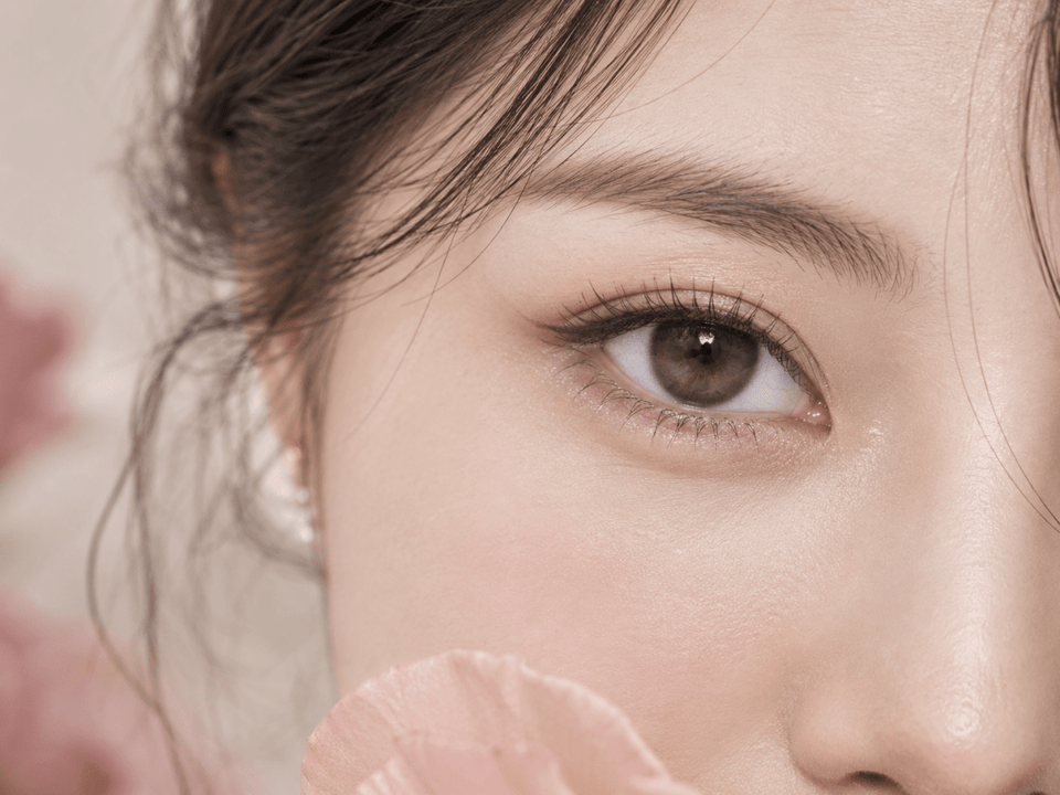
To make your eyes look more defined without an obvious enlarging effect, compare the printed edge, graphic placement and color contrast on the exact lens. A restrained pattern that sharpens the iris boundary can create clarity while allowing the natural iris to remain visible. Graphic diameter is useful context, but a single millimeter figure cannot predict the look on your eye.
In this guide

Start with the effect you want
Eye definition means the iris boundary or texture reads more clearly; apparent enlargement means the printed area makes the visible iris seem wider. This guide focuses on design choices for adding definition while keeping a bigger-eye effect restrained. For a fuller comparison of how the two effects differ, see the definition-versus-enlargement guide.
Read the printed edge before the shade name
The outer edge is often the first design feature another person notices. Look for a thin, feathered or interrupted border if you want a clearer iris outline without a heavy ring. Tiny breaks can let the original iris boundary show through. By contrast, a wide, opaque dark border can make the colored area appear larger even when the printed diameter is moderate.
Compare the edge at two distances. A close crop reveals how the pigment is placed, but a face-length portrait suggests whether the border remains visible in ordinary conversation. If it disappears entirely at that distance, the result may add texture rather than distinct definition. If it becomes the strongest visual element in the face, the lens may be more dramatic than your brief calls for.
Look also at where the edge ends. Some designs appear to have a slim outline but place darker pigment across a wider outer zone. Others combine a modest ring with transparent gaps. The broad placement matters because the eye reads the total printed shape, not just the darkest line. Product diagrams and identified lens close-ups can be useful here; a generic model photograph cannot establish the exact geometry.
A “no-ring” description does not mean zero definition. A pattern can define through radial strokes, slightly deeper color near the iris perimeter or increased contrast within the iris. If you dislike visible circles, compare those pattern choices before dismissing all lenses without a named limbal ring.
Compare graphic placement, not just diameter
Overall lens diameter describes the physical lens. Graphic diameter, often shown as G.Dia, describes the approximate diameter of the colored print when the brand provides it. Neither number alone tells you how dense the print is, where its darkest points sit or how the pattern blends into the center. Avoid reading overall diameter as a direct measure of the visible colored circle.
Two lenses with a similar G.Dia can look different. One may place a darker ring at the perimeter, while another distributes fine pigment toward the center. The first may create a stronger enlargement impression; the second may alter iris color with less emphasis on size. Conversely, a smaller graphic can still look bold if its border is opaque and high contrast.
Use the printed-area number as a shortlist filter only after confirming that it belongs to the exact product and version. A daily and monthly lens with a shared collection name can have different designs or specifications. Check the current product page for the specific replacement format, shade and available prescription options. If a G.Dia is not listed, mark it “unknown” instead of estimating it from a photograph.
When you compare photos, avoid measuring apparent iris size from screenshots. Cropping, camera angle, pupil size and retouching can distort that measurement. A more honest comparison asks which pattern carries pigment beyond the natural iris edge and how visible its border appears at a similar face scale. That is a qualitative judgement, and it should be recorded as such.
Choose contrast and opacity for your natural iris
For soft definition, a shade with moderate contrast against your iris often works better than a dramatically lighter or darker one. On dark brown eyes, a muted brown or olive pattern may reveal texture in daylight while retaining a familiar outline. A pale, highly opaque gray can make the eye look striking, but it may also become the focus of the face. Neither effect is inherently better; choose the one that matches your brief.
Opacity matters as much as color name. A translucent print may blend with the natural iris and vary substantially between wearers. A dense print can mask more of the original iris and produce a more uniform catalog color. “Brown” therefore describes a family of possibilities, not a predictable result. Seek identified model images across more than one natural iris color when the seller provides them.
Pay attention to the inner transition near the pupil. A soft, uneven fade helps the print meet the unprinted center without a hard circular boundary. A flat block of color can be visually striking, yet it may make the lens look more apparent at close range. In neutral light, ask whether you see a gradual meeting of colors or a distinct ring around the pupil.
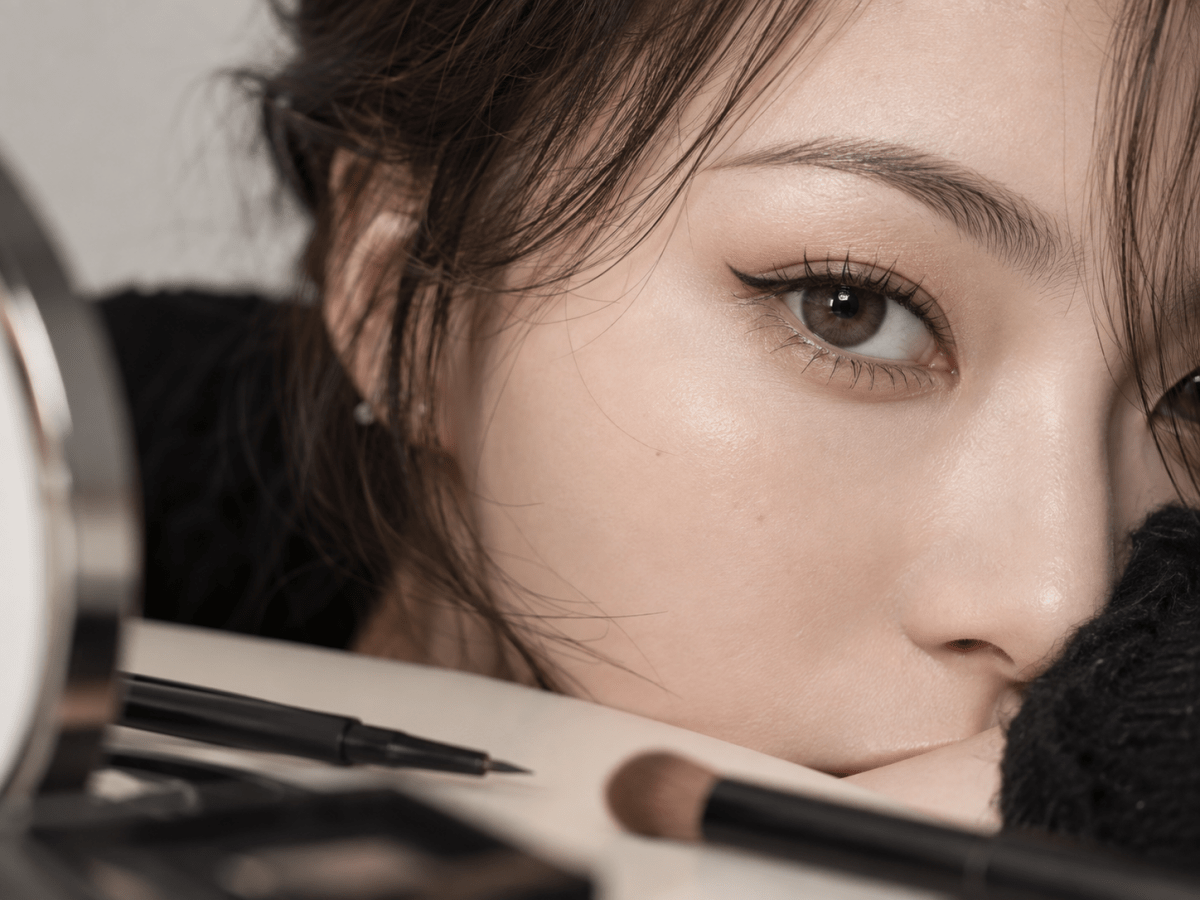
Do not use makeup-heavy photographs as your only evidence. Eyeliner, mascara and bright catchlights can make nearly any lens seem more defined. If possible, pair a product close-up with a simple portrait or a picture taken in ordinary indoor light. Keep exposure and white balance in mind; an image filtered warm or cool can shift both the natural iris and printed pigment.
How to evaluate product images fairly
First confirm the image belongs to the exact shade and version you intend to buy. Collections sometimes use a hero image from a neighboring product. Look for captions, labels or a linked product detail. If the identity is unclear, do not treat that photograph as proof of the lens's edge, printed size or color.
Next compare like with like. A close crop is useful for spotting radial lines and the outer border. A portrait at similar distance is better for deciding whether the effect reads as definition or enlargement. A lens photographed with the eye turned sideways may appear different from a straight-on view. Keep those roles separate instead of letting one dramatic image answer every question.
Use a small evidence note for each candidate: “edge: softly broken,” “print: mostly inside natural iris,” “contrast: moderate in indoor image,” and “unknown: result on my iris.” These notes are more reliable than a one-word verdict such as “natural.” They also make it easier to revisit your choice without misremembering why a lens reached the shortlist.
If you have an earlier lens you liked, compare a real photograph of that specific lens on you under similar lighting. Note whether you liked its boundary, inner texture, color or overall size. That turns a vague preference into a practical reference. Do not infer that a new lens will fit or wear the same way because its photograph resembles the old one.
Build a shortlist in five steps
- Write your visual goal. Decide whether you want a clearer iris boundary, richer color, subtle texture or a combination. State the amount of visible ring you are comfortable seeing at portrait distance.
- Filter by exact lens identity. Record brand, series, shade and daily or reusable format. Keep different versions as different candidates until their product details are verified.
- Compare the three design levers. Describe outer edge, printed placement and contrast separately. Give each one a short evidence note from a labeled image or current product description.
- Check at normal face scale. Eliminate candidates that appear much bolder or larger than your brief when seen beyond a close crop. Do not select solely because a macro image shows appealing pigment detail.
- Confirm ordering suitability. Use your current contact lens prescription and professional fitting advice to check the exact lens, parameters and replacement format before ordering. Style never substitutes for these checks.
A compact comparison table can prevent a last-minute decision based on the most attractive photograph. For each candidate, note edge strength, pattern placement, opacity, evidence quality and any missing specification. The candidate with the most complete, relevant evidence may be easier to choose than one with a dramatic but unidentified image.
Three common definition goals
Subtle workday clarity on dark eyes
Prioritize a soft perimeter and modest contrast. Look for a shade that adds visible dimension in ordinary light while allowing some of your iris to remain part of the finished color. Check a portrait image without strong beauty lighting. If the listing has only a close-up, record the unanswered question and compare another candidate with better everyday images.
Sharper outline for photographs, without a doll-eye look
Choose an edge that is distinct enough to survive camera distance but still slim or broken. Compare identified portrait images at similar crop and lighting. A dramatic dark ring may work for a particular editorial look, yet it may cross the line into enlargement for your own brief. Write that tradeoff down before ordering.
Visible color change with limited apparent size
Focus on inner pigment and opacity rather than assuming a stronger outer ring is needed. A lens can brighten or change the iris while keeping its outer boundary restrained. On very dark eyes, transparent color may show less change than the catalog swatch suggests; look for real-eye images and accept that the exact outcome remains personal.
These scenarios are style comparisons, not fitting categories. A candidate that wins visually still needs to match the prescribed lens and available parameters. If it does not, take the product name and your goal to your eye-care professional rather than selecting a nearby online option.
Check the exact product before checkout
Open the current listing rather than relying on a saved screenshot. Confirm the shade, brand, series, replacement period, individual lens count and offered prescription selections. A color photo does not reveal whether a listing is daily, monthly, plano, spherical or toric. If the exact information is missing or inconsistent, ask for clarification before purchase.
Read your current contact lens prescription for each eye, including the exact model and any required parameters. In the United States, the FDA's buying guidance explains that contact lenses require a prescription, including decorative lenses. A zero-power cosmetic lens is still a contact lens. Rules and ordering steps vary by location, so use the requirements that apply to you.
Do not treat a close color match as permission to substitute a different lens. Material, geometry, fit, replacement schedule and prescription options can differ between similar-looking products. If a visual favorite is unavailable, ask your eye-care professional about an appropriate alternative. Do not change power, base curve or toric values just to make an online menu accept the order.
At checkout, read the actual selections for right and left eye and the pack contents. Inspect the delivered box and sealed containers before opening. If the label does not match what you ordered and were prescribed, keep the item unused and contact support with the order reference and clear photographs. This protects both the ordering record and your ability to resolve a discrepancy.
Wear, care and the limits of visual comparison
A stylish design is only one part of a good contact lens choice. The lens must be the one prescribed and fitted for you, and you must follow its replacement and care instructions. The CDC's prevention guidance covers clean handling, avoiding water exposure and safer wear routines. For a reusable lens, follow the approved solution and storage directions for that lens; a daily disposable is discarded after its intended use.
If you experience pain, persistent redness, unusual light sensitivity, discharge or blurred vision, remove the lens and seek eye-care advice promptly. Do not keep wearing it because the color looks good, and do not try a different cosmetic lens as a self-test. These symptoms are a health question, not a styling adjustment.
Every visual conclusion in this article is conditional. An image can help you compare a print, but it cannot promise the same iris color, apparent size, comfort or fit on you. Some product descriptions omit graphic diameter or show limited model photography. Keep missing information visible rather than filling it in from another product or from a marketing term.
For discovery, browse Natural Color Contacts and the 11.9–12.4 mm Graphic Diameter category. Those pages help you find candidates; the current exact product page and your professional prescription determine whether a candidate is suitable to order.
KPOP2 Editorial Team · Reviewed September 27, 2026. The design analysis is editorial and does not claim a controlled wear test. Health, prescription and care guidance is supported by the linked FDA and CDC resources. This guide does not replace an eye examination, professional fitting or current contact lens prescription.