Lens reviews & comparisons
Starburst vs. Gradient Colored Contacts: How to Compare Center Patterns
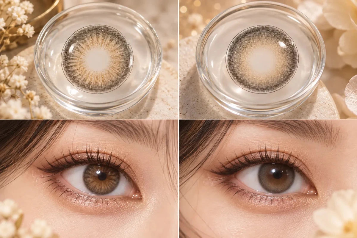

Starburst and gradient centers create different patterns around the clear pupil area. A starburst uses visible radial marks or rays. A gradient changes color or print density more gradually. Neither is automatically more natural or subtle: the result depends on the exact print, natural iris, outer ring, lighting, and viewing distance.
How the center patterns differ
A starburst center has lines, strokes, or rays that extend outward from near the clear center. They may be fine and low contrast or broad and easy to notice. “Starburst” is a visual label, not a standard measurement; two products using the word may print different patterns.
A gradient shifts color or density across an area without prominent spokes. Small dots can create a fade that appears smooth at ordinary viewing distance. A gradient may still have a visible boundary if its color or density changes abruptly. Read these words as descriptions of appearance, then check the exact lens image.
Compare the complete design
Start with the inner transition: are the rays fine, sparse, or high contrast, and does the gradient fade slowly or stop at a clear circle? Then inspect the main color field and outer ring. A starburst with a soft, low-contrast outer edge may look less graphic than one paired with a dark ring. A gradual center can still look bold when the color field is dense or strongly contrasted.
The wearer’s natural iris changes what remains visible. A ray pattern that blends into one iris may stand apart from another. Use bare-eye references and wear photos with similar lighting when available. A close-up helps you read the artwork; a face-distance image shows how much the pattern registers in context. Flash, exposure, filters, and cropping can change the apparent contrast.
A practical side-by-side method
- Confirm the exact model and shade. Do not compare related versions as though the print were identical.
- Describe the center. Record radial marks, fade, color change, and how sharply the print begins.
- Check the middle and outer zones. Note density and ring strength so the center is not judged alone.
- Match the photo conditions. Prefer similar natural iris colors, lighting, angle, and face distance.
- Choose by your goal. Decide whether you prefer visible texture, a gradual blend, or a more graphic effect.
If only a product rendering is available, use it to compare the printed pattern, not to predict an identical on-eye result. If the listing uses “starburst” or “gradient” without a clear image, ask the seller for a close-up of the exact version. Our guides to narrow clear centers and dense versus feathered outer rings cover two separate design features that can alter the same overall impression.
Keep style separate from fit
Center artwork is an appearance feature, not a fitting parameter. Choose a preferred pattern only among lenses appropriate for your eyes. In the United States, the FDA advises using a current, valid contact lens prescription and checking the exact lens information. Follow local rules and ask your eye care professional before changing models.
Frequently asked questions
Does a starburst look more natural than a gradient?
Not in every case. Fine rays may blend in one design; a smooth gradient may still have a noticeable boundary in another.
Does a gradient always look subtle?
No. Color contrast, print density, and the outer ring can make a gradual design look bold.
Can I tell how the pattern will look from a close-up?
A close-up reveals the artwork, but use face-distance wear photos to see its overall appearance on an eye.
The takeaway
Starburst describes radial marks; gradient describes a gradual color or density transition. Compare the exact center, main color field, and outer ring in similar photos, and choose the pattern that matches your preferred look. Neither label predicts fit or guarantees the same result on every iris.